


by Bryce Coward, CFA and Stephen Vanelli, CFA, Knowledge Leaders Capital
In recent weeks the market has been notably broader in terms of the upside participation from stocks other than FAANMGs. Typically, this type of action in the early stages of a business cycle would be strongly associated with the “value” style working, since “value” companies skew considerably smaller than “growth” companies in aggregate. Yet, this cycle is different in that the Treasury yield curve has remained flat as a pancake even as the worst of the COVID downturn is likely behind us. The reason of course is the policy of financial repression enacted by the world’s central banks that aim to keep long-term bond rates low and insensitive to changes in the growth and inflation outlook. Indeed, as we heard from Dallas Fed President Kaplan just yesterday, if long rates were to rise then he would be inclined to buy more bonds, thereby putting an effective ceiling on long-rates. So, in essence, the Fed has already adopted de facto yield curve control even if de jure yield curve control may be further in the future.
The result? The profitability of financials may be impaired until the policy of financial repression has run its course. Since financials represent somewhere between 30%-40% of most “value” indexes, “value” as a style could very well underperform for many more years while plenty of “value” type companies actually do quite well. Let’s get to some charts to illustrate this concept.
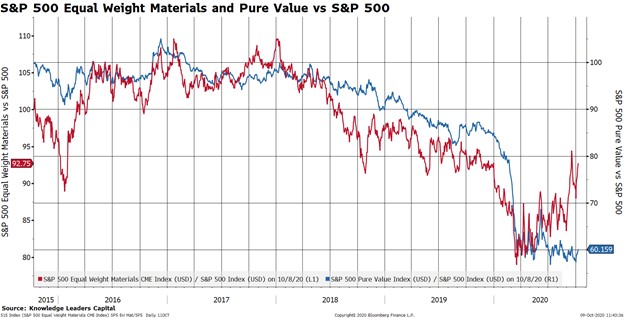
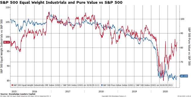
The below three charts show the relative performance of the equal weighted consumer discretionary, materials and industrials sectors vs the S&P 500. These relative performance series are depicted with the red line on the left axis. We chose to show those three sectors because they are often the 2nd, 3rd, and 4th most heavily weighted sectors in many “value” style indexes, behind financials. We then overlay the relative performance of the S&P 500 Pure Value Index vs the S&P 500. This second series is depicted with the blue line on the right axis. What we observe in each of the three charts is that the average stock (the average stock being more value-y than growth-y) in these sectors is beginning to materially outperform the S&P 500 even as “value” as a style remains in the doldrums. In other words, “value” stocks in “value” sectors are working quite well even though “value” as a style is still dead.

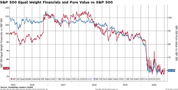
Next we show the equal weight financials sector (i.e. the most value-y stocks in the most value-y sectors) vs the S&P 500 (red line) and then overlay the Pure Value Index vs the S&P 500 (blue line). Notice that these two series are almost identical, which shows how “value” styles aren’t working because financials aren’t working.
From those charts it’s pretty easy to show how the performance of “value” as a style is very much dependent on the performance of financials. Finally, we show how the performance of financials (blue line) is very much dependent on the yield curve (red line). If the policy makers have put a de facto cap on the steepness of the yield curve (i,e. the red line can’t go up much from here because long rates are de facto capped), then the best we are likely to get from the blue line (relative performance of financials) is sideways action.

There are a lot of ways to invest in “value” companies and perhaps this illustrates how gaining “value” exposure to may best be executed by avoiding the “value” indexes.
Copyright © Knowledge Leaders Capital