by Meb Faber, Meb Faber Research
Below are 11 charts or stats to mull over.
Any other great charts I’m missing? (You all already know my portfolio and plan for 2015 but old post if you have not read.)
Click to enlarge any.
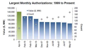
1. Buyback Authorizations
April 2015 highest amount ever
2. Value of M&A Deals
May highest ever: $242B
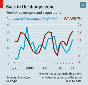
3. Valuation of M&A Deals
The average EV/EBITDA multiple for global M&A stands at 12.4x in 2015 YTD, the highest full year level on record.
via Economist
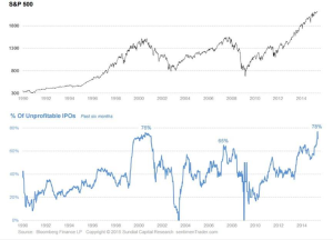
4. % IPOS unprofitable
Near or at highest ever.
via Howard Lindzon
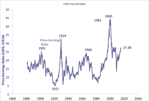
5. Shiller CAPE
Highest except 2000, 2007, and 1929.
via Shiller
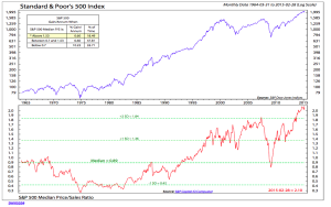
6. Median P/S Ratio
The Price-to-Sales ratio of the median stock in the S&P 500 is at an all time high at 2.1 since 1964. Median 0.89 . Ditto for median price to book, earnings, and cash flow.
via Ned Davis
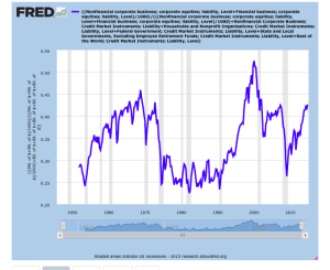
7. Allocation of Investors to Equities
With exception of 2000, near prior peaks.
8. P/E Ratio of Cheapest S&P 500 Sector
Highest ever.
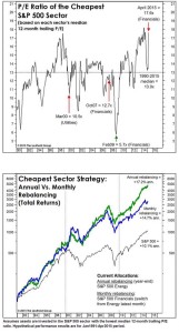
Via Leuthold
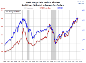
9. NYSE Margin Debt
All time high.
Via dShort
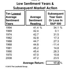
10. Yearlong Sentiment
Second highest ever.
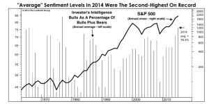
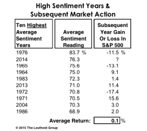
via Leuthold
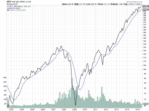
…And the 1 bullish chart……
The trend.
Is up.
And for now, the 1 bullish chart is more powerful than all the bearish charts…
via StockCharts
Copyright © Meb Faber Research


