Authored by Steve Keen via Real-World Economics Review,
Before the current turmoil began, Federal Reserve Chairman Ben Bernanke's hope was that rising asset prices would lead to a "wealth effect" that would encourage the American consumer to start spending again, and thus help the American economy finally leave the "Great Recession" behind.
His predecessor Alan Greenspan argued in February that this would work because:
"...the stock market is the really key player in the game of economic growth... The data shows that stock prices are not only a leading indicator of economic activity, they are a major cause of it. The statistics indicate that 6 percent of the change in GDP results from changes in market value of stocks and homes." (Greenspan 2013)
This is the so-called "wealth effect": an empirical relationship between change in the value of assets and the level of consumer spending which implies that an increase in wealth will cause an increase in consumption.
Greenspan's sage status is somewhat tarnished post-2007, so I don't think anyone should be surprised that his definitive statement involves a sleight of mouth. The "6 cents extra spending for every dollar increase in wealth" found in the research he alluded to was for the relationship between changes in the value of housing wealth and consumption, not stocks. In fact, the authors argued that the wealth effect from stocks was "statistically insignificant and economically small":
"Consistent and strong evidence is found for large but sluggish housing wealth effects... the MPC [marginal propensity to consume] out of a one dollar change in two-year lagged housing wealth is about 6 cents...
Furthermore, a statistically insignificant and economically small stock wealth effect is found ...
Additionally, there is evidence that the housing wealth effect is significantly larger than the stock wealth effect... these results suggest that it is necessary to take into consideration the potentially substantial difference between consumers' respective reactions to fluctuations in the housing markets and stock markets." (Carroll and Zhou 2010, p. 18. Emphasis added)
So the empirical data does not support Greenspan's notion that the stock market drives the economy (though the housing sector might). But equally the economy isn't booming sufficiently to make the reverse case that the economy drives the stock market. So what is causing the markets to boom right now?
Let's start by taking a closer look at the data than Alan did. There are a number of surprises when one does - even for me. Frankly, I did not expect to see some of the results I show here: as I used to frequently tell my students before the financial crisis began, I wouldn't dare make up the numbers I found in the actual data. That theme continues with margin debt for the USA, which I've only just located (I expected it to be in the Federal Reserve Flow of Funds, and it wasn't - instead it's recorded by the New York Stock Exchange).
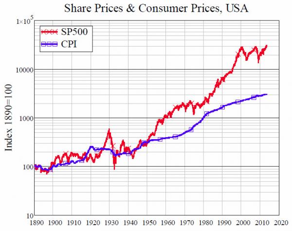
The first surprise came when comparing the S&P500 to the Consumer Price Index over the last century - since what really tells you whether the stock market is "performing well" is not just whether it's rising, but whether it's rising faster than consumer prices. Figure 1 shows the S&P500 and the US CPI from the same common date-1890—until today.
In contrast to house prices, there are good reasons to expect stock prices to rise faster than consumer prices (two of which are the reinvestment of retained earnings, and the existence of firms like Microsoft and Berkshire Hathaway that don't pay dividends at all). I therefore expected to see a sustained divergence over time, with of course periods of booms and crashes in stock prices.
Figure 1: The S&P 500 and the CPI from 1890 till today
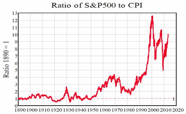
That wasn't what the data revealed at all. Instead, there was a period from 1890 till 1950 where there was no sustained divergence, while almost all of the growth of share prices relative to consumer prices appeared to have occurred since 1980. Figure 2 illustrates this by showing the ratio of the S&P500 to the CPI - starting from 1890 when the ratio is set to 1. The result shocked me - even though I'm a dyed in the wool cynic about the stock market. The divergence between stock prices and consumer prices, which virtually everyone (me included) has come to regard as the normal state of affairs, began in earnest only in 1982.
Until then, apart from a couple of little bubbles in stock prices in 1929 (yes I'm being somewhat ironic, but take a look at the chart!) and 1966, there had been precious little real divergence between stock prices and consumer prices.
Figure 2: Ratio of stock prices to consumer prices from 1890 till todays
And then, boom! What must certainly be the biggest bubble in stock prices in human history took off—and it went hyper-exponential in 1995.
In 1982, the ratio of stock prices to consumer prices was only 1.8 times what it was in 1915. By 1990, the ratio was substantial at 4 times - well above the level of 1929 (2.6:1) but below the peak reached back in 1966 (4.1:1). Then it just exploded to 12.5 times by the peak of the DotCom bubble in 2000.
Since then, it's been doing the Jitterbug. The current rally has erased the crash of 2008 in nominal terms, but at a ratio of just over 10:1 today, it still stands shy of the two previous peaks of 12.5:1 in 2000 and 10.5 in 2008.
So are stocks in a bubble? On this view, yes - and they have been in it since 1982. It has grown so big that - without a long term perspective - it isn't even visible to us. It has almost burst on two occasions - in 2000 and 2008 - but even these declines, as precipitous as they felt at the time, reached apogees that exceeded the previous perigees in1929 and 1968.
But this of itself doesn't truly establish that there is a bubble however, since as noted, even I expected to see a trend in the ratio of stock prices to consumer prices over time. Perhaps 1890-1950 was the abnormal and this is now a restoration of it?
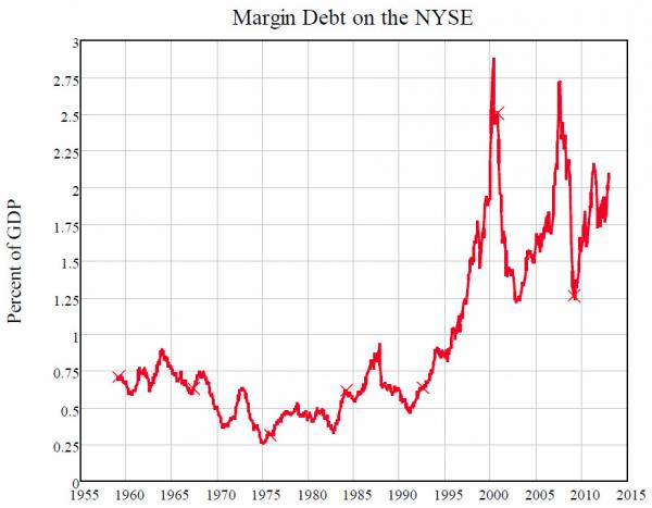
So is there any other series that looks anything like this? Oh, let's try one at random - say, the ratio of margin debt (on the New York Stock Exchange) to GDP (see Figure 3).
Figure 3: NYSE Margin debt as percentage of GDP
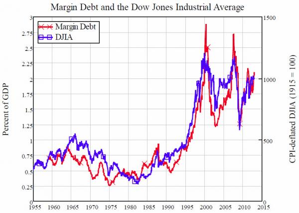
OK, I had my tongue in my cheek, but again this data had even me gob smacked when I first plotted it. I had not expected this correlation: my analysis actually runs from change in margin debt, rather than its level. So this outright match blew me away - particularly when I put the two series on the same chart (see Figure 4 - and yes Alan, feel free to use this one on the ABC News!).
My causal argument commences from my definition of aggregate demand as being the sum of GDP plus the change in debt—a concept that at present only heretics like myself, Michael Hudson, Dirk Bezemer and Richard Werner assert, but which I hope will become mainstream one day. Matched to this is a redefinition of supply to include not only goods and services but also turnover on asset markets.
This implies a causal link between the rate of change of debt and the level of asset prices, and therefore between the acceleration of debt and the rate of change of asset prices—but not one between the level of debt and the level of asset prices. Nonetheless there is one in the US data, and it's a doozy: the correlation between the level of margin debt and the level of the Dow Jones is 0.945.
Figure 4: Margin debt compared to the DJIA—correlation 0.945
Of course there are elements of spurious correlation here: they were both generally rising over 1955-2013. But one can also make a causal argument that increasing levels of debt levered up the gap between asset and consumer prices. This assertion of course directly contradicts a famous proposition in academic finance—the "Modigliani-Miller theorem" that the level of debt has no impact on the level of asset prices—which is another good reason to take it seriously.
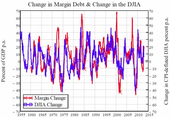
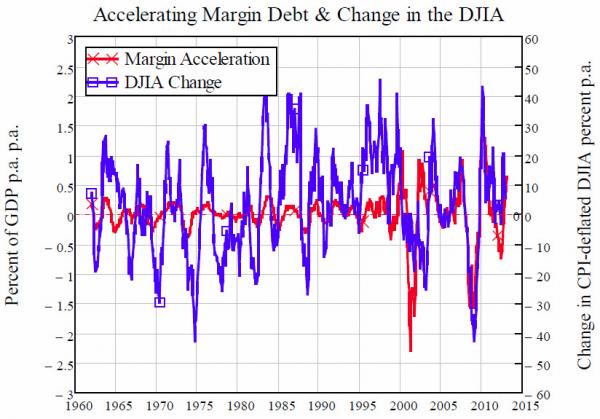
In devising my "aggregate demand is income plus change in debt; aggregate supply is goods and services plus net turnover on asset markets" relation, I was never sure whether the measure of asset market turnover should be based on the level of asset prices, or their rate of change: this was something that only empirical research could clarify. And on this point, the US data is again exceptional: both the rate of change of margin debt (relative to GDP) and the rate of acceleration of margin debt correlate strongly with change in the Dow over the past six decades.
Figure 5: Change in margin debt & change in the Dow--correlation 0.59
The correlation of the change in debt with change in the Dow is stronger than the correlation of acceleration - 0.59 versus 0.4 - but both are pretty strong for correlations over more than half a century, especially since conventional wisdom asserts they should both be zero.
Figure 6: Margin debt acceleration & change in the Dow--correlation 0.4
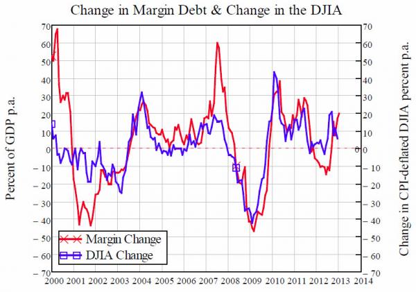
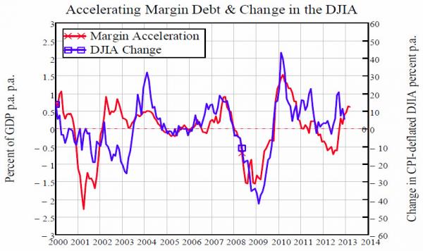
The correlations have risen too as the level of debt has risen - both aggregate private debt and, in the USA's case, margin debt which is specifically used to buy shares.
Figure 7: Change in margin debt & the Dow in recent years—correlation 0.69
Figure 8: Margin debt acceleration & change in the Dow - correlation 0.6
Now comes the complex question: which causes which? Does rising/accelerating margin debt cause the stock market to rise, or does a rising stock market entice more people into margin debt? Obviously there will be some cumulative causation here: both statements are going to be true to some degree. But this also implies a positive feedback loop, which is part of the explanation for why stock prices are so volatile.
Regardless of that complex causal loop, this data scotches Greenspan and his causal argument that a rising stock market causes a rising GDP. The market - and recently the economy - has risen not because of "the wealth effect", but because of "the leverage effect". Leverage has returned to the stock market, driving up stock prices and aggregate demand in the process.
How far can it go? Margin debt is still shy of its all-time high as a percentage of GDP, so there is certainly some headroom for further rises. But at the same time, the market is still in territory that was uncharted before the Loony Zeros (my "Roaring Twenties" candidate for how we should describe the last decade and a half) drove it higher than it has ever been before. Fragility, rather than sustainability is the message I would take from this data.
I'm reassured in this prognosis by the fact that Greenspan made precisely the opposite point in that interview, when he stated that "the price-earnings ratio is at a level at which it cannot basically go down very much." As some other commentators have observed, Greenspan expressing confidence in the stock market is a reliable contrary indicator.
Copyright © Real-World Economics Review


