As the dust continues to settle from last month’s big stock market selloff, markets have stabilized and it has become increasingly clear that what we saw was swift but common downward correction within an ongoing bull market. That being said, it has also become clear that the tone of this bull market has changed. It’s like being at an outdoor event after a big blast of wind knocked everything over. All the chairs and tables have been picked up but they aren’t quite in the same place as before.
In last week’s Equity Leaders Weekly, we took a look at sector performance, how the tone has shifted from an index-driven bull lifting all boats market, to a more normal market of sector rotation and stock picking.
We continue our look at how the bull market has changed in this issue of Equity Leaders Weekly, highlighting changes in the VIX and in the relative performance between emerging and developed markets, as a reflection of how sentiment and expectations have changed over the last month.
The next big scheduled news event for the markets is the March 20-21 Fed Meeting, Jerome Powell’s first as Fed Chair. The central bank is expected to continue its program of gradual interest rate increases. The statement, member projections, and press conference may provide insights to investors on whether the Fed is planning three, four, or more rate hikes this year, which could influence bond yields, the US Dollar, Gold, stocks, commodities, and currencies.
Volatility Index (VIX.I)
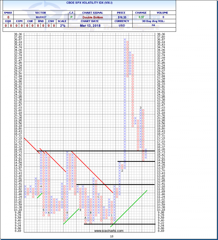
In the February 8th edition of Equity Leaders Weekly, we looked at a long-term 10% chart of the Volatility Index (VIX.I) to put the market selloff that week into context. This time, we are looking at a more sensitive, shorter-term 2% chart of the VIX.I to see what has happened since then.
By the latter part of 2017, a relentless bull market had driven down volatility, reflected in the VIX, to extremely low levels that persisted for months. Extreme complacency had set in, which partly explains why when the correction did arrive, but it took many by surprise and came on so quickly.
Prior to the correction, the VIX had been stuck in a low range between 9.0 and 12.5. The correction caused a brief spike in the VIX, also known as the Fear Index, up into the 30's, a big spike but not unusual in the context of previous market corrections.
Over the last month, as markets have regained their footing and indices have stabilized, the VIX has come back down which is completely normal and expected in these circumstances. What is different and significant, however, is that the VIX has not returned to its previous range. It has settled into a higher 14 to 16 zone currently. This indicates that following the correction, overall volatility has increased and investors are more aware of risk and more skittish than before. Indicating that going forward investors may be more selective about what they own in their portfolios and less inclined to overstay their welcome.
iShares Emerging Markets ETF vs. S&P 500 Index (SPX.I)
For much of this decade the easy trade for institutional investors has been to borrow cheap money and plow it into indices following the path of least resistance. With easy stimulus cash starting to slowly dry up, interest rates starting to rise, and bond prices falling variations on what is known as the carry trade have become less attractive, this has forced investors to look beyond US big cap stocks for returns.
By the summer of 2017, capital had been concentrating in a smaller number of large cap stocks, particularly in technology, where a small group became known as the FAANG (Facebook, Apple, Amazon, Netflix, Google) trade. Following the recent correction, however, investors have started to broaden their horizons once again and market breadth has started to improve, a positive sign for the health of the longer-term bull.
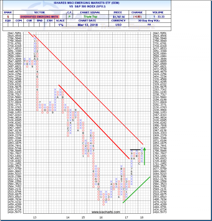
One sign of improving breadth and of investors willing to take on more risk to generate returns is the performance of emerging markets relative to developed markets. The comparison of the iShares Emerging Markets ETF against the S&P 500 index (which is the standard benchmark for big cap institutional investors) has broken out to the upside, completing a bullish Triple Top pattern and embarking on a new upleg. This indicates that capital is starting to flow out of big cap stocks and into other areas including emerging markets.
Comparisons such as this are the foundation of our analysis at SIA Charts. On our home page, we have one click links to a number of key comparisons that advisors and investors can utilize to identify large, broad capital flows across asset classes and market groups.
SIACharts.com specifically represents that it does not give investment advice or advocate the purchase or sale of any security or investment. None of the information contained in this website or document constitutes an offer to sell or the solicitation of an offer to buy any security or other investment or an offer to provide investment services of any kind. Neither SIACharts.com (FundCharts Inc.) nor its third party content providers shall be liable for any errors, inaccuracies or delays in content, or for any actions taken in reliance thereon.
For a more in-depth analysis on the relative strength of the equity markets, bonds, commodities, currencies, etc. or for more information on SIACharts.com, you can contact our sales and customer support at 1-877-668-1332 or at siateam@siacharts.com.


