by Tiho Brkan, The Short Side of Long
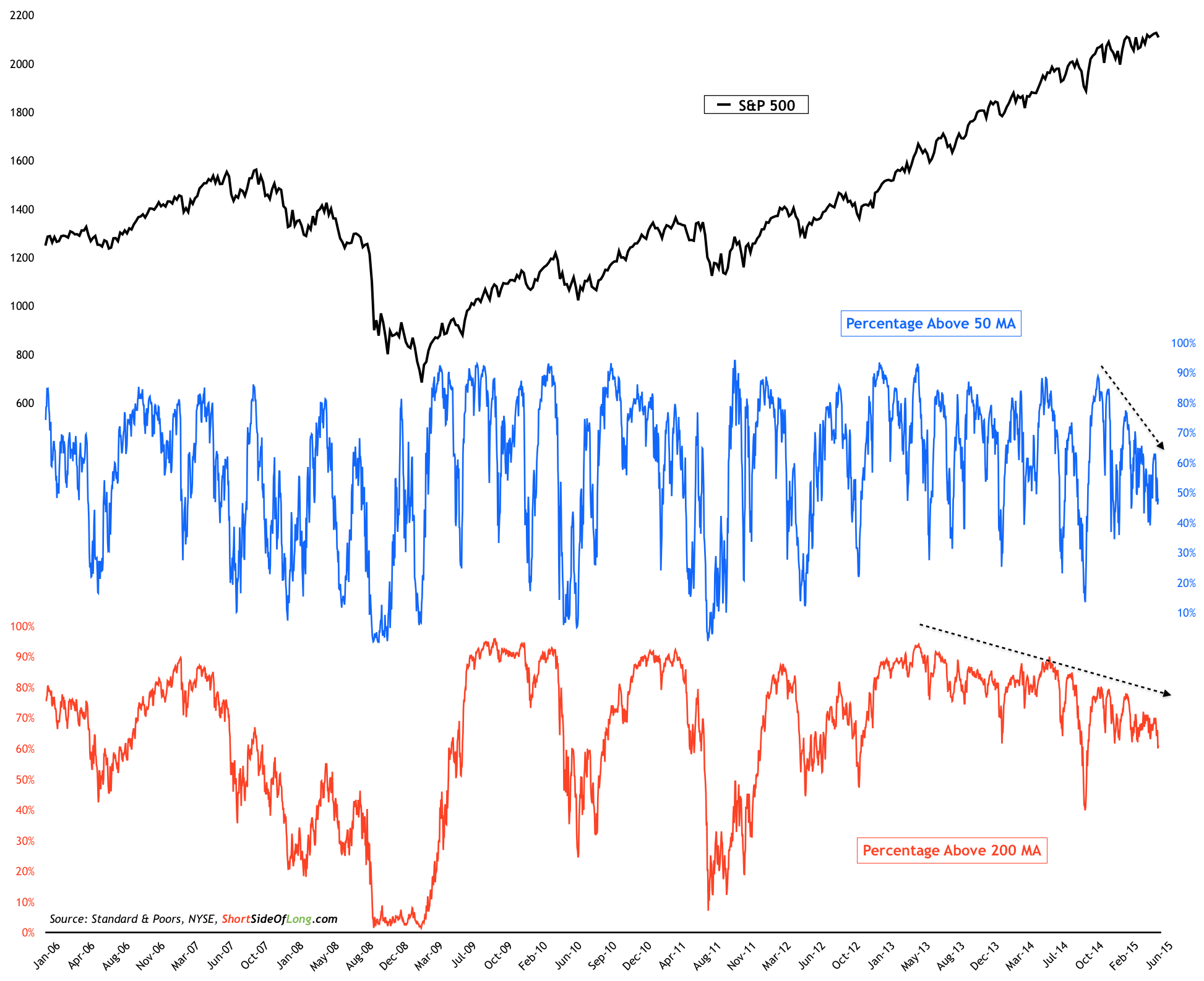
Today's chart of the day focuses on US broad market breadth. When looking at market breadth, such as the percentage of stocks within an index trading above 50 day moving average (short term) and 200 day moving average (long term), there are two different ways to analyse the data.
Firstly, when the readings get towards extremes on either end, the market is considered overbought or oversold. As an example, when percentage of stocks trading above 200 MA gets below 20%, market usually bottoms either from intermediate or longer term perspective and a rally follows.
Chart Of The Day: Broad market breadth participation keeps weakening
Source: Short Side Of Long
Secondly, we look for both divergence of data with the index price in both rising and falling markets. During falling markets if breadth numbers start to improve, it could be a sign that fewer and fewer stocks continue to be in a downtrend, which signals increasing participation for a new bull market. Conversely, during rising markets if breadth numbers start to deteriorate, it could be a sign that fewer and fewer stocks continue to be in an uptrend, which signals decreasing participation in an aged bull market.
And today's chart of that the shows an aged bull market with stock participation decreasing, where fewer and fewer stocks continue to be in an uptrend, both in the short and long term readings. S&P 500 is trading at the same level it did in March of this year, and a drop of only 50 points or 2% will send it back to the same price levels of November 2014. Hardly a healthy market thus far...
Copyright © The Short Side of Long


