When I discuss the market’s breadth one of my go-to measures is the Advance-Decline Line. This tool simply looks at the number of stocks that are rising and falling and ideally we have more stocks that are going up than going down. So far, the A-D Line has continued to confirm the rise in stocks. Simple as that. But there is another tool that I like to watch and that breaks down the 500 stocks that make up the S&P 500 and examines where they are relative to their individual 52-week highs and lows. I looked at this indicator back in October of last in a post titled, We Haven’t Seen A Market Top Yet. And based on it’s current level while the S&P 500 is at (near) a new high, I began to dive deeper into the data.
We do not only want more stocks going up than going down when the U.S. market itself is rising but we want broad participation at new highs. Barry Ritholtz once shared some of the key signs Lowery’s Research looks for in a market top (note: I’m not calling for a market top in this post) in an article for Bloomberg. One of which is the number of stocks that are 20% or more below their 52-week high. Quoting Paul Desmond, chief strategist of Lowry’s:
When a major index such as the S&P 500 is making new highs but the number of SPX stocks making 52-week peaks begins declining, that divergence is a significant warning sign. Desmond notes that this can warn of an eventual top as much as a year ahead of time.
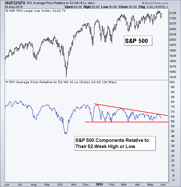
This point is what I’d like to take a look at today. One of the charts I review daily is below and shows the S&P 500 ($SPX) and an indicator that measures the average position of the individual S&P 500 stocks in relation to their own 52-week high and low on a scale of 100-0 with 100 being all of the stocks are at their 52-week high and 0 if all the stocks were at a 52-week low As of May 26th, we are at 63, meaning we are closer to stocks being at their mid-point (a reading of 50) between their high and low than they to mirroring the index and being near at fresh all-time high. So what’s this mean? Next I’ll review past examples of this taking place.
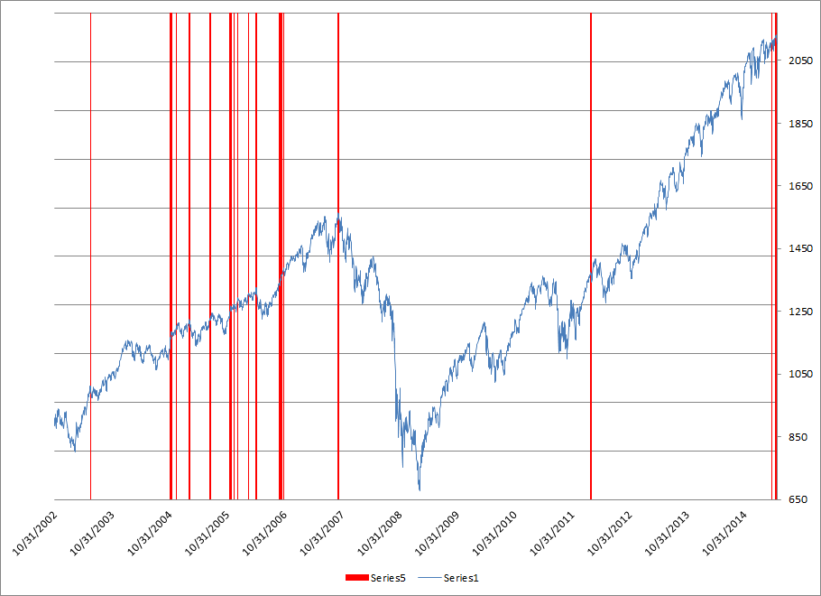
 Below is the S&P 500 (blue line) with red vertical lines marking past instances since 2002 when the S&P 500 was at a new 52-week high but the above mentioned indicator was at 70 or less. Since the start of the current bull market we have only seen this occur once, and that was in February of 2012. Before that we had quite a few days meet this criteria in 04-06. And yes, it also marked the market peak in 2007, but stay with me and don’t just assume we are seeing an end to the bull market. So let’s zoom in a bit on this next chart….
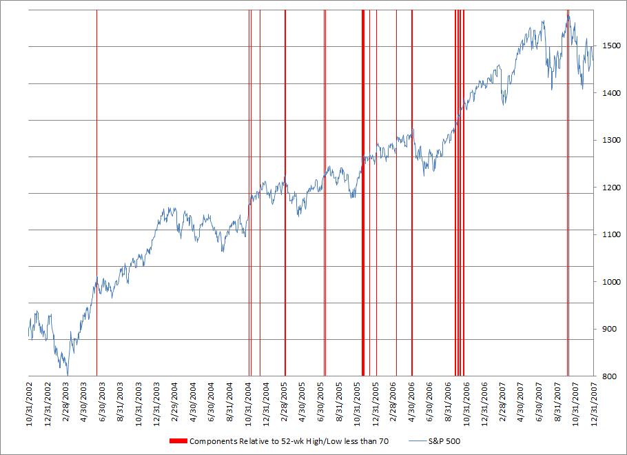
 With this next chart we can get a better idea of the resulting price action after the above mentioned criteria has been met, as shown by the red lines during 2002-2007. Typically we have seen price decline but the majority of the examples have turned into what many would call “buyable dips.” You’ll notice that not every time did the market decline, nothing is perfect in measuring the ‘health’ of an up trend – October 2006 is a great example of where we saw very low relative readings while the market was at a fresh high but the S&P 500 continued even higher.
 So what does this mean for stocks today? Here are my two takeaways from this data….
1. At the most recent closing high in the S&P 500 this indicator was at a 67. At the peak in ’07 it was at a 63 and has only been that low at a 52-week high in the S&P one prior time, November ’05 (a date that did not coincide with a turning point in stocks, even on a short-term basis). So while we are still seeing a relatively low level of S&P 500 stocks participating right now, things were even weaker in 2007.
2. The up trend in the average position of the S&P 500 components has not broken. If you look back at the first chart you’ll see we’ve been able to hold above 60 so far this year. What would cause me to get concerned is if we saw more stocks shift to lower, away from their prior 52-week high’s, while the S&P 500 itself headed higher. This would widen the divergence and decrease the level of participation in the up trend of the U.S. market. What would actually be bullish, is if we saw the market decline, reset, and begin seeing a stronger level of participation in the trend as stocks head higher.
This is just one set of data and there are many others that can also provide insight into the ‘health’ of the bull market. In the end, it’s confirmation that I’ll look for, and that only comes in the form of pure price movement. In this case it would be the S&P 500 declining. Until that happens I continue to give credence to the current up trend. It’s shown more resiliency than many would have expected. However, it’s tough to not be concerned by this low level of participation in the bull market, this seems like an awfully low average leverage for stocks to be trading at in their respective ranges while the index itself is so high. We’ll see what happens.
Disclaimer: Do not construe anything written in this post or this blog in its entirety as a recommendation, research, or an offer to buy or sell any securities. Everything in this post is meant for educational and entertainment purposes only. I or my affiliates may hold positions in securities mentioned in the blog. Please see my Disclosure page for full disclaimer. Connect with Andrew on Google+, Twitter, and StockTwits.
Copyright © Andrew Thrasher


