


Submitted by F.F.Wiley of Cyniconomics blog,
In his 712-page tour de force, The Great Deformation, David Stockman dissects America’s descent into the present era of “bubble finance.” He describes the housing bubble’s early stages as follows:
The American savings deficit was transparent after the turn of the century, but the Fed flat-out didn’t care. … Greenspan and his monetary central planners had a glib answer: do not be troubled, they admonished, the Chinese have volunteered to handle America’s savings function on an outsourced basis.
So instead of addressing the growing deformations of the American economy after the dot-com crash, the Fed chose to repeat the same failed trick; that is, it once again cranked up the printing presses with the intent of driving down interest rates and thereby reviving speculative carry trades in stocks and other risk assets.
Needless to say, it succeeded wildly in this wrong-headed game plan: by pushing interest rates down to the lunatic 1 percent level during 2003-2004, the Fed sent a powerful message to Wall Street that the Greenspan Put was alive and well, and that the carry trades now offered the plumpest spreads in modern history. Under the Fed’s renewed exercise in bubble finance, asset prices could be expected to rumble upward, whereas overnight funding costs would remain at rock bottom.
That is exactly what happened and the equity bubble was quickly reborn. After hitting bottom at about 840 in February 2003, the S&P 500 took off like a rocket in response to virtually free (1 percent) money available to fund leveraged speculation. One year later the index was up 36 percent, and from there it continued to steadily rise in response to reported GDP and profit growth, albeit “growth” that would eventually be revealed as largely an artifact of the housing and consumer credit boom which flowed from the very same money-printing policies which were reflating the equity markets.
In hindsight, it’s hard to refute Stockman’s perspective on the Fed’s role in the housing bubble. But that won’t stop some from trying, and especially the many academic economists beholden to the Fed. Research papers have stealthily danced around the Fed’s culpability for our crappy economy, as we discussed here.
More importantly, if Stockman is right about bubble finance, there’s more mayhem to come. Consider that denying failure and persisting with the same strategy are two sides of the same coin. Just as investors avoid the pain of admitting mistakes by holding onto losing positions, Fed officials who claim to have done little wrong are also more committed than ever to propping up asset markets with cheap money.
For those concerned about another policy failure, a key question is: “As of today, where do we stand with respect to bubbles and bubble finance?”
We’ll compare two indicators that may help with an answer:
- Stock valuation indicator: To eliminate the problem that price-to-earnings (P/E) multiples tend to skyrocket when earnings shrink in a recession, we use price-to-peak-earnings (P/PE). This is the S&P 500 (SPY) index divided by the highest earnings result from any prior 12 month period. (See here for further discussion.)
- Monetary policy indicator: We use the difference between Fed policy rates (the discount rate until 1954 and fed funds rate thereafter) and inflation, averaged over the prior two years. By taking a two-year average, we capture lags in the economic effects of rate changes (commonly estimated at up to 24 months), while also smoothing out anomalies.
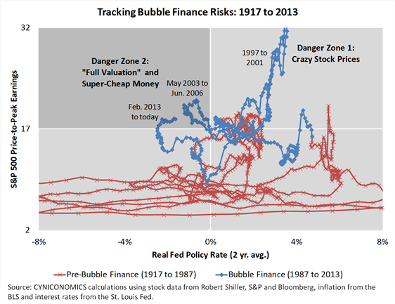
Here’s the data:

The chart shows that it wasn’t until the Fed’s battle with the Internet bust – described above by Stockman – that policy rates were first lowered below inflation at the same time that stocks were “fully valued” (which we defined as a P/PE above 17). The Fed had never before allowed the policy/valuation mix to drift into the chart’s bolded, upper-left quadrant.
Today, we’re well into our second experiment with that quadrant, which is a precarious place to be. It doesn’t take much analysis to see that strong policy stimulus despite an elevated price multiple is a recipe for bubbles.
In other words, the chart suggests another reason to expect the next bear market to be severe, as we discussed in “P/E Multiples, Deleveraging and the Big Experiment: Sizing Up the Next Bear Market” and again in “Bubble or Not, U.S. Stocks Are Priced to Deliver Dismal Long-Term Returns .”
Worse still, we haven’t even contemplated the Fed’s preoccupations as we head into Janet Yellen’s reign. The next time you puzzle over the transparency of the forward guidance or the timing of the taper or the transparency of the guidance for the timing of the taper (you get the idea), we suggest coming back to the data above.
In the bigger picture, interest rates alone are enough to show that we’re back in the danger zone.
Bonus chart
While the policy/valuation mix reached the chart’s bolded quadrant for the first time in 2003, you may wonder about close calls. Eliminating the bubble finance era, we find two:

The first occurred in late 1958 and 1959, and Fed Chairman William McChesney Martin met the challenge with aggressive increases in both interest rates and stock market margin requirements. Stockman discussed these policies in The Great Deformation, stressing that Martin responded to financial excess only four months after the end of a recession. Martin’s actions helped to slow lending growth while preventing asset bubbles.
The second close call occurred in 1972, when Fed Chairman Arthur Burns held the discount rate steady at a five-year low of 4.5%. Alongside President Nixon’s blunders, Burns’ dovish approach soon spawned double-digit inflation, a painful recession and a severe bear market.
Overall, four past chairmen faced a policy/valuation mix that was either headed toward or inside of the bolded “danger zone” in our charts. Martin tightened preemptively and escaped unscathed. Burns and Greenspan will forever be seen to have lost the plot. The history books aren’t yet written for Ben Bernanke, but we don’t like his chances.