October 16, 2012
by Liz Ann Sonders, Senior Vice President, Chief Investment Strategist, Charles Schwab & Co., Inc.
Key Points
- By definition, inflection points are characterized by maximum weakness.
- Many US economic readings are again suggesting notable signs of life.
- Will the improvement be enough to offset the "fiscal cliff"?
One of the more interesting characteristics of the skepticism that has met the economic recovery over the past several years is the fact that it's overly focused on the absolute versus the relative. By that I mean when discussing an improvement in economic data, it's met with comments like, "yes, but we're nowhere near prior levels of growth." This phenomenon can be applied toward the economy overall, but also to segments, such as housing.
Inflection points versus absolute recoveries
As an analyst of the economy (and markets), I believe it's important to look for inflection points, not to wait until the "all's clear" bell is rung. Remember, the stock market is a leading indicator, while many of the most widely watched economic indicators are laggards (such as the unemployment rate). By definition, leading indicators will move first; the economy will follow; and lagging indicators will pick up the slack.
Also, by definition, inflection points (when moving from weakness to strength) occur at moments of maximum weakness in the data. It's at that point that I'm generally most intrigued … not after the recovery is in full swing.
Today's report is an attempt at inflection-point discovery. We recently experienced a third consecutive mid-year economic slowdown, all of which have had similar triggers. All three years' soft patches were partly triggered by the eurozone crisis, and politics figured into at least two (2011's debt ceiling debacle/Standard & Poor's downgrade of US debt and 2012's "fiscal cliff" concerns). This year's also had a heavy dose of concern about China's slowdown.
US leading economic indicators looking much better than global
In the three charts below, you can see the relative strength of the leading indicators for the United States compared to either the eurozone or China. Our growth is no great shakes, but we haven't suffered to the same degree.
OECD Composite Leading Indicators
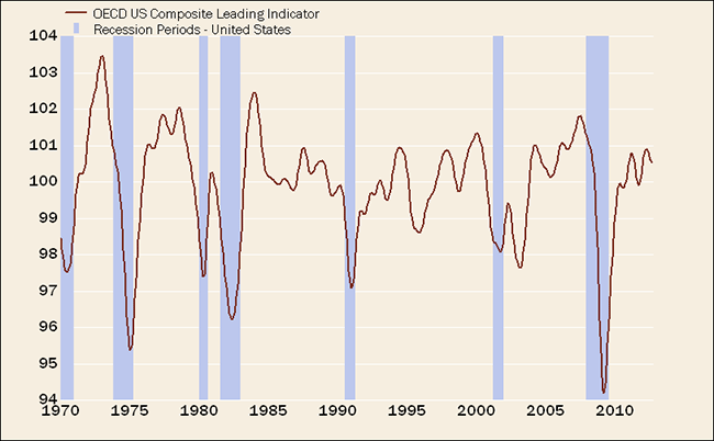
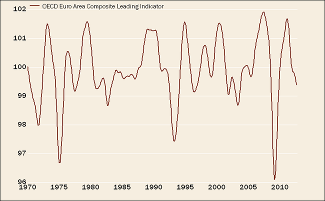

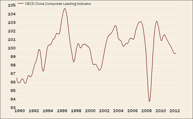
Source: FactSet, Organisation for Economic Co-operation and Development (OECD), as of August 31, 2012.
It appears as if the United States is at least stabilizing, if not pulling out of its latest slump. There are even a few signs of improvements within the eurozone and China: eurozone industrial production has increased nearly 3% over the past four months (even in Greece), and China's M2 money supply and exports both recently moved well above expectations. By no means does that mean we think US or global growth will be robust—only that the worst may be behind us for now.
I believe an appropriate comparison is between our economy today and in 1998—that was the year during which the Asian financial crisis erupted. Pessimistic assumptions about the impact on US growth did not pan out, as domestic growth was sufficient to offset the drag from overseas weakness. Like then, the aggressive easing of monetary policy could be the necessary offset to keep the weakness contained to the eurozone and China.
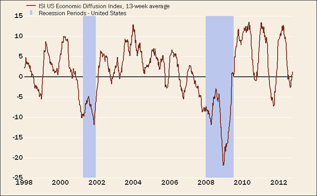
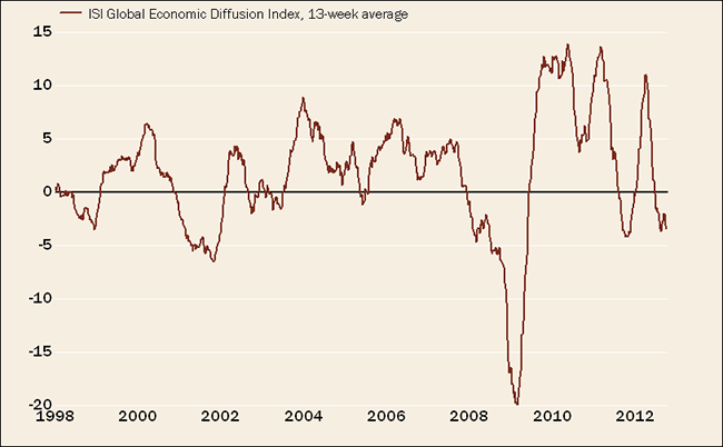
One of the key indicator sets I track often are diffusion indexes of dozens of high-frequency economic indicators. ISI has the most comprehensive set of indexes, which measure strength minus weakness. As such, when the lines are ascending it indicates increasing strength relative to weakness and vice versa.
US Indicators Turning Up … But Not Yet Global
Source: FactSet, ISI Group, as of October 8, 2012.
In the US index above, you can see the three-year repetition—but also the latest turn for the better. At the inflection points in 2010 and 2011, we began to see a much healthier stock market, and I think the latest upturn in the data will be met with the same. This turn has occurred in spite of the still-weak reading of the global diffusion index.
Where's the improvement domestically?
Much has been made of last week's much-better-than-expected drop in the unemployment rate, thanks to a surge in the "household survey" measure of job growth (from which the unemployment rate is calculated). Conspiracy theorists jumped all over the numbers, and although I understand the basis, given how extreme an outlier the unemployment rate's drop was, I don't subscribe to the theory that the numbers were rigged. The household survey is notoriously volatile, and we should all keep a close eye on subsequent revisions to judge the ultimate trend.
But supportive of a better jobs outlook have been several notable economic readings:
- The aforementioned improvement in the jobs picture
- The bounce in both the manufacturing and non-manufacturing ISM indices (in the case of the former, back above the 50 contraction/expansion line, after three months below it)
- The bounce in consumer confidence and sentiment readings
- Strong retail sales (even excluding gasoline), along with positive revisions to prior months
- Much better housing data, including a five-year low in foreclosure filings
- The 14th consecutive week of improvement in ECRI's weekly leading index
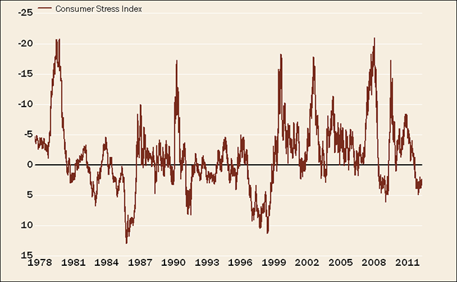
In particular, consumers have gotten a lift recently, tied to the improvement in confidence. Notably, both of the largest components of household net worth—homes and stocks—have been boosts. In fact, a broad measure of consumer stress is at a fairly low level.
Consumers less stressed out
Several years ago I created a "consumer stress index," incorporating a variety of metrics all designed to gauge the level of stress on consumers. It's made up of several market, inflation, housing and debt indicators, and as you can see in the chart below, its present level is fairly low by historical standards.
Lower Consumer Stress
Consumer Stress Index Components: average year-over-year percentage change of S&P 500® index, nonfarm payrolls, real disposable personal income, median home price; and inverse of oil price, medical care inflation, household liabilities and CRB (Commodity Research Bureau) Foodstuffs Index. Source: FactSet, as of October 12, 2012.
What if we don't fall off the fiscal cliff?
In fairness, I'll conclude with my oft-stated concerns about the fiscal cliff—the one major impediment to a continuation of the growth turn we appear to be witnessing. Housing is presently a notable bright spot, but is unlikely to be a significant enough growth driver to prevent a recession if we fully fall off the fiscal cliff. Concerns about the cliff largely explain the reluctance of businesses to invest and/or hire, standing in stark contrast to recent improvement in consumer confidence.
But what if the consensus is wrong? What if our politicians actually get their act together and construct a solution to the fiscal cliff? I'm fond of saying I'm always more intrigued by the story no one is telling and less intrigued by the story everyone is telling. Many have lost faith in our politicians' willingness or ability to get anything done, but the possibility we don't topple off the cliff is not built into expectations, in my opinion, and could be a very "positive tail risk" for the market.
Copyright © Charles Schwab & Co., Inc.


