


by Chris Kerlow, Shane Obata, Craig Basinger, Derek Benedet, Connected Wealth, RichardsonGMP
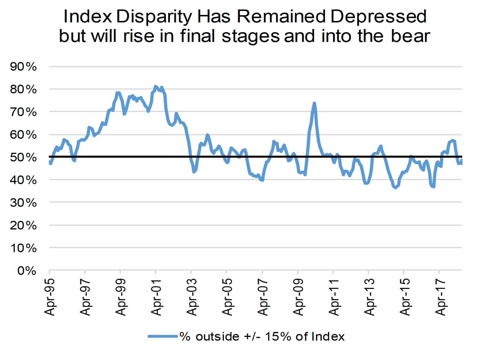
Markets continue to show late cycle characteristics and pundits are scouring for warning signs of the imminent bear. Some of the most widely talked about indicators are the flattening yield curve, weakness in emerging markets and softening industrial commodity prices. One potential indicator that is not getting much attention is market disparity. Probably because the performance between market weighted indices and their equally weighted counterparts has not diverged much in past years, a tell-tale sign of market disparity. But, as that disparity widens the potential for a strong reversal increases, leaving those late to the party vulnerable to hefty losses.
We monitor 30+ leading market indicators in our “Market Cycle Monitor”, most of which are well known. These help us to determine when a bull market may turn into a bear. Market disparity is not in this “monitor” because it is hard to sum up in one number. Even so, we like analyzing it periodically to make sure that we are not investing in assets that are exuding irrational exuberance. When everybody seems to like one side of a trade, that is when it tends to carry the most risk. Because there are few remaining prospective new buyers left who could push the stock higher. Conversely, when a stock / sector is beaten down it tends to present the best opportunity since there are many potential new buyers out in the market.
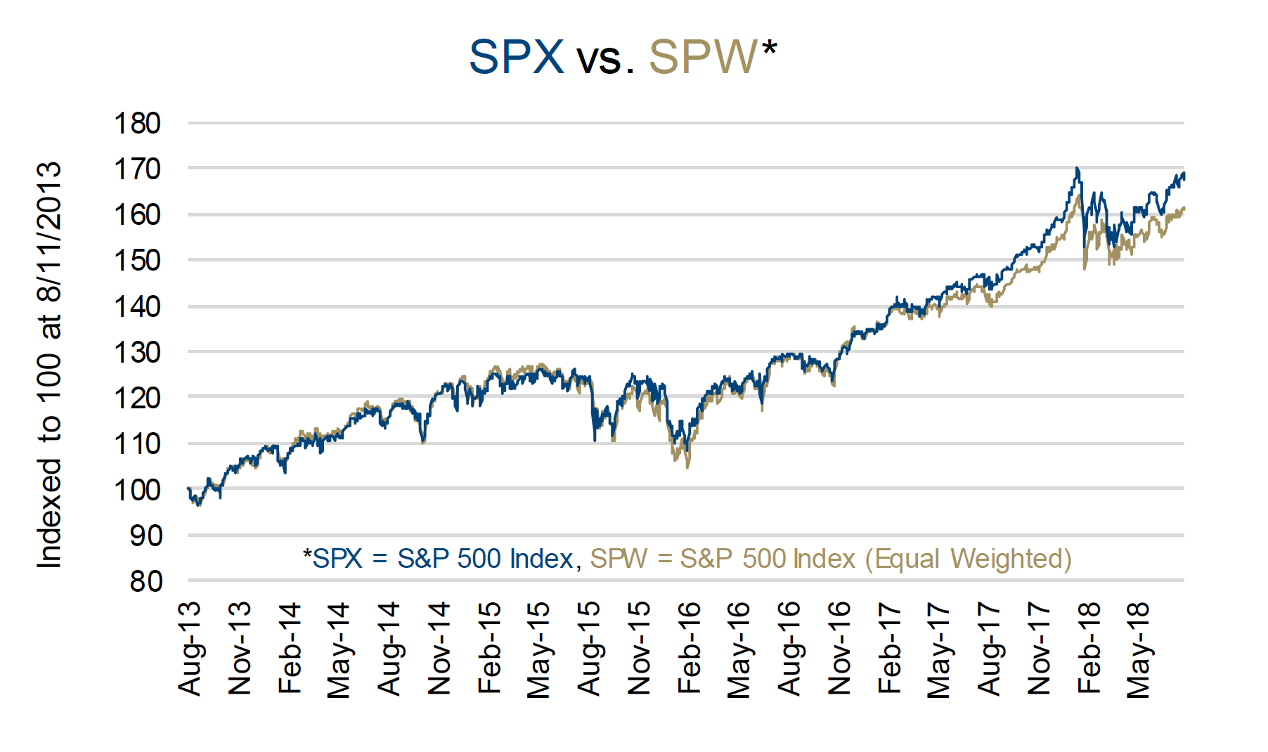
The performance of the S&P 500, which is a market cap weighted index, has not been meaningfully different than that of the equally weighted index. This is typical of an expansionary environment, in which the average stock moves higher and there are few outliers, up or down. Statistically speaking, this makes the returns distribution more peaked (leptokurtic) than a normal distribution, resulting in more returns concentrated around the mean (Chart 3 bottom). This causes most stocks to have a near-average return and a few to have ones that are out on the extremes (tails of the distribution). This is a very challenging environment for active managers. If you cannot identify those few outliers then it is very hard to add value, because all of your holdings will have near-average performances. If you are unfortunate enough to hold any of those left tail stocks or “torpedoes” then you can easily underperform. This is part of the reason why active managers, in aggregate, have had a hard time beating the benchmark during late cycle bull markets.
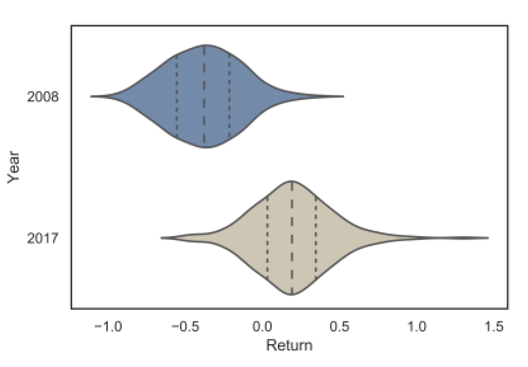
During a recession, we tend to see that bell curve flatten out (platykurtic), a situation with fewer outliers but also many fewer average performers (Chart 3 top). This is when active management can thrive. All you need is to pick a portfolio of mostly above average performers and not many underperformers. In this case, there is much less need to have those homerun stocks and to avoid the torpedoes.
The problem is that it is the homerun, high flying stocks that lure investors in. This is caused by the recency bias innate within all of us. The problem is that most people get in after much of the easy money has been made, leaving them exposed to names that will likely get hit the hardest when things move in the other direction.
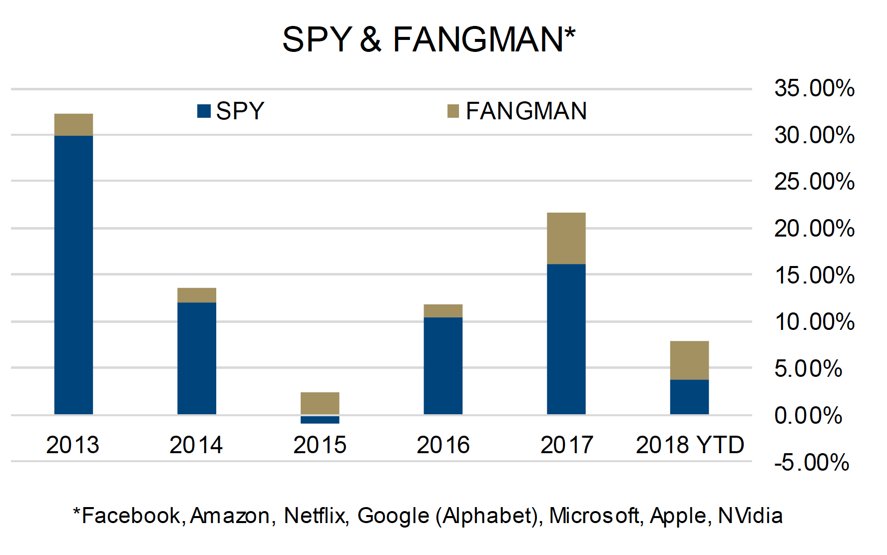
The high flyers over the past few years have been encapsulated by the acronym FANGMAN, which covers Facebook, Amazon, Netflix, Google (Alphabet), Microsoft, Apple and NVidia. The chart on the right shows just that. As of Friday, the S&P 500 Total Return index is up a little less than 8% so far this year, with over half of that return attributable to FANGMAN. These high flying technology names have caught the attention of investors and the media and have drawn in a lot of money flows. Exacerbating the problem is that as the stock price rises, more money is drawn to the name, causing the market cap to rise. Eventually, every incremental dollar of passive investment moves more and more into these select names because most ETFs track market cap weighted indices.
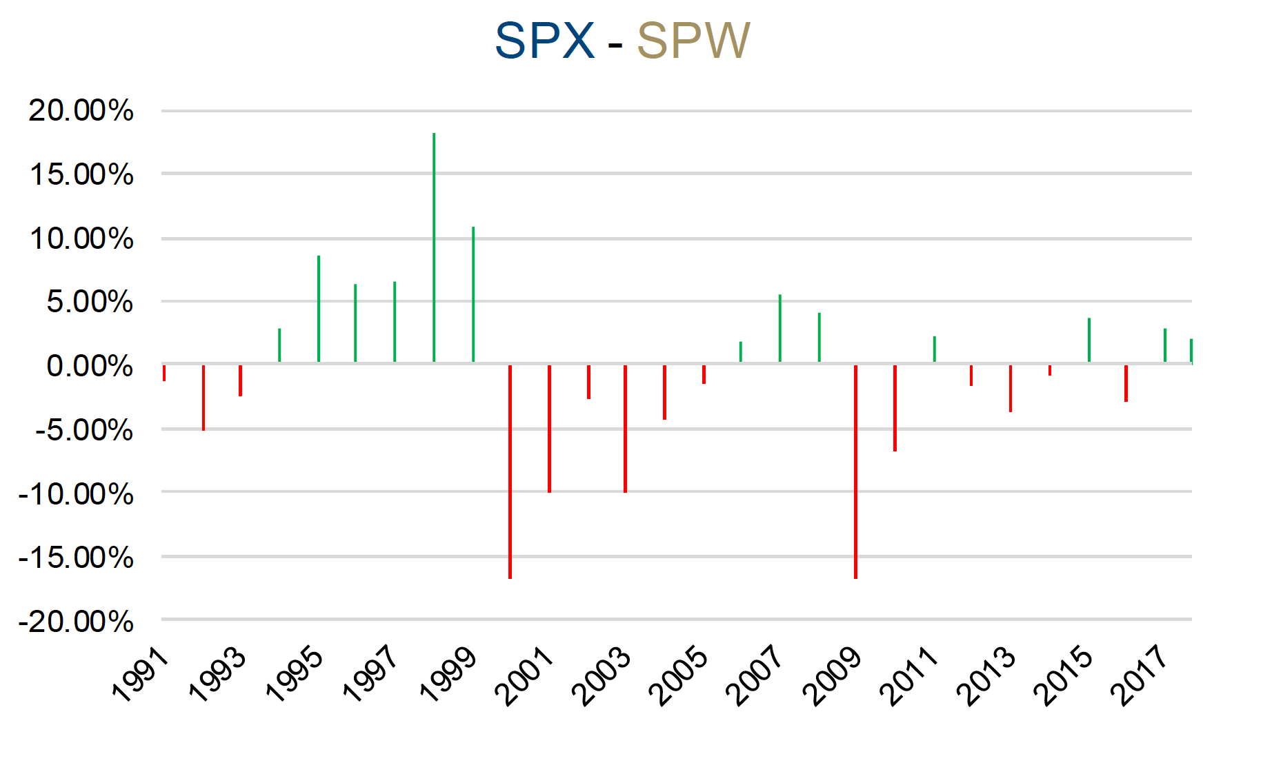
If you have been investing for over 20 years this narrative is quite similar to what we saw / read about in the late 90’s early 2000’s during the tech bubble and subsequent crash. The chart to the right shows the difference between annual returns for the S&P 500 index and its equally weighted counterpart. If you look back at that era then you can clearly notice that during the late stages of that bull market, the large constituents were big outperformers and that the opposite was true during the subsequent pull back. History never repeats but it often rhymes. If you are an active trader, there could certainly be opportunity to pick up some nice returns in the last stages of a high flying rally. However, if you tend to buy and hold then moving into this group now could leave you exposed to outsized losses during a correction.
Sectors Will Show Disparity Too
Many of the aforementioned points tend to be true for sector performance as well. The divergence amongst sectors tends to balloon during volatile times, making sector allocation that much more important. It is also likely coupled with a rotation of sector leadership away from the more cyclically oriented sectors (Technology, Materials, Industrials) and in to the defensives (Consumer Staples, Utilities). The key here is to not get greedy, chasing the best performing sectors late into an expansion, like the environment we are currently experiencing. At some point, one should look to rotate into areas that have not performed quite as well.
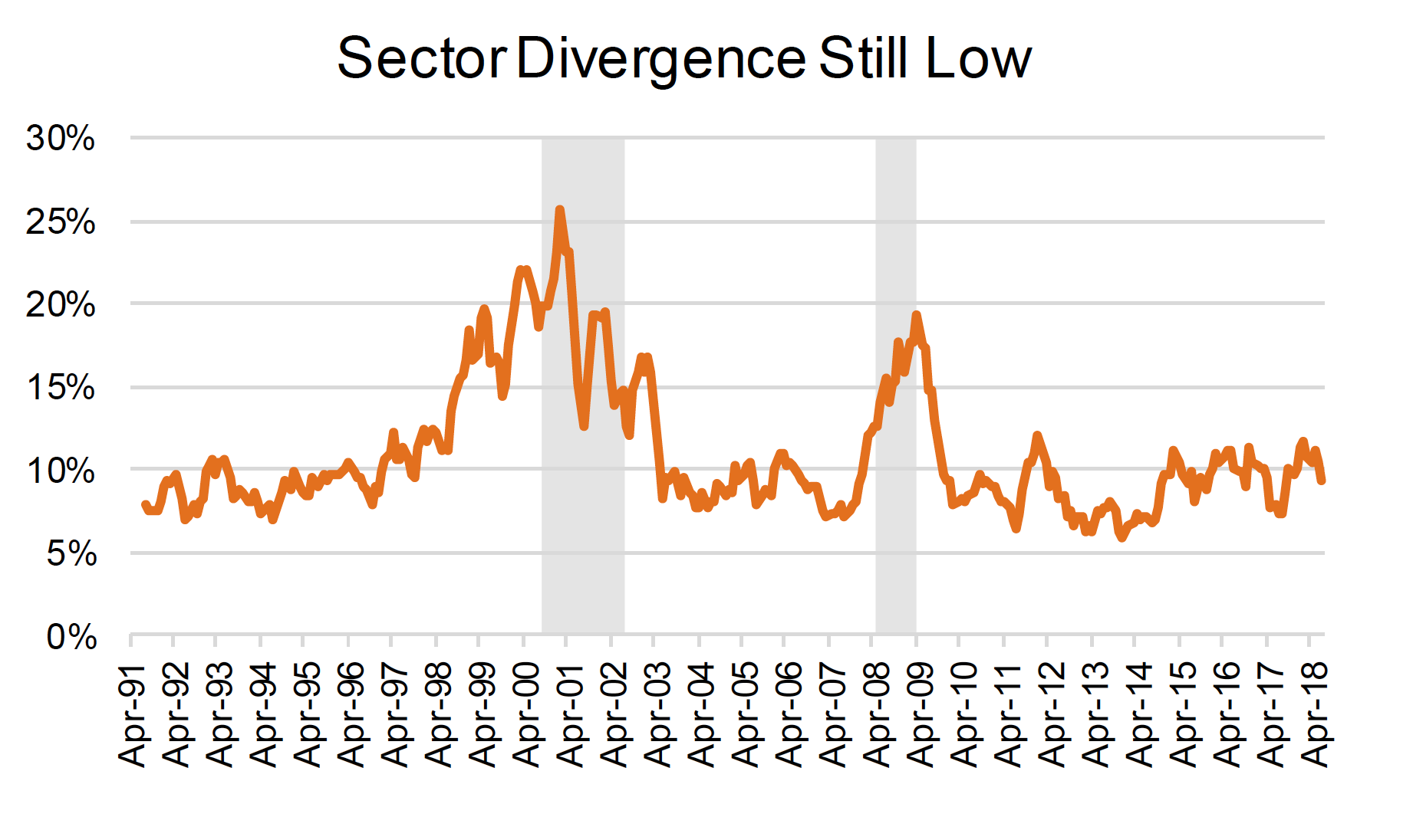
Chart Investment Implications
The good thing for investors is that constituent and sector disparity tend to be leading indicators, we start to see this take shape leading into a recession and then intensify during the crisis. For investors, it is important to remember to not chase performance late into the cycle. For retail investors that tend to pick between active fund managers and passive solutions, it could be time to start increasing your allocation to active managers with a defensive tilt.
*****
Charts are sourced to Bloomberg unless otherwise noted.
This publication is intended to provide general information and is not to be construed as an offer or solicitation for the sale or purchase of any securities. Past performance of securities is no guarantee of future results. While effort has been made to compile this publication from sources believed to be reliable at the time of publishing, no representation or warranty, express or implied, is made as to this publication’s accuracy or completeness. The opinions, estimates and projections in this publication may change at any time based on market and other conditions, and are provided in good faith but without legal responsibility. This publication does not have regard to the circumstances or needs of any specific person who may read it and should not be considered specific financial or tax advice. Before acting on any of the information in this publication, please consult your financial advisor. Richardson GMP Limited is not liable for any errors or omissions contained in this publication, or for any loss or damage arising from any use or reliance on it. Richardson GMP Limited may as agent buy and sell securities mentioned in this publication, including options, futures or other derivative instruments based on them.
Richardson GMP Limited is a member of Canadian Investor Protection Fund. Richardson is a trade-mark of James Richardson & Sons, Limited. GMP is a registered trade-mark of GMP Securities L.P. Both used under license by Richardson GMP Limited.
Connected Wealth, RichardsonGMP © Copyright 2018. All rights reserved.