


Identifying Opportunities: Using Comparison Charts to Spot Sector Trends
by Bob Simpson, Synchronicity Performance Consultants
Is it really impossible to beat the major indices? We know that all the studies show that only a small percentage of professional money managers ever beat the major indices but should this keep us from trying?
One way to help you, if this is one of your longer-term goals, is to look at the major sectors through a different lens.
Comparison charts provide you with a different way of looking at indices, sectors, stocks, bonds, mutual funds and ETFs. A comparison chart is a ratio of the price of one security to another. For example, If Home Depot (HD) is trading at $131 and the S&P 500 (SPY) is trading at $203 the ratio is ($131/203) 0.646.
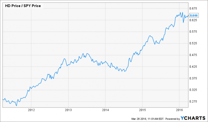
If the trend in a comparison chart is rising, the first company listed in the top left corner is stronger than the second.
If you only ever hold stocks that are trending higher than the indices, your performance will be greater than that of the index you are trying to out perform.
To gain a good macro view of the markets, you can run the same analysis, using sectors. There are now a broad range of sector ETFs that you can use to conduct such a comparison. Let’s take a look at a couple – Energy and Consumer Discretionary.
Energy
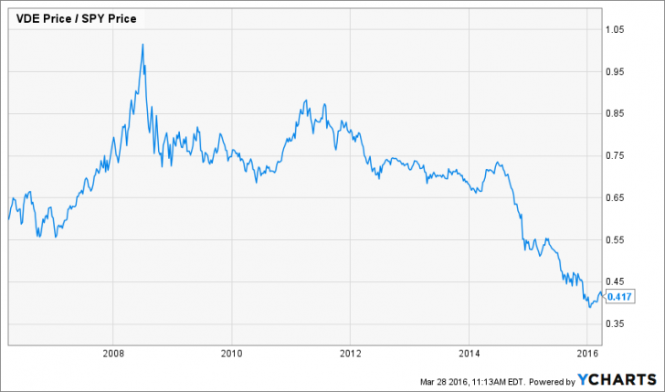
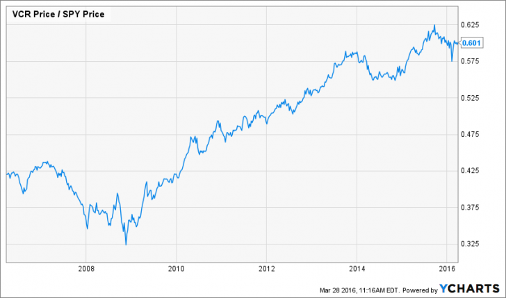
The trends on these two sectors are in completely different phases – Energy is in a major downtrend against the S&P 500 and has been since 2008. Consumer Discretionary has been in a major uptrend since 2008. In other words, if you had over weighted your portfolio in Consumer Discretionary, you would have out performed the index and if you had positioned in Energy, you would have under performed. If you had chosen Consumer Discretionary instead of Energy, performance would have been significantly better.
You can use a variety of methods to determine if there is a positive or negative trend. Moving averages and trend lines are probably the simplest or you can simply look at a chart like this and make an assessment. A visual assessment may simply look for slowing in the rate of change.
This is also a great way to assess a mutual fund or ETF. Run the comparison chart and if the tend is positive against an appropriate benchmark, that fund or ETF is generally a good choice.
In this week’s Huddle, we compared at all the US sectors against the S&P 500. To get a good handle on which sectors are out performing and which are under performing, watch the recording of the Huddle below.
***
The Huddle is a 30 minute virtual session facilitated by Bob Simpson of Synchronicity Performance Consultants, each Friday at Noon Eastern time. During these insightful sessions, a broad range of topics are discussed, ranging from financial markets, investment strategies, business development and how to use stock screening tools, like YCharts.
Synchroncity has been conducting these sessions each week since 2013 and recorded and posted them on their site. To date, they have conducted over 100 sessions with participation from a broad range of advisors across North America.
If you would like to attend live sessions, contact Bob Simpson at 905-502-0100, or via email at info@synchroncity.ca
Copyright © Synchronicity Performance Consultants