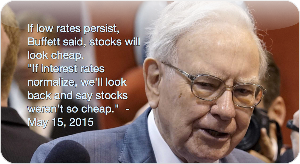
So, Buffett's response (at the 2015 annual meeting) to questions regarding the valuation of the stock market was interesting. He used to just say it's in a "zone of reasonableness", but this time said that if interest rates stay at current low levels, the stock market is cheap, and if interest rates normalize, it is expensive. Well, he has been saying for a while that stocks are better than bonds.
We know there is a relationship between interest rates and stock market valuation. Some criticized the old Fed model (10-year bond yields compared to the earnings yield of the S&P 500 index) saying that there was a correlation between the two for only a short period in history but there hasn't been a correlation between them for most of history. This is true, but it is also true that there is a logical connection between them so we can't deny a relationship just because we can't get some charts to look convincing.
Anyway, just for fun, I decided to play around with some figures. My goal was actually just to see what the stock market should be valued at if interest rates normalize. I did that before, but this time I wanted to do it empirically.
One thing I don't advocate or call for is for the stock market to catch up to the bond market. If it did, then the P/E ratio of the market would get to 50x, and that's too expensive. At that level, even I would pound the table to get out of the market.
So first of all, we've already seen the many charts comparing bond yields to earnings yields and how they have tracked each other closely (and diverged) in recent years. So I decided to look at it a different way; by X-Y plotting it. This is nothing new; strategists do this sort of thing all the time (as I used to too back in the old days).
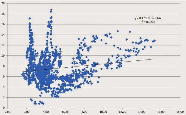
This is the data from 1871 through the end of 2014. The earnings yield is on the Y-axis and the 10-year bond rate is on the X-axis. (all data is based on the S&P 500 index (and predecessors for older data), ttm earnings from Shiller's website).
Wow. Looks like a raptor claw. So the Fed model critics are right. The R² is basically zero. But we knew that.
The two vertical clusters are from the era when interest rates were low. The cluster to the left is when rates were around 2% and the stock market got cheap in the late 1940's and early 50's. The second vertical cluster (or claw) was when the market swung around in 1915-1920. Excluding those two periods, there seems to be sort of a linear relationship.
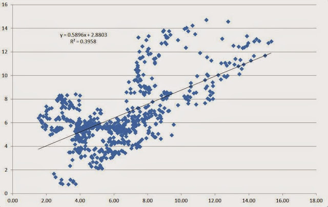
So let's see what happened since 1955:
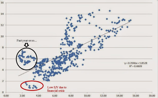
Now we see a little bit more of a clear slope, verified by the higher R² of around 0.4.
Not that different, but here it is from 1970:
We can see that the stock market didn't continue down the slope as rates declined. The dots all the way at the bottom when interest rates were between 2% to 4% and earnings yield dipped below 2% was just from the financial crisis; the E declined dramatically.
Eye-balling this chart, even if rates got back up to 6%, the stock market valuation would still be reasonable; no need for a valuation adjustment.
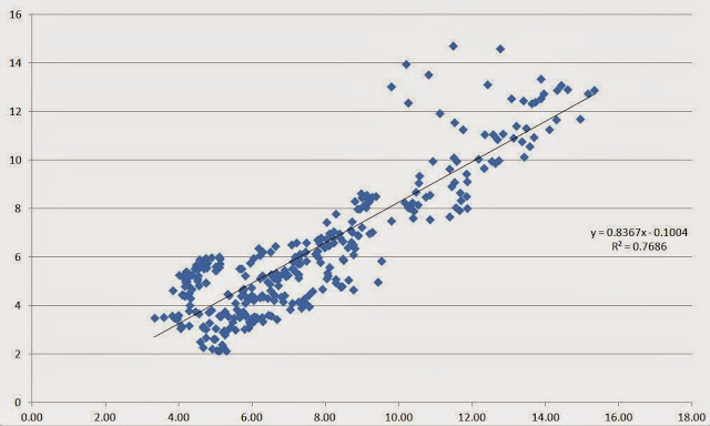
Just for fun, I took out the data after 2007. Let's look at this from 1980-2007:
Obviously, the R² increases and the slope gets closer to 1 (0.8367).
So we see that stock prices are cheap at current interest rates, but the thought is that they may become expensive if interest rates "normalize".
But what does it mean for interest rates to normalize? From the above charts, it looks like the stock market can be in the fair value range even with rates going back up to 6% or more.
What is "Normal"?
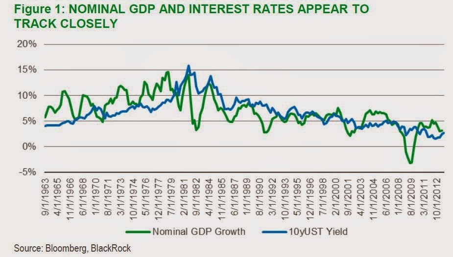
People have been calling for higher rates for years now, so I won't quote anyone's guess on where they think rates will go. Here's a chart I used in a post a while back about valuing the stock market using interest rates. Since noone can predict interest rates, as a proxy, I used the nominal GDP growth rate as a level where long term interest rates should eventually settle.
Here's the chart that only goes to 2012, but since it's a long data series, it doesn't matter too much:
Of course, the problem with this is that yes, nobody can predict interest rates but to use this model we need to predict GDP growth and inflation. Economist track records there aren't much better.
But we can at least see where rates would be without the "distortion" of central banks given reasonable assumptions.
For example, I have no problem with "normal" long term real GDP growth of 2.0%, and inflation in the 2.0%-3.0% range. That gives us a range for nominal GDP growth of 4-5%. So interest rates too, should be around there. I have no problem thinking of 4-5% as the level of long term interest rates in a normalized environment with no central bank manipulation of long term rates (well, there will always be some sort of activity going on, but I just mean the massive QE-type thing).
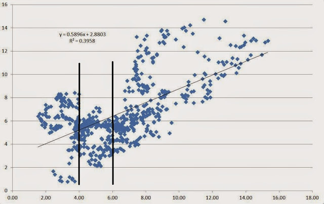
Let's go back to the above X-Y plot charts. I am going to go back to the chart from 1955 to include more data. Data before 1955 may not be too meaningful, plus 59 years is enough data for this.
I drew vertical lines between 4% and 6%. My question is, what is the average earnings yield (and standard deviation) of the stock market when interest rates were in this range? Keep in mind that this interest range is far higher than where interest rates are now.
When interest rates were between 4% and 6% since 1955, the stock market traded at an average P/E of 20.4x. If you put standard deviation bands around the cluster, the range would be 16.6x - 26.6x for one standard deviation and 14x - 37.9x for two standard deviations.
If you expand the range to 4-7% or 4-8%, then the average P/E comes down to 14x, so in that case the market would look overvalued. But I think a lot of the vertical dot cluster in the 7-8% range is from the 1970's. Of course, we can't assume that won't happen again.
Just for fun, let's see these figures from 1980-2014. Some will argue that this is no good since the market has been overvalued for most of the past three decades. But again, let's just see for fun:
Interest rate range average P/E
4 - 6% 23.3x
4 - 7% 22.7x
4 - 8% 21.6x
If you do it by constant range (instead of expanding it) you get:
Interest rate range average P/E
4 - 6% 23.3x
6 - 8% 19.6x
Using data since 1980, even if rates went up to the range of 6-8%, the market would be fairly valued at 19.6x P/E.
I actually don't agree with this; I would still value the market at closer to the inverse of the bond yield; a 6-8% interest rate range would suggest P/E ratios of 13-17x.
Shorting an Overvalued Market?
So people keep saying the market is overvalued. If you are short the market because you think it's overvalued, then you would have to think hard about it. The above suggests that the market is not overvalued even with interest rates going up to 6% (well, I would view it as a little overvalued with rates at 6%). If you think the market is overvalued, then you have to think that bond yields have to go higher than 6%. But then if that is the case, it's probably a better trade to just short the bond market.
When you say the market is overvalued, you are basically saying that interest rates are too low. In that case, the bond market is even more overvalued than the stock market; the stock market has a big valuation cushion before rising rates start to hurt it whereas bond prices will get hit immediately. In fact, if you believe in mean regression, then you would have to actually buy stocks and short bonds against it.
Of course, there are other reasons to be short the market, but I am just isolating this one component, valuation.
If you look at long term charts of market valuation, it looks really high and scary, but the above shows that in this environment, things are pretty normal.
If you do assume that a 1970's event is coming soon (and this view is not so uncommon), then shorting stocks and bonds might be a great idea. But even then, you have to keep in mind that if you do short expecting a 1970's-type event, you are betting on an event that occurs very infrequently. How many interest rates spikes and inflationary events have we had in the past 100 years?
As Buffett likes to say, it's not smart to bet on low probability events. (It's just as dumb to assume that low probability events are zero probability events!)
Conclusion
I don't know why, but I suddenly just wanted to do this. I guess Buffett's comment made me think about market valuation again and made me wonder what "normal" interest rates are and where the market should trade in that case. Sometimes it's fun to plot some data to see what things look like.
I am more comfortable comparing bond yields and earnings yields directly as Buffett does in his discussion about market valuation (which I excerpted in length here: Buffett on Market Valuation) without going through all of this.
From this, though, we can conclude that even if long term interest rates pop up into the 4-6% range, the stock market is still in the fair value range; the market is trading now at just about exactly the average level the market has traded at when interest rates were between 4% and 6% since 1955.
Yes, moving that range up to 7% or 8% moves the average down to a 14x P/E, but most of that vertical cluster is from the 1970's (note the lack of that cluster since 1980). The same figures for data since 1980 shows much higher valuation levels (but maybe biased on the high side).
If we are constrained in growth as economies around the world mature, then normal interest rates may not go too far above the 4-6% range. If that's the case, the stock market looks fine.
Copyright © The Brooklyn Investor


