This most recent correction, dip or whatever you want to call it fit the pattern we saw during the two drops in 2013. When viewing the S&P 500 ($SPX) on a weekly chart we can see price dip down to the 20-week moving average followed by the next week advancing higher while holding the moving average as support as price eventually heads higher, continuing the predominate trend. This is what we saw take place over the last two weeks, with price holding the 20-week moving average as traders took the price of equities higher. A second highlight last week was the backwardation we were experiencing in volatility ($VIX) corrected itself with the $VIX dropping nearly 30% as traders realized the world did-in-fact not come crashing down.
Equity Trend
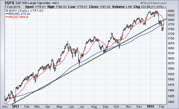
The ‘purist’ of the trend following community would view the current price action of the S&P 500 ($SPX) as in a down trend with it having lower lows and lower highs. However, I feel we are still in a trend ‘neutral’ point with Friday’s movement taking us to the first ‘lower high’ at 1800 – potentially putting in a higher high. We closed the week at an interesting point as the S&P tests the trend line (green dotted line) that had acted as support for the bulk of 2013. If this trend line becomes resistance and the 100-day moving average (blue line) is once again threatened then the equity bulls may be in some trouble.
Commodities
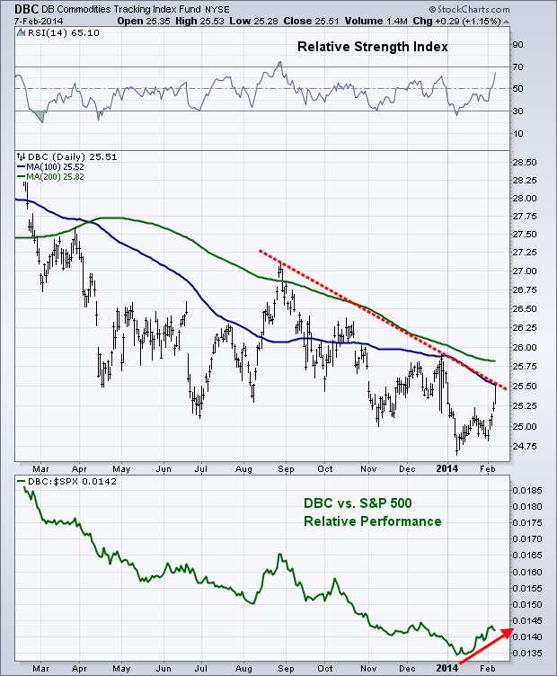
While not a big fan of making predictions, in Phil Pearlman’s Yahoo! Finance article in December I said “Typically we see the most hated areas of the market one year rotate back to strength the following year. I’ll be watching to see if this happens for the commodities market in 2014.” While the year is still young, this is exactly what appears to be happening as commodities are leading in relative performance against equities.
Looking at a current chart of the Commodities Tracking Index ETF ($DBC) we are at a potentially make-or-break point. Trading finished out last week butting up against the 100-day moving average, which stopped commodity bulls in their tracks in December. Price is also at the falling trend line off the August and December 2013 highs. If $DBC can break these two levels of resistance and power through the 200-day moving average then we would have ‘open air’ so to speak, with little resistance to stand in the way of price continuing its up trend until we get to the August ’13 high.
Equity Breadth
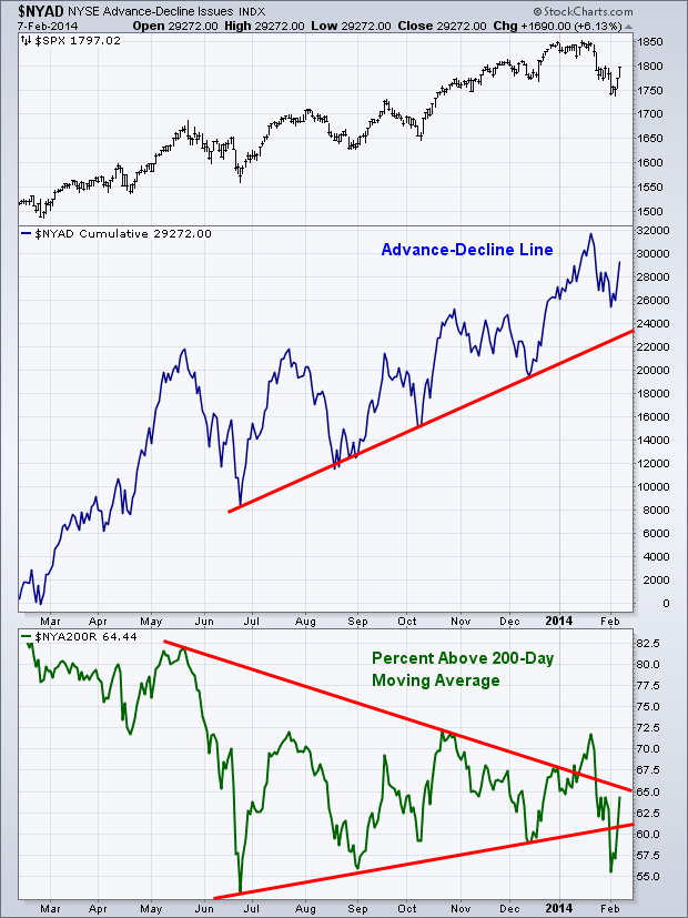
In last week’s Technical Market Outlook I said that while equity prices were back at December levels, we were not seeing the same action in the Advance-Decline Line; with this measure of breadth holding up rather well among the selling pressure. The Percentage of Stocks Above Their 200-day Moving Average indicator also was able to break back above its trend line support as more stocks began to move higher.
Equity Momentum
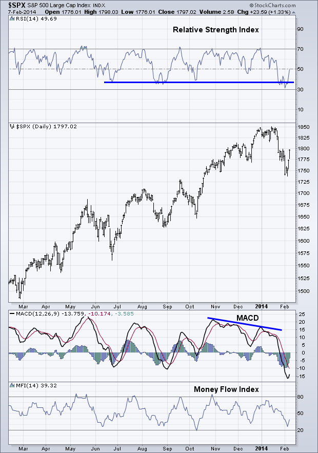
My favorite measure of momentum, the Relative Strength Index (RSI), was able to hold support last week as it finished out trading testing the 50 level. Neither of the two oscillator momentum indicators (RSI and Money Flow Index) reached ‘oversold’ conditions during selling pressure, which is a bullish sign that bulls are likely still in control. We’ll see if this continues in trading this week.
Emerging Markets
Last week I wrote a post “Early Signs of Bullishness for Emerging Markets” and showed a chart of the relative performance of $EEM against $SPY. Emerging market equities have begun to gain ground against their domestic counterparts which comes at an interesting time….
The chart below is from Morgan Stanley (courtesy of Business Insider) and shows the in and out flows from emerging market funds. Apparently two weeks ago was the last bit of weakness emerging market traders could take, as they sent weekly flows lower by the 5th largest move in history. This is exactly what contrarian traders want to see as it shows a potential sign of blood in the streets.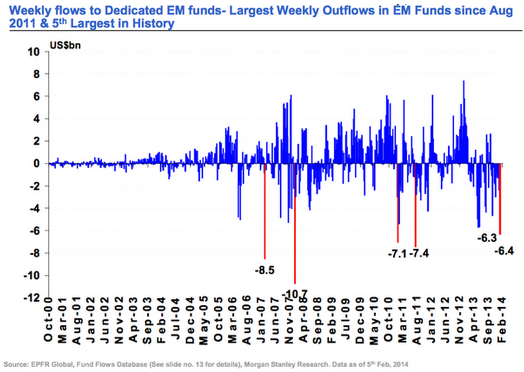 60-Minute S&P 500
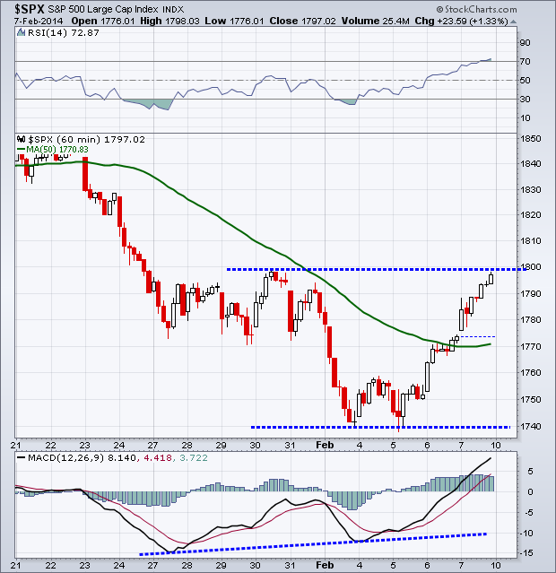
The short-term view of the S&P 500 ($SPX) gave us an interesting viewpoint last week. First lets look at the price action. We saw selling into the 1740 level, followed by a small bounce before selling headed back to 1740 where price gave a false break of the previous low, with the next candle testing 1740 as buyers began stepping back. This was our first sign that price may begin to head higher. The S&P finished the week testing resistance 1800. Looking at momentum, specifically the MACD indicator (bottom panel), we can see a positive divergence was forming as it put in a higher low while price made a lower low. Finally we have the Relative Strength Index which got pushed above 70 into ‘overbought’ territory – a bullish sign going into trading this week.
 Last Week’s Sector Performance
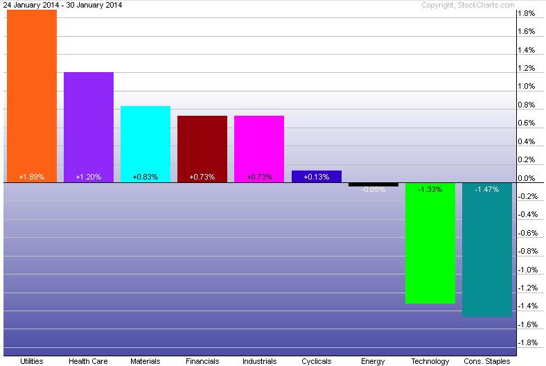
Once again, the utilities sector ($XLU) was the best relative performer last week, followed by health care ($XLV) and materials ($XLB). Consumer staples ($XLP) and technology ($XLK) held up the rear.
 Year-to-Date Sector Performance
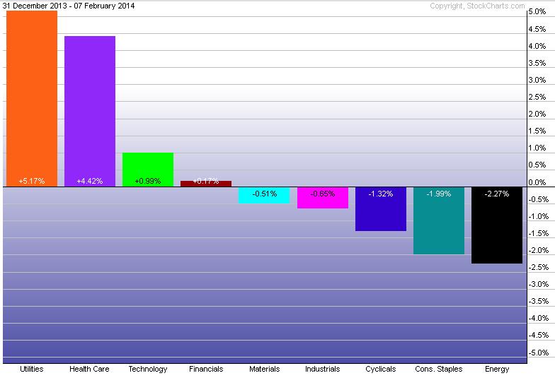
Not much change has occurred in the YTD sector performance with utilities ($XLU) continuing to lead the pack with health care ($XLV) and technology ($XLK) coming in second and third.
This week is a light week for economic reports. The highlight will likely be Janet Yellen’s first testimony as Fed Chair before Congress.
Monday: None
Tuesday: Janet Yellen testifies before Congress
Wednesday: None
Thursday: Retail Sales and Jobless Claims
Friday: Industrial Production
Disclaimer: Do not construe anything written in this post or this blog in its entirety as a recommendation, research, or an offer to buy or sell any securities. Everything in this post is meant for educational and entertainment purposes only. I or my affiliates may hold positions in securities mentioned in the blog. Please see my Disclosure page for full disclaimer. Connect with Andrew on Google+, Twitter, and StockTwits.
Copyright © Andrew Thrasher


