by Liz Ann Sonders, Senior Vice President, Chief Investment Strategist, Charles Schwab & Co
Key Points
-
- Recessions are not back-to-back negative GDP quarters; they’re instead defined using four key coincident economic indicators.
- Bear markets often overlap with recessions (and typically lead them), but not always.
- It’s important to distinguish between leading and lagging economic indicators and to focus at least as much on trend as level.
Recession chatter is abundant lately. It’s increasingly the focus of Q&A sessions at investor events at which I’ve been speaking. I also received a series of questions last week about recessions from a Schwab colleague who has many younger Schwabbies on his team, most of whom have not lived as working adults through a recession. In putting together answers to his questions in one of our internal sites, I decided it was a topic to which I should devote these pages.
Perhaps heightened recession concerns are to be expected given the duration of the current cycle—which will become the longest post-WWII expansion if a recession doesn’t begin by July of this year. Or perhaps it’s because of the recent deterioration in economic data across a fairly wide spectrum of indicators. I’ve been touching on the topic quite a bit in my writings as well as on Twitter, but it’s time for a more evergreen look at recessions.
Inevitability
The bottom line is the U.S. economy will move into a recession at some point. It’s inevitable. They always occur at the end of a cycle and set the stage for the subsequent cycle. Recessions haven’t been outlawed, nor can (or should) they be prevented at all costs by the Federal Reserve or other policy-makers. What we don’t know is the length of runway between now and the next recession. I’ve been positing that at this stage, an earnings recession seems more likely in the near-term (i.e., starting sometime in this year’s first half) than an economic recession. But it’s never too early to refresh our memories as to what to look for to gauge the risk and timing of recessions.
What a recession is and isn’t
First, let’s get the definition straight. I’m always surprised when I hear or read the perceived definition of a recession being two consecutive quarters of negative gross domestic product (GDP). That is not, nor has ever been, the definition of a recession. The official arbiter of recessions is the National Bureau of Economic Research (NBER) and they define a recession as “a significant decline in economic activity spread across the economy, lasting more than a few months, normally visible in real GDP, real income, employment, industrial production, and wholesale-retail sales.” Not coincidentally (pun intended), those latter four economic readings make up The Conference Board’s Index of Coincident Indicators, which get released monthly alongside the Leading Economic Index (LEI), which I’ll get to later in this report.
For “proof” of the difference between the perceived definition and the actual definition, note the following:
- The 2001 recession did not have back-to-back negative GDP quarters.
- The 1960-1961 recession did not have back-to-back negative GDP quarters.
- There were back-to-back negative GDP quarters in 1947, yet there was no recession.
Below is the full post-Great Depression roster of official recessions.
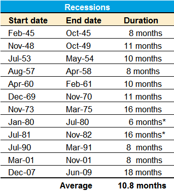
Source: Charles Schwab, National Bureau of Economic Research (NBER). *Back-to-back “double dip” recessions.
As you can see, the average span of recessions during this time period was 10.8 months, with a range from six months to 18 months. Keep in mind, that the NBER is generally late in declaring the start and end dates of recessions—they do not do any recession forecasting, but instead wait until the trends are clear with regard to the parameters they use for declaration and dating purposes.
Stock market relative to recessions
What should we expect from the stock market during a recession? Should we assume 20% or more market losses given the tendency for stocks to enter into a bear market in anticipation of recessions?
The table below shows every S&P 500 bear market (using the traditional -20% definition) in the post-Great Depression era, but also what I’ll call “near bear markets” (down at least 19% but less than 20%).
As you can see in the table below, there is typically an overlap between the two, with bear markets generally starting in advance of recessions (red entries are bear/near bear markets which overlapped with recessions). That said, there are bear/near bear markets that have not accompanied recessions (like 1987); and there are recessions that have only had near bear markets (like 1991). There are a surprisingly large number of near bear markets.
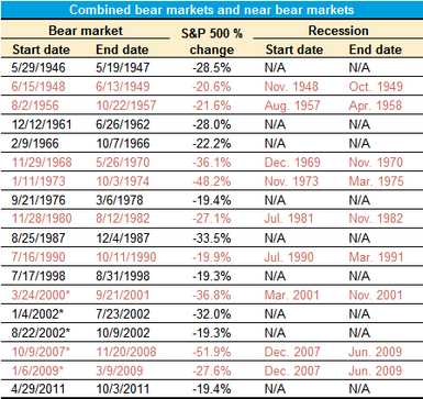
Source: Charles Schwab, Bloomberg, National Bureau of Economic Research. Bear market defined as 20% or greater drop in S&P 500. Near bear market defined declines of more than 19% but less than 20%. *3/24/2000–10/9/2002 is generally considered one long bear market (-49.1%), but there were two 20% rallies within that span. **10/9/2007 – 3/9/2009 is generally considered one long bear market (-56.8%), but there was one 20% rally within that span.
Bear markets that overlapped with recessions were generally more severe than those occurring outside recessions. The average bear/near bear market without a recession was -24.6%, while the average bear/near bear market with a recession was -32.2%.
My old adage
This next section will highlight several popular economic indicators—and the importance of understanding the difference between lagging and leading economic indicators. It will also help to illustrate my well-worn, and oft-cited adage that “when it comes to the relationship between economic data and the stock market, better or worse tends to matter more than good or bad.” In other words, we often think of what’s happening in the economy in “good or bad” or “strong or weak” terms; when we should be thinking in “better or worse” terms.
Unemployment rate “too low” to suggest increasing recession risk?
When discussing recessions with investors, and listening to many pundits in the media, I often hear today’s low unemployment rate (UR) cited as a reason not to fret a recession any time in the near future. But here’s the rub—the unemployment rate is one of the most lagging of all economic indicators. In fact, as you will see in the chart below, the unemployment rate has always been low at the outset of recessions. It’s most significant period of deterioration has historically been during recessions; not in the lead-up to recessions. Put another way, a rising unemployment rate doesn’t cause recessions; recessions cause the unemployment rate to rise.
Unemployment Rate Around Recessions
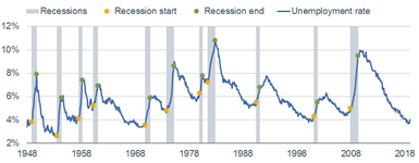

Source: Charles Schwab, Department of Labor, FactSet, Ned Davis Research, Inc. (Further distribution prohibited without prior permission. Copyright 2019(c) Ned Davis Research, Inc. All rights reserved.), as of January 31, 2019.
In the post-WWII era, the average uptick in the UR from its trough to the month the recession began has been 0.4%, with a range of 0.0% to 0.7%. In other words, there were times when the UR hadn’t moved up at all, yet a recession was ultimately declared as having started.
It’s also instructive to see the data in the table above, which highlights what happens when you compare a highly lagging indicator (the UR) to a highly leading indicator (the stock market). The worst returns for the stock market historically came when the UR was in its lowest zone (think last year); while the best returns have come when the UR was in its highest zone (think the start of the bull market in March 2009). This is because the stock market generally anticipates the coming increase in the UR once it’s sniffed out a recession; and also anticipates the coming decrease in the UR once it’s sniffed out a recovery.
Unemployment claims troughs lead recessions
Although less “popular” as an indicator, the most leading of the various employment indicators is initial unemployment claims. In fact, they’re one of the 10 subcomponents of the LEI, which I’ll get to shortly. The fact that claims recently broke out to the upside suggests we need to be on guard for the signal they’re giving about the length of time between now and the next recession. If they continue to tick higher, the risk of a recession starting sooner rather than later will move up.
Unemployment Claims Around Recessions
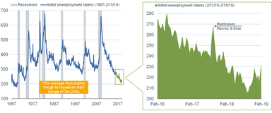
Source: Charles Schwab, Department of Labor, FactSet, as of February 15, 2019.
Consumer confidence peaks lead recessions
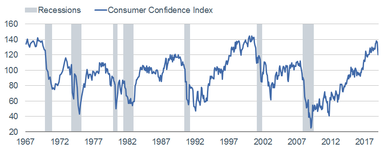
In addition to hearing the unemployment rate cited as a reason not to fret a recession, I often hear the same about consumer confidence. As you can see in the chart below of The Conference Board’s measure of consumer confidence, it remains high in level terms, but is clearly off the peak. Consumer confidence, as a leading indicator, has typically peaked out not too far in advance of recessions’ starts.
Consumer Confidence Around Recessions
Source: Charles Schwab, FactSet, The Conference Board, as of January 31, 2019.
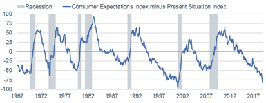
Another consumer confidence-related indicator for recession risk is the spread between the “present situation” component of the consumer confidence survey and the “future expectations” component. As you can see in the chart below, extreme troughs in this spread have been consistent indicators of coming recessions. (Of course, we don’t yet know whether we’re at or near the trough for this cycle, but the currently-extreme spread bears watching.)
Consumer Confidence Spread Around Recessions
Source: Charles Schwab, FactSet, The Conference Board, as of January 31, 2019.
LEI peak?
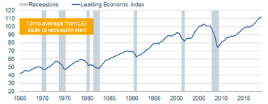
I’ve touched on a couple of the more leading indicators, but let’s look more broadly at the full set. I focus on the Leading Economic Index (LEI), put out by The Conference Board. As you can see in the full-history chart below—in their presently-constituted form (they’ve been “back-fitted” to account for changes to the indicators that are most highly-correlated to the business cycle)—the span between LEI peaks and recession starts has been 13 months, with a range of eight to 21 months. For what it’s worth, the span between LEI troughs and recession ends has been only two months, with a range of zero-to-five months; so there is generally more signal lead time heading into recessions than heading out of them.
Leading Indicators Around Recessions
Source: Charles Schwab, FactSet, The Conference Board, as of January 31, 2019.
In its presently-constituted form, the LEI never failed to give a heads up that a recession was coming. For what it’s worth, the LEI peaked last September and declined in two of the subsequent four months. It’s perhaps too soon to judge whether last September’s peak was the peak for the cycle, especially given the temporary effects of the government shutdown, but we’ll see.
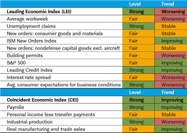
Looking under the LEI’s hood, you can also see where the deterioration has been concentrated. I also included a Coincident Economic Index (CEI) section given the aforementioned connection between those indicators and the NBER definition of recessions. It’s true that there is not yet any “red” flashing for these indicators in level terms; but there certainly is some flashing occurring if you look at the indicators’ trends.
Source: Charles Schwab, FactSet, The Conference Board, as of January 31, 2019.
Election year
One of the aforementioned questions I received from my colleague was about whether a recession is possible during an election year (yes, I know the election isn’t until next year). Historically, recessions have sometimes occurred during election years:
- In 1932, we were in the midst of the Great Depression (1929-1933).
- In 1948, a recession began in the same exact month as that year’s election.
- In 1960, a recession began early that year.
- In 1980, we were already in the “double-dip” recession(s) ending in 1982.
- In 2008, we were already in the midst of the worst recession since the Great Depression.
Fed models say what?
The Federal Reserve has not distinguished itself historically with forecasting recessions. But that doesn’t mean they haven’t created forecasting models for both recessions and GDP growth. Among myriad recession probability models out there, the one from the Federal Reserve Bank of New York is fairly popular. As you can see in the chart below, it’s showing a 24% chance of a recession, which doesn’t sound high. But as shown, with the exception of the late-1960s and mid-1990s, once the model reached that level it continued to rise and recessions were soon on the way.
Recession Probability Model
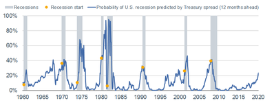
Source: Charles Schwab, Federal Reserve Bank of New York, as of January 31, 2019. Model uses difference between 10-year and 3-month Treasury rates to calculate probability of a recession 12 months ahead.
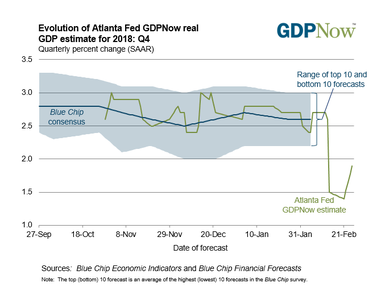
Both the Atlanta and New York Federal Reserve Banks also publish GDP forecasting models, which you can see below. Atlanta’s model, called GDPNow, doesn’t yet have a new forecast for this year’s first quarter, but their forecast for 2018’s fourth quarter dropped precipitously from 3% late-last year, but recently rebounding to 1.9% today. The NY Fed’s model, called Nowcast, does have a forecast for this year’s first quarter and it’s dropped from 2.6% late-last year to only 1.2% today (although their fourth quarter 2018 forecast is 2.3%, so higher than GDPNow’s).
GDPNow for 4Q2018
Nowcast for 1Q2019
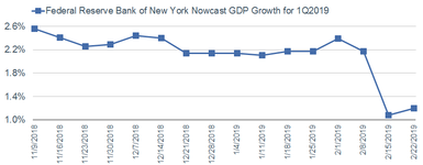
Source: Charles Schwab, Bloomberg, Federal Reserve Bank of New York, as of February 22, 2019.
The mother of all recession indicators
We saved the best for last and will conclude with a look at what has arguably been the best recession forecasting indicator historically—the yield spread. There are myriad spreads across the Treasury duration spectrum, but the one historically most useful for forecasting recessions is the spread between the 10-year and three-month Treasury yields. As you can see in the chart below, inverted yield curves (when long-term rates fall below short-term rates) has generally been followed shortly thereafter by recessions.
Yield Curve Around Recessions
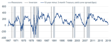
Source: Charles Schwab, FactSet, as of February 22, 2019.
More recently, in FEDS Working Paper No. 2018-055, Fed Governor Eric Engstrom and Fed Research & Statistics Economist Steven A. Sharpe argued that the spread of short-term Treasury rates—the difference between the six-quarters-ahead forward rate and the three-month yield—might be preferable as a predictor because it focuses on expectations of the near-term path of monetary policy. For what it’s worth, that spread did invert briefly at the beginning of January this year.
Concluding with hope
Having little interest in being a Debbie Downer, I’ll conclude with the reasons why the length of runway between now and the next recession could remain fairly long. Both household and business balance sheets remain relatively healthy. The Fed has taken a dovish turn. Some version of a trade deal may be in the works. And although still up from last year’s low, unemployment claims have recently ticked lower again. But it’s never too early to spend time assessing the risks associated with recessions. Perhaps last year’s near bear market was an indication of a recession starting as soon as this year, or perhaps it was a head fake. I believe an earnings recession is a possibility this year, even if we can avoid an economic recession starting this year. But given myriad late-cycle conditions, we continue to urge investors to be prepared for the end of this cycle.
Copyright © Charles Schwab & Co


