by Lance Roberts, RIA
While there is much debate over whether another bear market is imminent, weekly moving average crossovers suggest a different outcome for now. There are many current concerns, from geopolitical risk to still inverted yield curves, slowing economic growth, high interest rates, and inflation. Yet, despite those concerns, markets are flirting with all-time highs.
While 5% money market yields are certainly enticing, investors often need to step back from the “doomsday” dripping headlines. Given that one of our behavioral investing traits is “loss avoidance,” it is easy to talk ourselves into an overly cautionary position. The mistake is that while alleviating our short-term emotional concerns, it can lead to a significant wealth impairment in the long term.
Therefore, it is often worth digging ourselves out of the media headlines and focusing on what the market tells us. After all, the stock market has a long track record of leading the economy by 6-9 months. To explain this, start with the chart of the S&P 500 index below and notice those interesting blue dots.

What Did The Market Know?
Yes, those market dots represent stock market peaks. However, why did the stock market top at those particular points?
Let’s take a look at the data below of real (inflation-adjusted) economic growth rates:
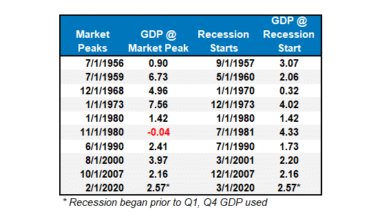
Each of the dates above shows the economy’s growth rate immediately before the onset of a recession. The table above notes that in 7 of the last 10 recessions, real GDP growth was 2% or above. In other words, according to the media, there was NO indication of a recession.
But the next month, one began.
With that understanding,let’ss return to those”“interesting blue dot”” in the S&P 500 chart above. Each dot represents the market peak before the onset of a recession. The S&P 500 peaked and turned lower in nine of ten instances before a recession was recognized, anywhere from 6 to 16 months later.

The crucial point is that the stock market was signaling a coming recession in the months ahead, but the economic data didn’t reflect it. (The only exception was 1980 when they coincided in the same month.) The table below shows the date of the market peak and real GDP versus the start of the recession and GDP growth at that time.

The problem for investors is waiting for the data to catch up.
Moving Average Signals
Understanding that the market tends to lead the economy by six months or more, we can use longer-term market signals to help us navigate the risk of a recessionary downturn.
We have produced a weekly”“risk range repor”” in the Bull Bear Report for several years. That report contains several measures of analysis, as shown below.
- The table compares the relative performance of each sector and market to the S&P 500 index.
- “MA XVE”” (Moving Average Crossover) is determined by the short-term weekly moving average crossing positively or negatively with the long-term weekly moving average.
- The risk range is a function of the month-end closing price and the”“bet”” of the sector or market. (Ranges reset on the 1st of each month)
- The table shows the price deviation above and below the weekly moving averages.
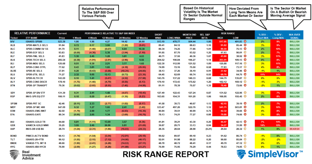
For this analysis, we will focus on the far right column. Every major market and sector (except for the U.S. dollar) is currently on a bullish moving average crossover. Given this is weekly data, it is slower to move, which tends to provide better signals for both increasing and reducing portfolio risk.
A Simple Chart
However, are these signals useful in safeguarding against the onset of a recession or just a more protracted market downturn like the one we saw in 2022? The chart below uses a simple weekly moving average crossover analysis to determine where investors should consider increasing or reducing risk to equity exposure.
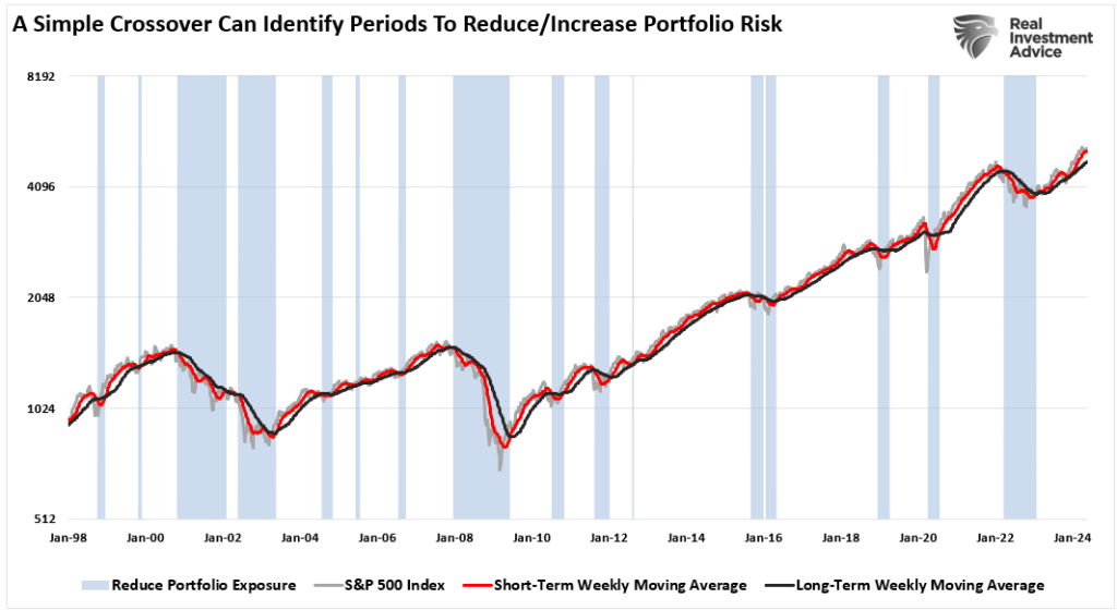
In 2000 and 2008, the moving average crossover signal warned investors that a recessionary onset was coming 9 and 12 months ahead of actual recognition. The weekly moving average signals also triggered a sell signal in early 2022 ahead of the ~20 decline, although the NBER has not recognized a recession yet.
Notably, these signals are not always perfect. The drawdown was so swift in 2020 during the pandemic shutdown that the signals to reduce and increase exposure coincided with the market. However, paying attention to these moving average signals over the longer term can provide investors with a valuable roadmap to follow.
Bullish Buy Signals Tend To Be Correct
Returning to the”“risk range repor”” above, a review of late 2021 warned our readers that market deterioration was increasing. The report below is from the October 6th, 2022, Bull Bear Report:
“The selling pressure continued this week, taking almost every sector and market into double-digit deviations below long-term weekly moving averages. Such extremes are not sustainable, and when all markets and sectors are this oversold, a reflexive rally becomes highly probable.”
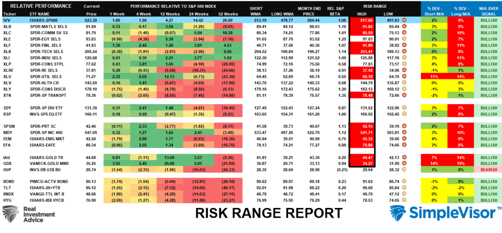
The table below shows that almost every sector and market had bearish moving average sell signals triggered. At the time, however, media headlines were filled with “death of the dollar,” recession warnings, and bear market alerts. However, such negative extremes are often coincident with market bottoms.

Furthermore, investor sentiment and allocations were likewise extremely negative.

Of course, as we now know in hindsight, October 2022 marked the bottom of the market, and the recession predictions have faded into the midst.
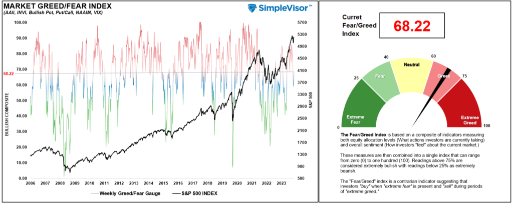
The market has recovered since then, and those bearish moving average sell signals have reversed to bullish buy signals. As discussed in this past weekend’s Bull Bear Report, while the market is overbought, and consolidation or correction is likely, with every major equity and bond market on bullish buy signals, the market is not predicting the onset of a recession.
Furthermore, investor sentiment and allocations are also bullish, which supports higher prices.
Corrections Tend To Opportunities
Does this mean that markets will be devoid of any short-term corrections? Of course not. We just experienced a 5.5% correction in April. Furthermore, corrections during market advances happen every year and tend to be opportunities to increase equity exposure as needed.
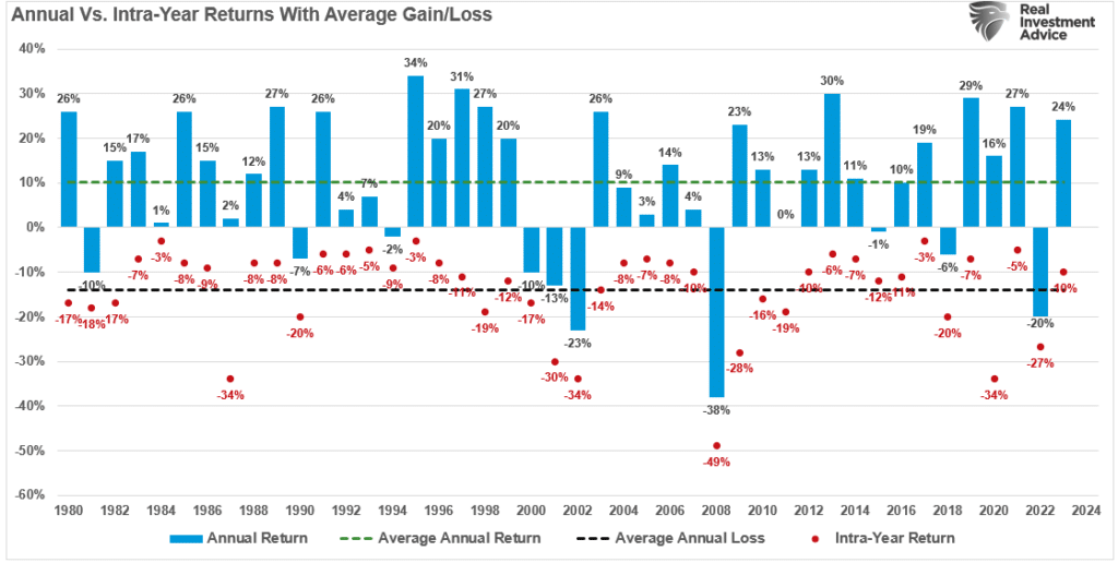
While some unexpected, exogenous events could send markets reeling, the market has a long history of anticipating recessionary onsets well before economists and the mainstream media recognize them.
With the plethora of “armchair commentators” pointing at every piece of data as an indicator of economic doom to get more clicks and views, we suggest sitting back and paying attention to the markets. Given that the market represents a vast group of individuals analyzing every possible data point, the signals the market provides tend to be a more reliable signal to follow.
When those bullish weekly moving average buy signals begin to reverse, with one following another, we will know it’s time to become increasingly more conscious of risk.
As of now, the market suggests that sitting in cash may be a mistake when it comes to reaching retirement goals.
Copyright © RIA


