by Lance Roberts, RIA
2021 has certainly started off interesting. From Reddit readers chasing the most heavily shorted stocks, to the new Administration discussing more stimulus, investors have had plenty to deal with. A market review seems appropriate as the bulls seem to remain bulletproof even as the mania grows.
Last Charge Of The Light Brigade
One thing this market has become known for is its resilience. Regardless of the event, “hope” combined with plenty of Central Bank interventions has kept markets pushing higher. But, all good things do come to an end, the only question is the timing and the event. Importantly, what history tells us is that it is the Federal Reserve that has always led the “last charge of the light brigade.”
For those unfamiliar with the story, the “Charge of the Light Brigade” was a charge of British light cavalry led by Lord Cardigan against Russian forces during the Battle of Balaclava in 1854, during the Crimean War. Lord Raglan, the overall commander of the British forces, had intended to send the Light Brigade to prevent the Russians from removing captured guns from overrun Turkish positions. Such was a task that was well-suited to light cavalry.
However, due to miscommunication in the chain of command, the Light Brigade was instead sent on a frontal assault against a different artillery battery, one well-prepared with excellent fields of defensive fire.
Although the Light Brigade reached the battery under withering direct fire and scattered some of the gunners, the badly mauled brigade was forced to retreat immediately. Thus, the assault ended with very high British casualties and no decisive gains. War correspondent William Russell, who witnessed the battle, declared:
“Our Light Brigade was annihilated by their own rashness, and by the brutality of a ferocious enemy.”
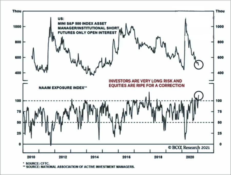
Such is the current market environment. Investors, much like the British Calvary, face rather daunting odds of long-term success. With a market that is overly bullish, overly complacent, and excessively valued, outcomes those that charged headlong into the battle have often suffered serious injuries. As the chart below shows, “bears” have gone into complete hibernation.
Who Is Left To Buy?
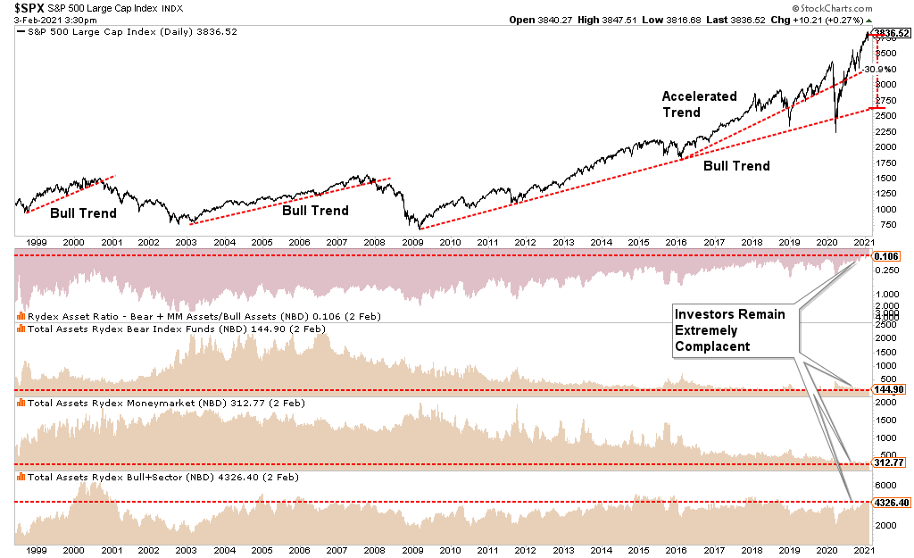
Of course, one of the overriding questions is who is left to buy. With equity investor equity allocations at the highest levels in years and cash levels at record lows, such would suggest there is a diminishing pool of buyers to support markets.
The chart below shows the ratio of Rydex bullish to bearish assets. While not an all-encompassing survey of investors, it does provide a decent sample size for our analysis. The more extreme exuberance of investors has pushed the market well above the long-term bullish trend. It would currently require another 30% drop to close that gap, just as we saw last March.
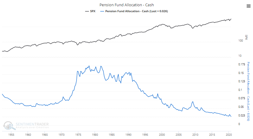
But it isn’t just retail investors that are effectively “all-in” the market. Pension funds, which have substantially larger holdings than retail investors, are sitting on their lowest cash levels….ever. (Charts courtesy of SentimenTrader.com)
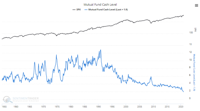
Mutual funds, likewise, are also at record low levels of cash.
The point is that with investors “all-in” and leveraged, when a correction occurs, such has the potential to be exacerbated by the rapid unwinding of positions.
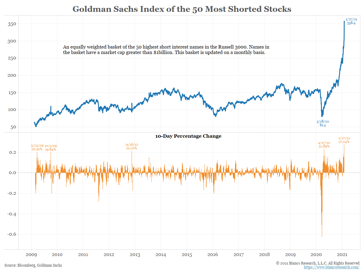
Of course, with investors chasing the most heavily “shorted” stocks, which are stocks with the worst possible fundamentals, it is clear the bulls feel “invincible” to any type of correction.
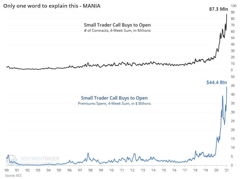
The invincibility is evident in the amount of speculative call option buying by retail investors which dwarfs anything seen in previous market history.
In the short-term, which equates from a few days to a few weeks, markets are sentiment-driven. None of this means the markets will “crash” tomorrow. As John Maynard Keynes was said:
“The markets can remain irrational longer than you can remain solvent.”
However, just as important is what Bob Farrell once quipped:
“Investors buy the most at the top and the least at the bottom.”
Market Review – Daily Chart
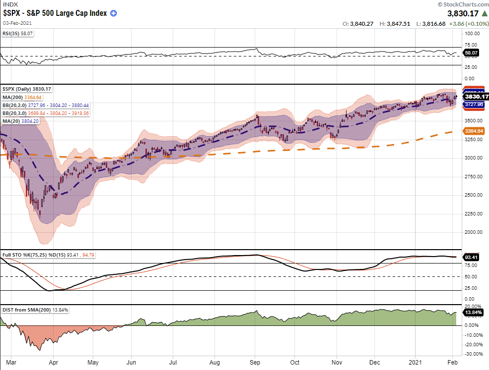
As shown, the S&P index is currently overbought and trading significantly above its 200-dma. The short-term correction at the end of January did little to alleviate these conditions. However, with the Bollinger Bands narrowing, the market could trade higher over the next month.
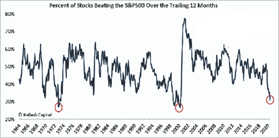
A worrisome sign is the percentage of stocks outperforming the S&P 500 index over the last 12-months. The breadth of that outperformance has gotten extremely narrow. It is worth noting the previous dates of the lows in this indicator.
As Bob Farrell once noted:
“Markets are strongest when broad and weakest when narrow.”
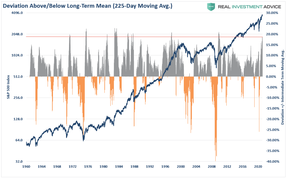
Also concerning is the more extreme deviation from the 225-day moving average, somewhere between February and March, we could see a larger correction take hold. In any given year corrections of 5-10% are completely within norms. Historically, such extreme deviations have tended to align with bigger corrections.
Market Review – Weekly Chart
For investors, the outlook becomes much more troubling as we look further out.
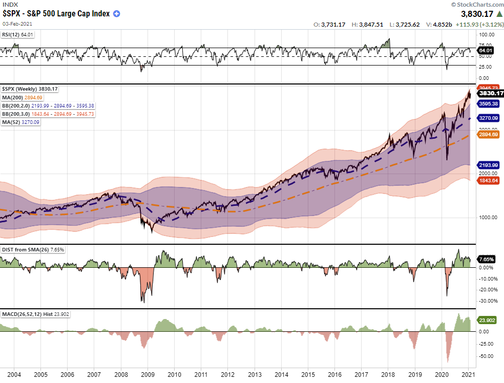
The market is trading well into 3-standard deviation territory above its long-term mean. Furthermore, while the market is incredibly overbought on a weekly basis, there is a negative divergence in relative strength (RSI).
Since weekly charts are slower moving, such does not mean the markets will crash immediately. Long-term charts indicate that price volatility will likely be higher in the months ahead, and investors should monitor their risk accordingly. While momentum-driven markets can remain irrational much longer than logic would predict, eventually, a reversion has always occurred.
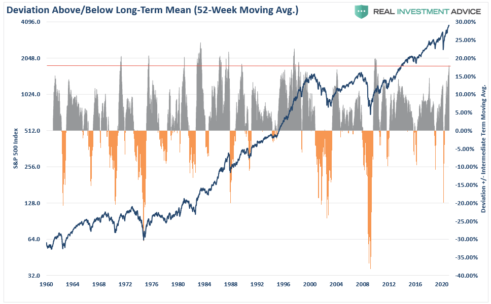
The chart below shows the price deviation from the one-year weekly moving average. Given the deviation is well above 15%, price corrections have historically always been nearby. (Such does not mean a market crash. A correction of 10-20% is well within norms.)
Long-Term View Is Bearish
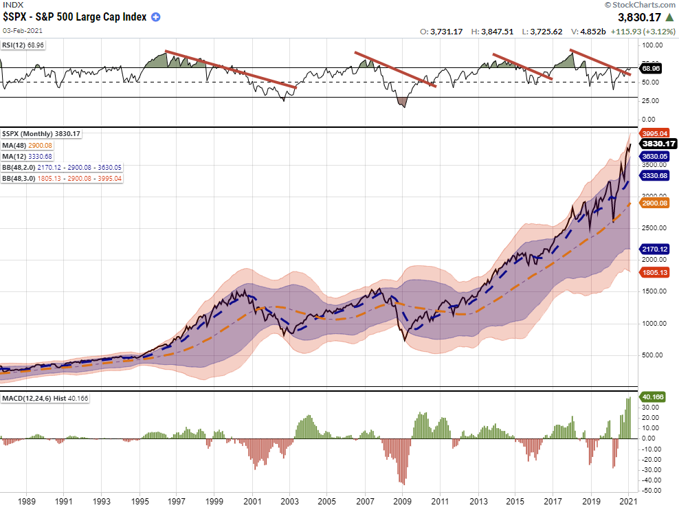
The monthly chart of the S&P 500 is likewise just as problematic. Again, long-term charts predict long-term outcomes and are NOT SUITABLE for trading portfolios short-term.
As shown, the deviation from long-term monthly means and negative divergences in relative strength has previously been warning signs for more significant corrections.
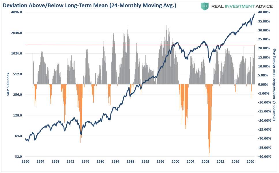
We see the same problematic setup when viewing the market’s current deviation from its 2-year monthly moving average. The current deviation has only occurred 5-times since 1960 and has always led to a correction over the next several months. (Some worse than others.)
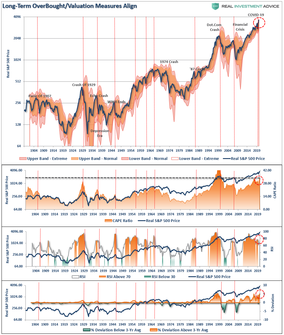
However, since 1900, using QUARTERLY analysis, the picture is bearish for returns over the next decade. The research below aligns valuation, relative strength, and deviations into one chart.
There is little to suggest investors who are currently extremely “long equity risk” in portfolios now won’t eventually suffer a more severe “mean-reverting event.”
While valuations and long-term deviations suggest problems for the markets ahead, such can remain the case for quite some time. It is this long lead time that always leads investors to believe “this time is different.”
Because of the time required for long-term data to revert, monthly and quarterly data is more useful as a guide to managing expectations, allocations, and long-term exposures. In other words, this data is not as valuable as a short-term market-timing tool.
What Could Cause A Correction In 2021?
Lots of things.
The market is currently priced for perfection betting on explosive economic growth, a falling dollar, interest rates remaining low, consumer spending surging sharply, and inflation remaining muted. The reality is that none of those things will likely turn out to be the case.
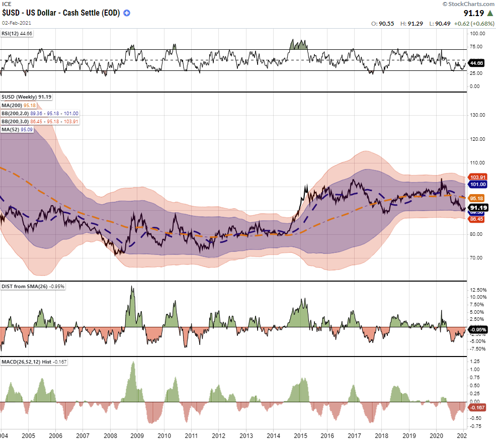
The one thing that always trips of the market is the one thing that no one is paying attention to. For me, that risk lies with the US Dollar. As noted previously, everyone expects the dollar to continue to decline, and the falling dollar has been the tailwind for the emerging market, commodity, and equity “risk-on” trade. Whatever causes the dollar to reverse will likely bring the equity market down with it.
That is the risk we are paying attention to right now.
What This Means And Doesn’t Mean
Let me repeat the following just so there is no confusion.
“What this analysis DOES NOT mean is that you should ‘sell everything’ and ‘hide in cash.’”
As always, long-term portfolio management is about managing “risk” by “tweaking” things over time.
If you have a “so so” hand at a poker table, you bet less or fold.
It doesn’t mean you get up and leave the table altogether.
What this analysis does suppest is that we should use rallies to rebalance portfolios.
- Trim Winning Positions back to their original portfolio weightings. (ie. Take profits)
- Sell Those Positions That Aren’t Working. If they don’t rally with the market during a bounce, they will decline more when the market sells off again.
- Move Trailing Stop Losses Up to new levels.
- Review Your Portfolio Allocation Relative To Your Risk Tolerance. If you have an aggressive allocation to equities at this point of the market cycle, you may want to try and recall how you felt during 2008. Raise cash levels and increase fixed income accordingly to reduce relative market exposure.
Could I be wrong? Absolutely.
But what if the indicators are warning us of something more significant?
What’s worse:
- Missing out temporarily on the initial stages of a longer-term advance, or;
- Spending time getting back to even, which is not the same as making money.
As I noted recently in our blog on trading rules:
“Opportunities are made up far easier than lost capital.” – Todd Harrison
Copyright © RIA


