by Jeffrey Kleintop, Senior Vice President and Chief Global Investment Strategist, Charles Schwab & Co., Inc.
Key Points
- Yield curve inversions may signal opportunity, not just risk, for stock market investors.
- Historically, reversals in the long-term relative performance of growth and value stocks, large and small cap stocks, and U.S. and international stocks have been marked by yield curve inversions.
- Investors often focus on what had been leading and eliminate what had been lagging in their portfolios—resisting that emotional response may benefit investors when trends begin to reverse.
The yield curve is said to invert when the yield on the 3-month Treasury exceeds the yield on the 10-year Treasury. Many investors focus on this historically negative signal for the overall stock market, as inversions typically precede economic recessions. But, the opportunities signaled by a yield curve inversion deserve just as much attention. Inversions often mark a reversal in long-term market performance trends as leaders and laggards change places. Examining the relative performance of growth and value stocks, large and small cap stocks, and U.S. and international stocks we can see that reversals in long-term trends were often marked by inversions in the U.S. yield curve.
Growth and value
The chart below depicts long-term relative performance trends of growth and value stocks. When the blue line is rising, growth is outperforming value and when the orange line is rising, value is outperforming growth. The shaded areas are periods of when the U.S. yield curve was inverted.
Changes in growth and value performance trends around yield curve inversions
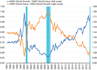
Shaded areas mark periods when the U.S. yield curve was inverted (3 month to 10 year)
Source: Charles Schwab, Factset data as of 3/30/2019.
Notice that the periods when the yield curve was inverted fell very close to the reversals in the longer-term trend of relative performance between growth and value stocks.
- In July 2000, the yield curve began to invert about four months after the March 2000 peak in the long-term trend of growth outperformance as value began to outperform.
- At about the mid-point of the yield curve inversion that began in August 2006, the reversal began in the long-term trend of relative performance as growth stocks started to outperform value stocks beginning in January 2007.
Large and small
The reversal in long-term relative performance around yield curve inversions can be seen in large and small cap stocks composing the MSCI EAFE Index. When the blue line is rising, large capitalization stocks are outperforming small capitalization stocks and when the orange line is rising, small caps are outperforming. Here again, the shaded areas are periods when the U.S. yield curve was inverted.
Changes in large and small cap performance trends around yield curve inversions
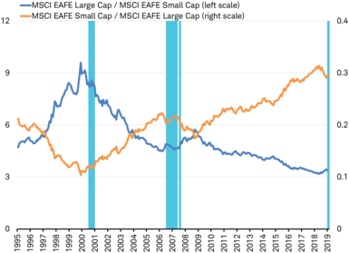
Shaded areas mark periods when the U.S. yield curve was inverted (3 month to 10 year)
Source: Charles Schwab, Factset data as of 3/30/2019.
The periods of inversion in the yield curve fell very close to the reversals in the longer-term trend of relative performance between large and small cap international developed stocks.
- In July 2000, the yield curve began to invert about six months after the long-term trend in relative outperformance by large cap stocks ended in December 1999 as small cap stocks began to outperform over the following six years.
- In August 2006, the yield curve inverted about four months after the reversal in the long-term trend of relative performance as large cap stocks began to outperform small cap stocks. That outperformance trend continued until August 2008 when small caps resumed their trend of outperformance (perhaps signaled by the re-inversion of the yield curve in August 2007 after temporarily becoming upward sloping).
U.S. and international
For the reversal of long-term relative performance around yield curve inversions for U.S. and international stocks, we look at the MSCI USA and MSCI EAFE Indexes. When the blue line is rising, international stocks are outperforming U.S. stocks. When the orange line is rising, U.S. stocks are outperforming international stocks. Again, the shaded areas are periods when the U.S. yield curve was inverted.
Changes in U.S. and international performance trends around yield curve inversions
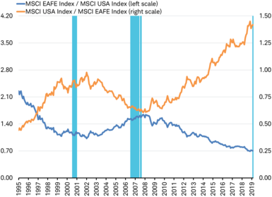
Shaded areas mark periods when the U.S. yield curve was inverted (3 month to 10 year)
Source: Charles Schwab, Factset data as of 3/30/2019.
The periods of inversion fell near the reversals in the longer-term trend of relative performance between U.S. and international stocks.
- In July 2000, the yield curve began to invert as the momentum was shifting away from U.S. stocks toward international stocks, although the definitive change in trend didn’t happen until January 2002.
- In October 2007, the yield curve inversion that began in August 2006 came to an end and appeared to mark the reversal of the long-term trend of relative performance with U.S. stocks starting to outperform international stocks.
In each of the above three charts the shading shows that the yield curve again inverted during the past month. Past performance is certainly no guarantee of future results but it is possible the long-term trends in relative performance are again nearing a reversal, potentially signaling shifts to outperformance by value, large cap, and international stocks.
A longer term view
Focusing on the past 25 years of inversions and reversals reveals a period of dramatic shifts in relative performance around the periods of imbalance in the global economy marked by inversions of the U.S. yield curve. But, the time period only accounts for two inversions of the U.S. yield curve (prior to the current period). A look back even further, at the past 50 years, reveals a similar pattern for the prior seven yield curve inversions. However, some of the inversions signaled only intermediate-term reversals that lasted just few years before resuming the prior longer-term trend in relative performance. We can examine this using the MSCI EAFE and USA Indexes which both go back almost 50 years (to the index inception in December 1969).
50 years of changes in U.S. and international stock performance and yield curve inversions
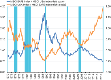
Shaded areas mark periods when the U.S. yield curve was inverted (3 month to 10 year)
Source: Charles Schwab, Factset data as of 3/30/2019.
Examining international and U.S. stock performance in the 50 year chart above, the inversion in 1989 signaled a large reversal in relative performance just as it began, similar to the previously discussed inversions in 2006 and 2000. The 1970 inversion also preceded the reversal that took place at the start of 1971. But, the start of the inversion in 1973 signaled only an intermediate-term reversal in international outperformance that lasted about three years (from mid-1973 to November 1976). Similarly, the two back-to-back inversions of the late 1970s and early 1980s again marked an intermediate-term reversal in international outperformance lasting four years (October 1978 to October 1982).
In general, the long history of yield curve inversions suggests that they consistently signaled reversals in long-term performance trends—but sometimes those new trends were established for only a few years.
Fight the emotion
The track record of the inversion of the yield curve as a signal of a potential bear market and recession on the horizon has some investors focused on preparing for a more difficult market environment. When markets get difficult, investors often instinctively seek to concentrate their portfolio on what had been leading and eliminate what had been lagging. But, that instinct might limit investors from seeing opportunity as the yield curve inverts and signals the potential for a reversal in the leaders and laggards.
Resisting the emotional response to difficult markets by maintaining exposure to the laggards through portfolio rebalancing may offer the opportunity to benefit from the potential for a reversal in relative performance trends in addition to greater diversification.
Copyright © Charles Schwab & Co., Inc.


