by Liz Ann Sonders, Senior Vice President, Chief Investment Strategist, Charles Schwab & Co
Key Points
- The most commonly-watched yield curve inverted last Friday, unleashing a near-2% decline for U.S. stocks; while the Fed’s preferred recession predictor yield curve has been inverted for much of the first quarter so far.
- History paints a mixed picture of yield curve inversions in terms of both duration to recessions and stock market returns.
- Stocks have historically lost money on an annualized basis when the yield curve’s been inverted.
Investors developed a case of the blues on Friday when the yield curve went into the red; but the history around yield curve inversions shows a wide swath of grey area. For the first time since mid-2007, the 10-year to three-month (10y-3m) portion of the U.S. Treasury yield curve inverted last Friday; which unleashed a near-2% decline in the S&P 500 on heightened fears of recession. That’s the longest stretch of time since at least the early-1960s without an inversion.
Every recession since the mid-1960s has been preceded by an inverted yield curve, so it’s little wonder recession fears have elevated. However, in addition to there having been “false positives,” an inversion doesn’t help define either the length of runway between the inversion and the subsequent recession; or the severity of the recession (or attendant bear market).
Lead-in
First, let’s dissect the lead-in to Friday’s inversion. Last Wednesday brought the Federal Open Market Committee (FOMC) decision to keep rate hikes on hold; with a definitive plan to halt the shrinking of the Federal Reserve’s balance sheet—the latter reinforcing the dovish 180 degree turn the Fed has taken since it last raised rates in December 2018. But weak U.S. economic data also aided the inversion by contributing to the decline in longer-term Treasury yields. In particular, Friday brought weaker Purchasing Managers Index (PMI) readings out of both the United States and Germany. This led to the market pricing in the end of the Fed’s rate hike cycle and that the next move will be a rate cut (about a 60% probability according to Bloomberg).
From last year’s second quarter real gross domestic product (GDP) growth rate of more than 4%, we are now looking at a fairly anemic growth rate expectation of 1.2% as per the widely-watched Atlanta Fed’s GDPNow forecast (caveat: that forecast was as low as 0.2% as recently as two weeks ago). Concurrently, global growth has weakened; with the negative interest rate policies of the European Central Bank (ECB) and Bank of Japan (BoJ) also contributing to the inversion of the U.S. yield curve. This is because low (and/or negative) yields outside the United States make U.S. Treasury bonds more attractive; and that buying pressure causes Treasury prices to rise and yields to fall.
The relationship between yield curve inversions and the economy is well known. When shorter-term rates are below longer-term rates (a normal curve), banks can lend profitably as they earn the spread by borrowing at the short end and lending at the long end. But once the curve inverts, the absence of profitability leads to compressed lending; with the resultant tightening in credit conditions contributing to a recession.
One-off or protracted inversion?
What we don’t know yet is whether Friday’s inversion was a one-off situation, with the curve destined to steepen again; or the beginning of a more protracted inversion. There is hope; with liquidity still ample amid tight credit spreads. The average return on invested capital (ROIC) for U.S. companies remains above both short- and long-term rates; while lower longer-term rates are increasingly supportive of the housing part of the U.S. economy.
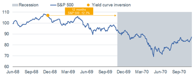
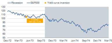
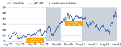
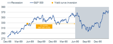
Since Friday, I’ve been inundated with questions about yield curve inversions historically; and what they say about the duration between now and the next recession and/or the likely path for the stock market. The honest answer is that history can give us some guideposts; but also enough grey area to make any kind of accurate forecast a difficult task. There have been myriad analyses done on the history of yield curve inversions; with the data often expressed in median or mean terms. Because of the wide dispersion in past experiences—both in duration-to-recession and stock market performance terms—I want to share details around each of the past seven inversions.
Below are a series of six charts—each one spanning from six months prior to the inversion through the entire subsequent recession. You will see that I combined the “double-dip” recessions of the early-1980s into one chart; although each of the two back-to-back recessions had a curve inversion preceding it.
Yield Curve Inversions Since 1968
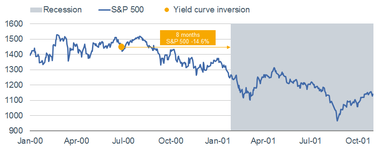
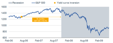
Source: Charles Schwab, Bloomberg, FactSet. S&P 500 price performance calculated using day prior to yield curve inversion thru end of month prior to recession start.
Summary “conclusions”
- The average span between inversions and subsequent recessions has been 11 months, with a range of five months (1973) to 16 months (2006-2007).
- The average return for the S&P 500 during the spans from inversion to recession has been +2.8%, with a range of -14.6% (2000-2001) to +16.5% (2006-2007).
- By looking only at the spans between inversions and recessions, it masks much of the equity market weakness associated with the end of each of these cycles (see below).
Maximum drawdowns
- -36.1% from November 1968 to May 1970
- -48.2% from January 1973 to October 1974
- -17.1% from February 1980 to March 1980
- -27.1% from November 1980 to August 1982
- -19.9% from July 1990 to October 1990
- -36.8% from March 2000 to September 2001
- -56.8% from October 2007 to March 2009
1998 sidebar
Some historical data shows a brief inversion in the curve in 1998, depending on which version of the three-month Treasury bill you use. The version we used for this report—the secondary market version which is derived from secondary market trading—has a longer history and allowed us to take the analysis back further. That version never inverted in 1998. However, the primary “constant maturity” rate version—used by the Treasury when calculating yield curves—did invert, albeit very briefly.
The 1998 experience is considered to be one of the “false positives,” with the aforementioned primary curve briefly inverting in September of that year. Markets were under considerable stress from the triumvirate of the Asian currency crisis, Russia’s bond default/currency collapse and the implosion of Long Term Capital Management (LTCM). Once the Fed stepped in to unwind LTCM’s portfolio and ultimately cut short-term rates, the yield curve steepened and a recession was put off.
Another wrinkle
Although the 10y-3m spread is one of the more common curves on which markets tend to focus, it’s not the only one. In fact, following the June 2018 FOMC meeting, a Fed paper was presented highlighting an alternative indicator of the likelihood of recession based on research by Fed economists Eric C. Engstrom and Steven A. Sharpe: https://www.federalreserve.gov/econres/feds/files/2018055pap.pdf
Their research found that longer-term spreads, like 10y-3m, are not as accurate in forecasting recessions as is the “near-term forward spread.” As noted by Engstrom and Sharpe, the latter “can be interpreted as a measure of the market’s expectations for the direction of conventional near-term monetary policy. When negative, it indicates the market expects monetary policy to ease, reflecting market expectations that policy will respond to the likelihood or onset of recession.” They further noted that “using forward rates should help identify more precisely than yields where on the maturity spectrum the signal for recession lies.”
As you can see in the chart below, this near-term forward spread inverted in January, steepened a bit thereafter, but has retreated back into inverted territory. It is at a level of inversion last seen in 2008. Frankly, when the Fed says they believe they’ve found the best recession-predictor among a series of yield curves, you probably want to pay attention when it’s inverted.
Near-Term Forward Spread
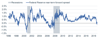
Source: Charles Schwab, Bloomberg, New York Federal Reserve, as of March 22, 2019. The near-term forward spread is the difference between current 3-month yields and the implied forward 3-month yield 18 months from now.
Back to the common 10y-3m yield curve, Bespoke Investment Group (BIG) published some historical returns for all periods when the curve has been inverted. Since 1962, the yield curve has been inverted on about 11.5% of all days, with the S&P 500 averaging an annualized change of -1.9% following these occurrences. The best forward returns for stocks came when the curve was in the +150-200 basis points range (i.e., when it the curve was steep and not inverted); which is obviously a far cry from where we are today.
Recession is coming
With much hyperbole being thrown around these days, I actually don’t think it’s headline-worthy to suggest a recession is coming. That’s the inevitable end to an economic cycle. What’s always difficult to gauge in advance is the length of runway between the present day and the next recession. I’ve been in the camp that believes it could be getting shorter than what the consensus currently believes—especially in the absence of a U.S.-China trade deal being inked (which we don’t yet know of course). With both yield curves discussed above having inverted, it shouldn’t be unexpected that the countdown clock has “officially” begun.
For a more evergreen look at recessions, see my recent report on the subject: The Beginning is the End is the Beginning: A Look at Recessions
Copyright © Charles Schwab & Co


