by Steve Blumenthal, CMG Wealth
“The essence of investment management is the management of risks, not the management of returns.”
– Benjamin Graham
Happy Thanksgiving to you and your wonderful family. Today’s post is holiday short because by the time it hits your in box I’ll hopefully be home with IPA in hand celebrating a hard-fought Black Friday golf tournament victory. Daughter, Brianna; son, Matthew and good friend, Stevie Oh, rounds out our foursome. If you are familiar with golf, it’s a scramble format where each player tees off. We pick the best drive and each player then hits from that spot. We again pick the best result and each player then putts from that spot. Matt and Stevie are the ringers and Brie and I hope to help. What’s particularly challenging is that the greenskeeper picks the most difficult pin position on each green. Lowest overall score wins the tournament. I’ll be hoping to check in with you next week with the “W.”
In this shortened holiday On My Radar post, let’s just dive in and take a look at what the latest trade signals are telling us about the stock market, bond market and the economy.
Despite the aged and overvalued nature of equities and ultra-low bond yields, you’ll find that the weight of market evidence continues to lean modestly bullish on equities and high quality fixed income.
My favorite stock market indicator, the Ned Davis Research CMG U.S. Large Cap Long/Flat Index signaled a reduction in S&P 500 Index exposure from 100% to 80% on Tuesday. This on the same day the S&P 500 Index reached another record high. You’ll also find that Don’t Fight the Trend and Tape remains modestly bullish and there remains more buying demand volume vs. selling supply volume. More buyers than sellers as they say.
On December 6, I am doing a webinar with ETF Trends along with Robert Schuster from Ned Davis Research. Tom Lydon will be hosting the call. We will be talking about how the Ned Davis Research CMG U.S. Large Cap Long/Flat Index works. This particular webinar is for advisor professionals only. If you are an advisor or financial professional, you can sign up here.
If you are an individual investor, please feel free to send me an email. We are planning an individual presentation and we’ll keep you on the list and notify you soon.
I came across this next quote in a piece from Raymond James’ Jeff Saut that to me at least seems to resonate with today’s market mood. Buy the dips. “There is always a disposition in people’s minds to think that existing conditions will be permanent . . . when prices are up and the country is prosperous, it is always said that while preceding booms have not lasted, there are circumstances connected with this one which makes it unlike its predecessors and gives assurances of permanency. The one fact pertaining to all conditions is that they will change.” Charles Dow
Dow’s quote is from the late 1920s. In 1928, the great Roger Babson advised investors to get out of the market. People thought he was nuts. He was early in that call as the market went about 40% higher. What was overvalued grew to be even more overvalued. He advised again… people thought he was even more nuts.
The market crashed, rallied and went on to ultimately lose nearly 89% of its value by 1932. While I’m not calling for anything to that degree of financial destruction, I can’t help but wonder if in a few years from now investors might be looking back asking their advisors how they could have let that happen.
I think there is a better way. I believe Benjamin Graham was right on when he said, “The essence of investment management is the management of risks, not the management of returns.”
Trade Signals is the process I built up over many years. It includes my favorite charts/processes. I designed it to help keep me invested in the equity and fixed income markets’ predominant trend while systematically managing risk. There are, of course, other well-founded ideas. I think it is as important today as it was in 1999, 2007 and even 1928.
Grab that coffee and find your favorite chair. Please let me know if you have any questions about how to read the Trade Signals charts.
Most importantly, a heartfelt Happy Thanksgiving wish to you and your family. I hope you had a great holiday and today finds you taking some time off. I’ll be reporting in next week – hopefully with that “W.”
Trade Signals — A Happy Thanksgiving Stock Market High
Notable this week:
The Ned Davis Research CMG U.S. Large Cap Long/Flat Index moved from 100% S&P 500 Index exposure to 80% exposure. While the overall weight of evidence is moderately bullish, the model equity line moved from uptrend to downtrend, thus the reduction in exposure. The overall equity market evidence remains moderately bullish.
There remains more buyers than sellers and Don’t Fight the Tape or the Fed remains bullish.
High quality fixed income remains in a buy signal, as measured by the Zweig Bond Model below. High yield remains in a sell signal. We are carefully watching HY.
The next section walks you through all of the Trade Signals charts.
Important note: Not a recommendation for you to buy or sell any security. For information purposes only. Please talk with your advisor about needs, goals, time horizon and risk tolerances.
Supporting Charts with Explanations
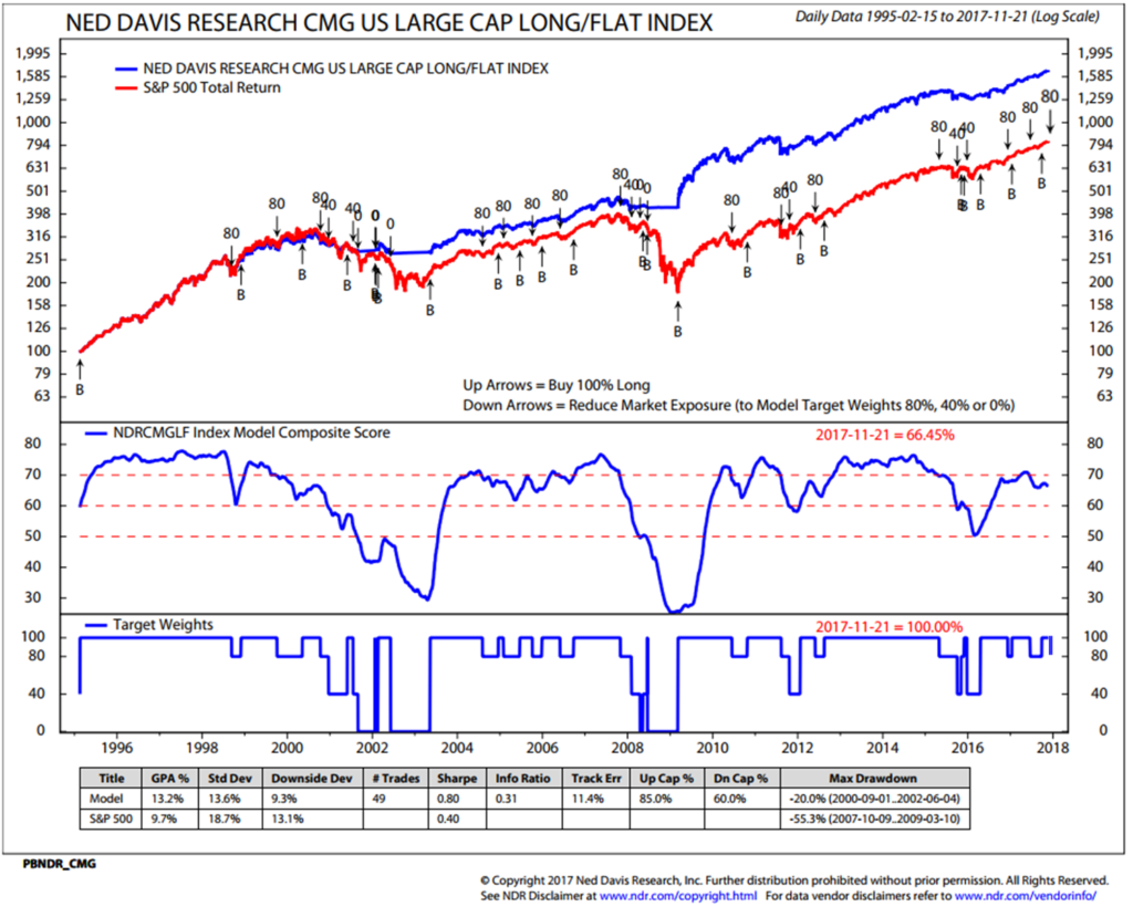
1. Ned Davis Research CMG U.S. Large Cap Long/Flat Index – Buy Signal (Bullish for Equities) – Note Reduction from 100% to 80% Large Cap Equity Exposure on 11-21-2017
The Long/Flat Index measures “market breadth.” Market breadth is simply market activity, such as advances and declines, new highs and new lows, advancing and declining volume and price momentum based upon the number of stocks in uptrends and downtrends. Technicians like “breadth” measurements for two main reasons:
- Breadth thrusts are often present at the start of major bull markets.
- Breadth nearly always weakens before prices do at a major peaks.
Source: Ned Davis Research
The NDR CMG Long/Flat Index process measures market breadth by analyzing the overall technical strength across 22 sub-industry sectors. The process individually measures the trend of each of the sub-industry sector, evaluating the rate of change in price momentum over short-term and long-term time frames and directional trend as determined by intermediate-term moving average crosses (for example, you may be familiar with the “golden cross” that compares the 50-day moving average price vs. the 200-day moving average price). The Index process also considers several mean-reverting indicators, such as deviation from trend and relative strength.
The most important line to follow in the red white and blue chart below is the blue model equity line in the middle section of the chart. It is the combined total score across the 22 sub-industry sectors. Think of it as a “market breadth” combined weight of evidence measurement.
Here is how you read the chart:
- Markets do best when the model equity blue line is moving up. Breadth nearly always weakens before prices do at major peaks… fewer and fewer stocks are moving the market higher (recall tech stocks in 1999 and financials in 2007).
- When the model equity line is above 70, the index stays 100% invested.
- When the model equity line is between 60 and 70 and the trend is moving higher, the index stays 100% invested. If the trend is lower, the index moves to 80% invested with 20% moving to T-Bills.
- When the model equity line is between 50 and 60 and the trend is moving higher, the index stays 100% invested. If the trend is lower, the index moves to 40% invested with 60% moving to T-Bills. With greater breadth determination comes greater risk.
- When the model equity line is below 50 and the trend is moving higher, the index is 100% invested. If the trend is lower, the index moves to 0% invested (“Flat”) with 100% moving to T-Bills. The most significant periods or risk comes when the majority of sub-industries are breaking down.
- You’ll find the model’s statistical data at the bottom of the chart.
- Down arrows show levels of exposures. Up arrows mark “B” or Long signals.
Legend:
Up Arrows with “B” Label = Buy Signal (100% long)
Down Arrows = Reduce Market Exposure to Model Target Weights
S&P Dow Jones Index Data, 1995 to present
Source: S&P Dow Jones Indices and Ned Davis Research. Click here to learn more about how it works.
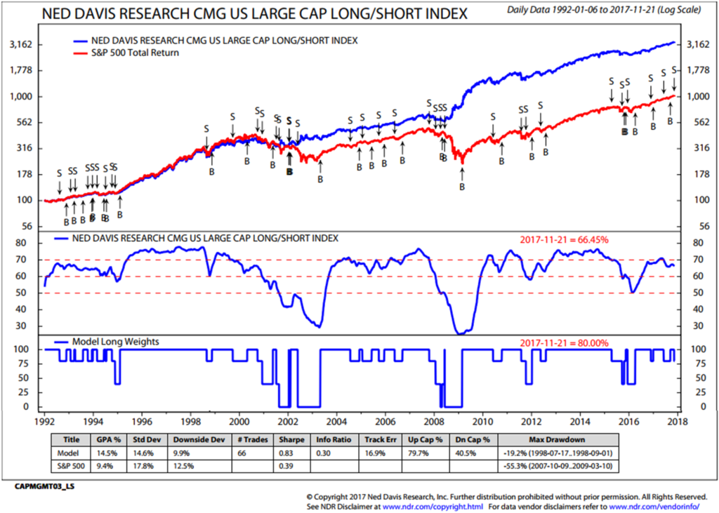
We created a Long/Short version of the Index and the data is favorable. The model goes from 100% to 80% to 40% invested in the same way as the Long/Flat; however, when the model trend line moves below 50, the process goes short U.S. Large Caps or short S&P 500 Index exposure.
- Here’s the data (note in the lower left-hand chart the model returns – a several hundred basis-point improvement in model return):
Data Source: Ned Davis Research (1992 to present). Note: S&P Dow Jones Indices does not calculate Long/Short Index.
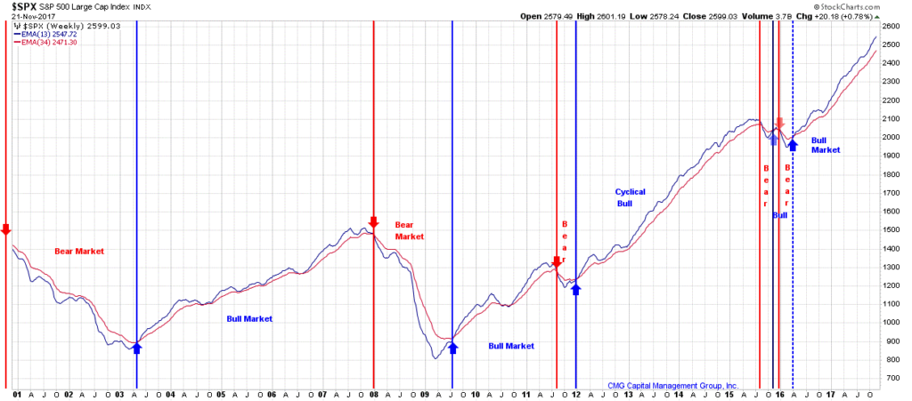
2. 13/34–Week EMA Trend Chart: Bullish Cyclical Trend Signal for Stocks
Note (in the chart below – upper right-hand corner) that the 13-week Exponential Moving Average (“EMA”), represented by the blue graph line, crossed above the 34-week EMA trend (red graph line) late first quarter 2016 (a trend buy signal). The Cyclical Trend for Stocks is bullish by this measure. You can see that this trend process has done a pretty good job at identifying the major cyclical (short-term) bull and bear market trends (note small red and blue arrows). In terms of risk management, a good stop-loss level may be at the point when the 13-week drops below the 34-week EMA.
Click here to see “How I think about the 13/34-Week Exponential Moving Average.”
Bottom line: The 13-week shorter-term trend line is above the 34-week longer-term trend line = bullish signal for equities.
3. Volume Demand vs. Volume Supply – Buy Signal (S/T Bullish for Equities)
When there are more buyers than sellers, prices move higher. When there are more sellers than buyers, prices decline. Supply and demand works that way in all things. Real estate, oil, stock prices and all goods in a free market.
This process looks at a smoothed total volume of declining issues versus a smoothed total volume of advancing issues using a broad market equity index. The performance, reflected in the chart below, is better when Vol Demand is better than Vol Supply. More buyers than sellers. This is a relatively slow-moving but important indicator.
Here is how to read the next chart:
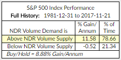
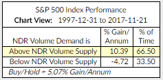
- S&P 500 Index Gain/Annum: The yellow highlight in the charts that follow shows the current regime, percent gain per annum and the amount of time since 1981 to present (which includes the great bull market of 1981 to March 2000) and 1997 to present.
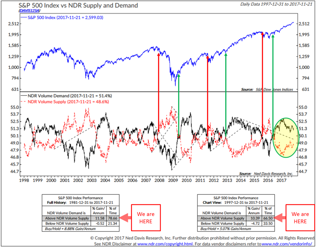
- The black line is NDR’s Volume Demand calculation (buying pressure)
- The red line is the Volume Supply (selling pressure)
- When the buying pressure is stronger than selling pressure, the market does better (since 1981, 11.43% gain per annum)… more buyers than sellers pushes prices up.
- When the selling pressure is stronger than buying, the market does worse (since 1981, -0.52% gain per annum)… more sellers than buyers pushes prices down.
Yellow shows the current signal. Currently in a buy signal. Here is the model’s data 1981 to present (which includes the great bull market and the two bear markets since 2000):
Here is the model’s data 1997 to present (which includes the tail end of the great bull market and the two bear markets and the bull market that started in 2009):
Next is a look at the data series 1997 to present. Here is how you read the chart:
- First note the black and red lines in the middle of the chart (red tracks the smoothed total volume of declining issues while the black tracks smoothed total volume of advancing issues as calculated by NDR).
- The middle section is a plotting of the ratio of the 10-day total of the number of advancing issues and the 10-day total of the number of declining issues.
- When advancing issues outnumber declining issues by a wide margin over a 10-day period (black line higher then red line), it generally indicates a significant shift in market momentum and tends to be followed by further gains
- The bottom two data boxes plot the returns in each regime. Two different time frames: one longer term since 1981 and the other since 1997.
Source: Ned Davis Research
NDR Disclosure
Click here for additional information about the indicator.
Bottom line: Volume Demand is above Volume Supply = a bullish signal for equities.
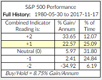
4. Don’t Fight the Tape or the Fed – Indicator Reading = +1 (Buy Signal for Equities). Current reading highlighted in yellow (below).
- The indicators that comprise this reading are a combination of NDR’s Big Mo and the 10-Year Treasury yield. It highlights just how important Fed activity is to market performance. Readings range from +2 to -2.
- Bottom line: when both the trend in interest rates (lower yields) and the trend in the overall market (the tape) are bullish, the market has historically performed best.
- +2 readings have occurred about 12% of the time since 1980. +1 readings have occurred approximately 25% of the time since 1980. -2 readings have occurred approximately 6% of the time since 1980 and the performance during those periods, as shown in the chart are challenging.
Source: Ned Davis Research
NDR Disclosure; CMG Disclosure.
Click here for additional information about the indicator.
Investor Sentiment
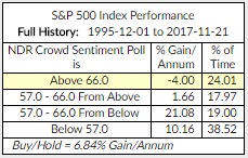
NDR Crowd Sentiment Poll: Extreme Optimism (S/T Bearish for Equities). Current reading highlighted in chart below. The current weekly sentiment reading is 70.8. It was 72.6 last week.
- Best buying opportunities occur at “Extreme Pessimism” readings below 57.
- Gain/Annum for the S&P 500 Index (data from December 1, 1995 to present). Current indicator score highlighted in yellow:
Source: Ned Davis Research
NDR Disclosure; CMG Disclosure.
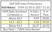
Daily Trading Sentiment Composite: Neutral Optimism (S/T Neutral for Equities). Current reading highlighted below.
- The current daily sentiment reading is 55.56. It was 55.56 last week.
- Best buying opportunities occur at “Extreme Pessimism” readings below 41.5.
- 1994 to Present (current indicator score highlighted in yellow):
Source: Ned Davis Research
NDR Disclosure; CMG Disclosure.
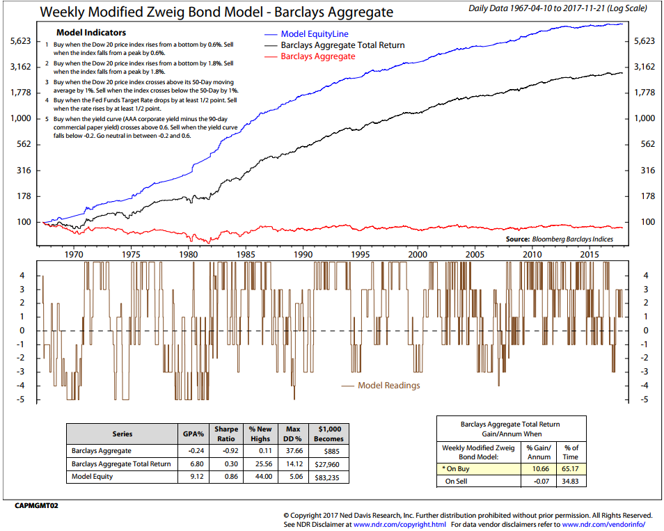
The Zweig Bond Model: Buy Signal – a bullish signal for high quality fixed income bond funds and ETF exposure.
Current indicator score highlighted in yellow (bottom right section):
NDR Disclosure; CMG Disclosure
- This next chart details the drawdown (“Max DD %”) history and a few other statistics. For example, if your $100,000 investment declines 10% to $90,000 over the period of time measured, your drawdown is 10%.
- Barclays Aggregate Bond Total Return has a max drawdown of -14.12% vs. a max drawdown for the Zweig Bond Model of -5.06%.
- You can compare the Barclays Aggregate Bond Index Total Return Max DD to the Model’s Max DD. Hoped for is a higher return and a lower DD. Also listed is the hypothetical growth of $1,000.
- Finally, you can calculate the model on your own – detailed in the upper left section of the chart. How to Track the Zweig Bond Model. Click here for more info about the Zweig Bond Model.
Gold:
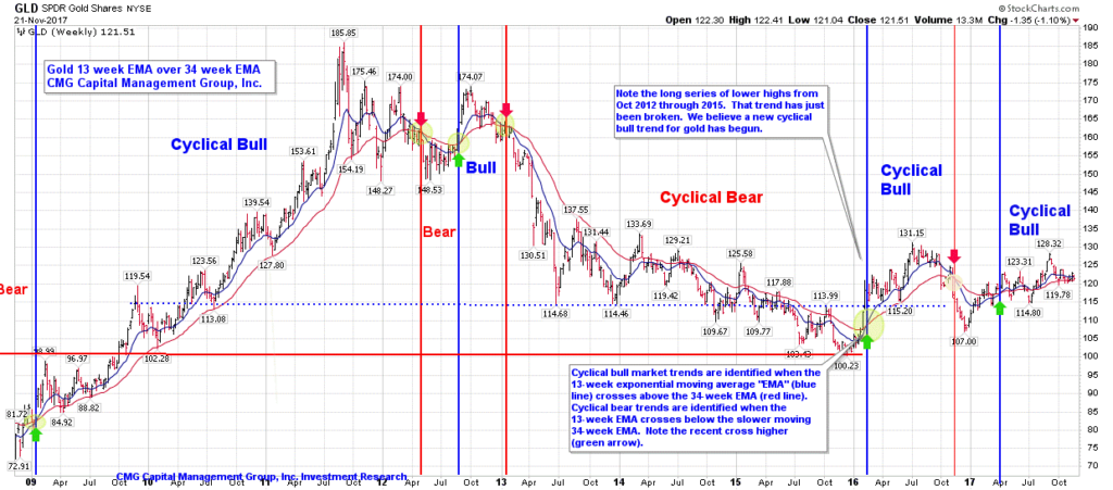
- 13-week vs. 34-week exponential moving average: Buy Signal
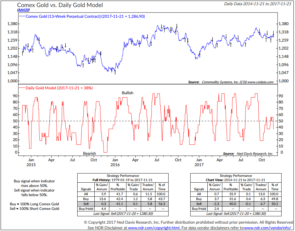
- Daily Gold Model: Sell Signal
Chart 1: 13-week vs. 34-week exponential moving average: Buy Signal
First, a look at the long-term cyclical trend in gold: Buy signals occur when the 13-week moving average trend line (blue line) crosses above the 34-week moving average trend line (red line). Sell signals occur when the 13-week moving average trend line (blue line) crosses below the slower moving 34-week moving average trend line (red line).
Green arrows indicate buy signals, red arrows sell signals. Note green arrow far right.
Source: StockCharts.com; CMG Capital Management Group, Inc.
The next chart is a shorter-term gold trend signal.
Chart 2: Daily Gold Model: Sell Signal
Source: Ned Davis Research
NDR Disclosure
Update on CMG Investment Indices
Equity Markets:
- NDR CMG U.S. Large Cap Long/Flat Index is positioned 80% invested in the S&P 500 Index.
- CMG Beta Rotation Index is positioned in the Vanguard Utility ETF.
- CMG Tactical Equity Index is 90% invested in equity ETFs (50% U.S., 20% developed world, 20% EM and 10% BIL) with U.S. exposure to healthcare, materials, large cap growth and Russell Top 200 growth via ETFs. Developed market exposure to Austria, Canada and Norway and EM exposure to India and Peru.
Follow the daily, weekly, monthly and annual performance of the CMG Tactical Equity Indices here.
Fixed Income: The fixed income trend indicators remain bullish on high quality bonds.
- CMG Tactical Fixed Income Index is positioned in convertible and international bonds.
- CMG Managed High Yield Bond Program is in a sell signal.
- The Zweig Bond Model is in a buy signal.
Follow the daily, weekly, monthly and annual performance of the CMG Tactical Fixed Income Index here.
Tactical All Asset:
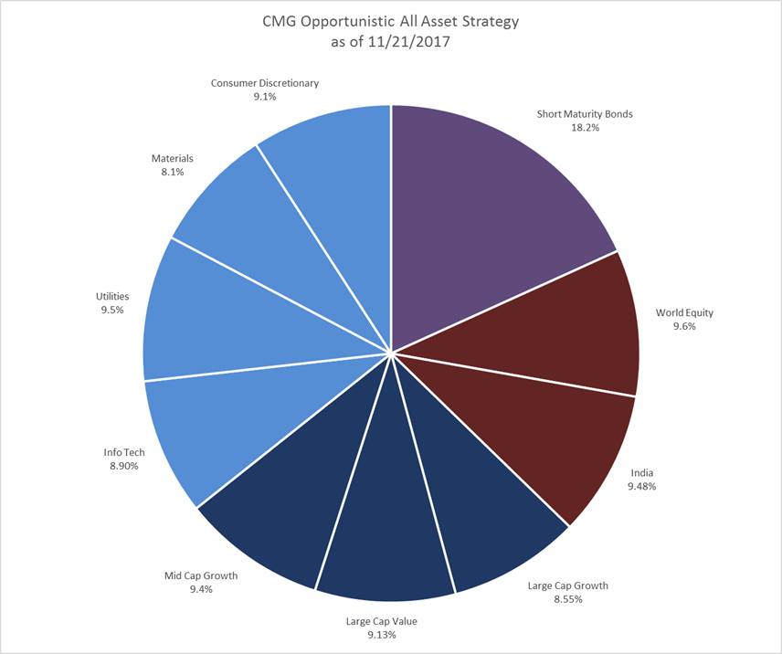
CMG Opportunistic All Asset Strategy — following is the updated portfolio summary:
- Overall, the Strategy is allocated approximately 81.8% to equities and 18.2% to fixed income.
- Following is a breakdown by asset class:
Follow the daily, weekly, monthly and annual performance of the CMG Tactical All Asset Index here.
Liquid Alternatives:
- Gold
- The short-term and the long-term trends are both bullish… see trend charts in the gold section.
- I favor up to 5% in gold with an increase to 10% for more aggressive investors. 0% exposure when both S/T and L/T indicators are bearish.
Important: Not a recommendation to buy or sell any security. For information and discussion purposes only. Consult your investment advisor regarding investment objectives, suitability and risk tolerance.


