by Steve Blumenthal, CMG Wealth Management
“You have to bet against the consensus and be right to be successful in the markets.”
– Ray Dalio, Founder, Bridgewater Associates, LP
It remains a decidedly risk-on environment. Interest rates are higher, the dollar is higher and the stock market is higher. The positives for higher equity prices are the liquidity coming from global central bankers, the potential for the repatriation of offshore corporate cash (estimated to be as high as $3 trillion), tax reform and a potential shift out of low yielding bonds and into stocks. Melt up? Maybe, but not without risks.
One of my favorite story tellers is the great Art Cashin. In a note this week he wrote,
On this day in 1961, the Museum of Modern Art, in New York, hung its newest and proudest possession. Weeks before, they had acquired “Le Bateau” by Henri Matisse. Matisse, who had died seven years earlier, was one of the great transitionalist painters of modern art. Influenced by the impressionist symbolism of Monet and his teacher, Moreau, Matisse was a founder of the Fauvist school that led to the cubism of Picasso and Braque.
So it was a big deal when the museum threw open its doors triumphantly — to allow the public to view “Le Bateau.” The event caused much publicity and over the next 48 days over 100,000 people would troop admiringly past the celebrated painting. It was only then that someone remarked that it didn’t look like it did in the book. There was a good reason for that. The museum staff had unknowingly hung it upside down and for 48 days none of the cognoscenti noticed the difference.
To celebrate this anniversary, take a treatise on modern economics and hang it upside down. Don’t be surprised if it looks pretty much like today’s financial pages.
Traders remained a little confused about how to view the picture presented by the market and the economy. The roll to new record highs continued but without any real zest.
A kind of “Oh yeah, another record, I guess.”
Don’t you just love Art’s fun wit?
Here is a picture of the artwork right side up.
Le Bateau (“The Boat”) is a paper-cut from 1953 by Henri Matisse.
The picture is composed from pieces of paper cut out of sheets painted with gouache, and was created during the last years of Matisse’s life.
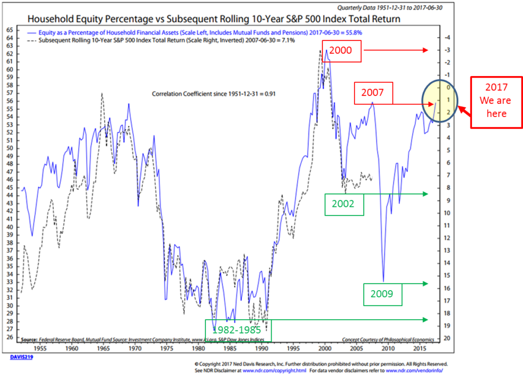
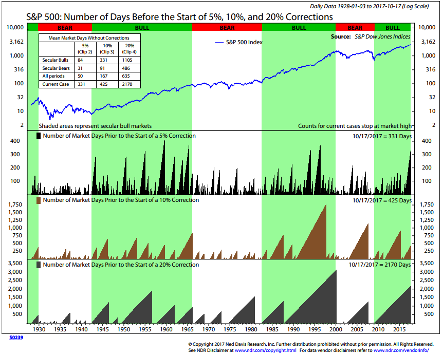
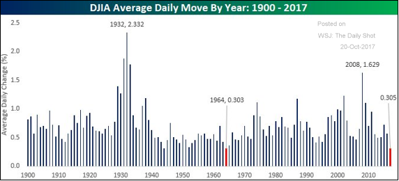
This week I share a chart that shows the S&P 500 has gone without a 5%, 10% or 20% correction. The current move is eerily absent volatility and is setting records for the number of days without a meaningful correction. There is also a chart showing the DJIA average daily move is the lowest in history (dating back to 1900). And you’ll find the number one chart I want to share with you this week titled, “Household Equity Percentage and Subsequent Rolling 10-year S&P 500 Index Total Return.” Please note the “We are here” notation and share it with your clients. “Upside down” indeed.
There is a bit more but you’ll find this week’s post to be a quick read. I hope you find the information helpful. Click on the “On My Radar” link below to view this week’s post.
Morning game plan: Grab that coffee and jump in. Evening game plan: Forget the coffee and grab a cold IPA or a fine glass of wine and read on….
♦ If you are not signed up to receive my weekly On My Radar e-newsletter, you can subscribe here. ♦
Follow me on Twitter @SBlumenthalCMG.
Included in this week’s On My Radar:
- “Greed, Fear, and Fallacy”
- Inflation or Deflation – Dr. Lacy Hunt & Van Hoisington
- Q&A – Answer to a Reader’s Question
- Trade Signals – No Signal Changes
- Personal Note – Penn State vs. Michigan
“Greed, Fear, and Fallacy,” by Arthur Grizzle and Charles Culver, Martello Investments
Several weeks ago, I shared an interview with behavioral economist and recent winner of the Nobel Memorial Prize in Economic Sciences, Professor Richard Thaler (here). So when I read Martello Investments’ monthly commentary this week, I thought it perfect to share their piece with you. From Artie and Charlie:
Earlier this month, Richard Thaler received the Nobel Prize in Economics, and his recognition was long overdue. In a world where conventional economics is driven by simplifying assumptions — assumptions like “markets are efficient” and “investors are rational” — Thaler’s contributions to the field as one of the founding fathers of behavioral finance bring a realistic perspective. The underlying principles of behavioral finance, blending financial theory with psychology, accept the emotional and cognitive biases of most investors. Instead of assuming investors are rational, Thaler and others acknowledge that, on the contrary, most investors are irrational, emotional creatures that are driven by a combination of greed, fear, and fallacy, and that it is these behavioral issues that can cause bubbles and overreactions.
Despite tidy econometric models that peg investors as rational creatures, we value the contributions of the behavioral camp; we believe that emotions and irrational decision-making tend to govern investor behavior, oftentimes to the detriment of the investor. There are numerous behavioral biases prevalent in investing; some of the more notable include loss aversion (losses are generally 2-3X more painful than the positive feelings associated with similarly sized gains), confirmation bias (only pay attention to opinions that agree with you), and endowment bias (what we own is more valuable than what we don’t). Ultimately, these behavioral fallacies can result in investors buying high (chasing) and selling low (out of frustration and fear), the consequences of which are long-term wealth destruction.
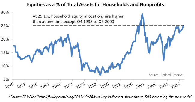
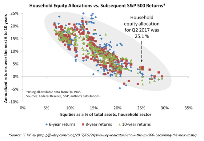
One of the key concepts in behavioral finance is called herding, which is the tendency of individual investors to follow the actions of a larger group. Herd behavior happens because people implicitly trust the collective wisdom, and because of the pressure to conform. Think of the 1990s technology stock bust or the 2007-2008 housing crisis; part of the driving force of the bubbles preceding those crises was a fallacy that suggested “everyone is doing it, so it must be right, and I should do it too.” I saw some charts recently that brought herd behavior to mind; in a post titled “Two Key Indicators Show the S&P 500 Becoming the New ‘Cash’”, FF Wiley (ffwiley.com) highlighted that investors hold more equities as a percentage of total assets than any other time since 1946 except during the height of the dotcom bubble in 1998-2000. Wiley takes his analysis a step further by showing that high equity ownership is generally followed by low 6-10-year future returns, while low equity ownership is generally followed by higher returns. Some of this growth is certainly caused by the price of the market itself; household ownership of equities will rise organically as markets rise, as equity ownership percentage will fall as stock prices fall. The fact remains that, if history is any guide, the current level of equity ownership by households is associated with very low future returns.
Part of the reason this relationship may exist is due to valuation; high equity ownership periods are generally associated with high valuation periods. Another reason it may exist is a related construct from the fields of sociology and behavioral finance: thresholds. Sociologist Mark Granovetter, in his paper Threshold Models of Collective Behavior, identifies that group outcomes are dependent upon the various thresholds of the members. In this case, a threshold for an individual is based on how many other individuals are engaged in the behavior. In financial markets we can think of a low-threshold actor as a contrarian, meaning they favor of non-consensus ideas. Similarly, we can think of high-threshold investors as “herd,” meaning they only participate after a large amount of reassurance. The problem is that by the time high-threshold entrants are sufficiently convinced to enter the market, the majority of the trend is over and there are few new entrants (with seemingly even higher thresholds) to push the market to new heights. This would mean the highest-threshold entrants generally enjoy the lowest returns. Using the chart above as a guide, any investor currently jumping into stocks after such a prolonged bull run (which we could call a high-threshold actor) should expect below average returns over a long holding period.
Though the threshold model may not be a pure comparable to the equity ownership charts above, we think it is fair to wonder, with household ownership approaching record levels, who is the marginal buyer of equities these days? One question that always comes up in these analyses is to wonder if “this time is different,” particularly given low interest rates globally, which push investors out on the risk curve and could theoretically cause a new higher stock ownership paradigm. Another potential answer is trend-following strategies and quasi-trend, vol-driven strategies like risk-parity, which some estimates put at $8 trillion globally in aggregate, and are natural buyers of equity markets in a stable up-trend with low volatility. Then there are the indiscriminate buyers, such as corporate buybacks, which have fallen to only $500 billion on a rolling 12-month basis. Let’s not forget the Bank of Japan, which owns an alarming proportion of Japanese ETF issuance.
High-threshold actors… indeed. You can find Artie and Charlie’s full piece here.
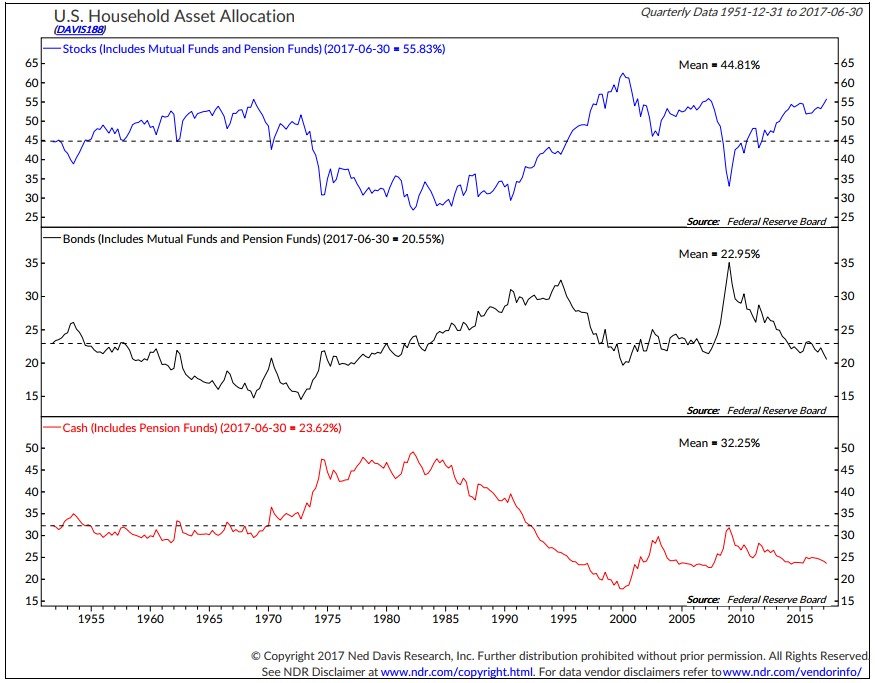
In past valuation posts, I’ve occasionally shared the following two charts. Ned Davis Research (NDR) charts the Federal Reserve’s “U.S. Household Asset Allocation” data. Below is the charted history of stock, bond and cash percentages. Stock ownership is currently 55.83% of a “Household’s” asset allocation (upper section of next chart).
NDR looks at that stock allocation number (55.83% today) and they then do something really cool. They analyze the history of the percentage in stocks and plot the returns an investor received ten years later.
Much as Artie and Charlie detailed in their commentary, NDR finds the same evidence. High equity ownership means so much money has bought in and bids up prices. When most are in, there are fewer buyers to buy and pushes prices higher. The “really cool” chart is next.
Here’s how to read it:
- The blue line is the “Household Equity Percentage” – numbers on left-hand axis. The current number is 55.83%.
- The dotted black line is the actual “Subsequent Rolling 10-Year Total Return.”
- Red boxes mark dates in time. Arrows point to the return achieved or projected if the 10-year period has not yet finished.
- Green boxes mark dates in time the household equity percentage was low and annualized returns were high.
- Overall, note the very high degree of correlation between the blue line (% Household Equities) and the dotted black line (Subsequent Annualized 10-Year Return).
- Current reading of 55.83% projects a 10-year annualized return of just slightly better than 1% (“We are here” far right side of chart).
- That means: expect equities to earn just 1% per year over the next ten years.
Say you were in the year 1982 and the percentage allocated to stocks was 35%, the subsequent 10-year annualized return was 14%. How about 1966? 54% in stocks and a subsequent 10-year annualized return of 2.5%. Pick any date and it’s easy to see the relationship.
It’s certainly not perfect, but with a high 0.91 correlation coefficient (1.00 is perfect correlation), it’s a probability not to be ignored. And with sound logic. Supply and demand.
Finally, note the return forecast in late 2008 and 2009. It’s pretty close to what has happened. Now what, don’t look back… look forward. The problem is most look back. Come on, who do you know that was buying in 2009?
Another great buying opportunity will present. It is not today. We should think differently. Most won’t. Yet between here and the next green box buying opportunity, we may go even higher before we go lower. Other buyers may emerge. Say a banking crisis in Europe finds money racing to the U.S. and investors feel stocks are a better bet than bonds, or U.S. investors are racing out of bond funds due to rising interest rates, or central bankers are buying U.S. ETFs. Don’t know, but when we look back ten years from now, I believe 1% per year for ten years is a highly probable outcome. But it will likely be a choppy up 20%, down 40%, up 10% type of ride on the way to 1% annualized. A very bumpy ride to that low return outcome.
You may find this next chart interesting. It shows the number of days before we get various degrees of correction vs. the current case.
S&P 500: Number of Days before a 5%, 10% and 20% Correction
Here is how you read the chart:
- Compare the data detailed in the box – upper left-hand side of chart.
- In “Secular Bulls,” the mean number of market days without a 5% correction is 84 days. The “Current Case” is 331 days. Also look at 10% and 20% corrections.
- Also shown are mean number of days in Secular Bears and All Periods vs. Current Case.
When does the next 5% or 20% occur? No one knows… But this too should give us reason for caution. So, too, should this next chart (hat tip to Artie Grizzle):
Complacency? The DJIA’s average daily move is the lowest in history (data 1900 to present). From @bespokeinvest courtesy of WSJ’s The Daily Shot.
Upside down? In the current market climate, it takes the courage of one’s convictions to heed Dalio’s advice and “bet against the consensus and be right.”
Inflation or Deflation — Dr. Lacy Hunt
Last week I promised to touch on Dr. Lacy Hunt and his partner Van Hoisington’s Q3 investor letter. Let’s first look at the early signs of rising inflation and then counter that argument with Lacy’s view on slow growth, deflation and declining interest rates. First on inflation…
The PCE Price Index is the Fed’s preferred gauge of inflation. With the Fed’s stated inflation target of 2%, PCE has been below 2% since early 2012. Janet Yellen recently said that low inflation is “a mystery.”
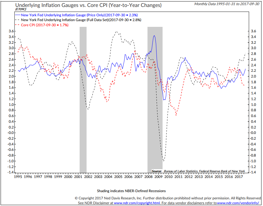
However, a new inflation indicator from the New York Fed, the Underlying Inflation Gauge (UIG), suggests that inflation pressures may be on the rise. If it is more accurate, we might one day look back and change the name to UGH.
There are two measures of UIG. One looks at price only and the other includes financial and global macro data such as labor market information, Treasury yield spreads, high yield bond market yields spreads and more. The price-only UIG has been edging higher since April 2015 and rose 2.3% year-over-year in September, the most since April 2012. The bigger UIG has been increasing since February 2016. It is up to 2.8% year-over-year through September and marks the fastest pace since 2006.
Core CPI inflation posted 1.7% year-over-year last month, close to its slowest pace since January 2015. Which should we believe?
I personally feel PCE and Core CPI understates what you and I are actually experiencing, but they are the Fed’s go to gauges. In any event, note in the next chart how the dotted red line (Core CPI) tends to follow the blue and dotted black lines (UIG-price and UIG-full).
Bottom line:
- Inflation is picking up and bond yields are jumping higher again. Interest rates are rising. Investors favor stocks over bonds in a stronger economy.
- When bond yields rise, bond prices fall. That encourages investors to switch from Treasurys to stocks. That also encourages switching into investment-grade corporate and high yield bonds, which have gained ground since the start of September.
- Rising rates favor financial stocks. We’ve seen a positive trend in financials.
With this rising interest rate period, I do want to share with you a link I promised last week. It is to Hoisington Investment Management’s September 2017 Quarterly Letter. Lacy slices and dices a number of large economic macro factors to drive his investment decisions.
Here is his current fundamental assessment and investment outlook:
With monetary restraint continuing to weigh on economic growth for the remainder of 2017 and 2018, inflation, which receded sharply this year (PCE is up 1.2% year-to-date and 1.4% year-over-year), will continue on a downward path. Coupled with extreme over-indebtedness, these factors are the dominant factors causing both cyclical and secular growth to weaken. Additionally, these negative impulses are presently being reinforced by the problems of poor demographics and productivity. Population growth in 2016 was the slowest since 1936-37 – roughly half of the post-war average – and the fertility rate in 2016 was the lowest on record.
These trends have contributed to the declining growth of household formation, which is now less than one-half the rate of increase that has been experienced since 1960. Productivity in the eight years of this expansion was the lowest for any eight-year period since the end of World War II.
These existing circumstances indicate that a Fed policy of QT and an indicated December hike in the federal funds rate will put upward pressure on the short-term interest rates. At the same time, lower inflation and the resultant decline in inflationary expectations will place downward pressure on long Treasury bond yields, thus causing the yield to curve to flatten. Continuation of QT deep into 2018 would probably cause the yield curve to invert. Short-term interest rates are determined by the intersection of the demand and supply of credit that the Fed largely controls by shifting the monetary base and interest rates.
Changes in long-term Treasury bond yields are primarily determined by inflationary expectations.
Inflationary expectations will ratchet downward in this environment, pushing the long Treasury bond yields lower.
Source: Van R. Hoisington and Lacy H. Hunt, Ph.D.
Cross messages? My two cents: inflation is picking up and bears watching. The Fed wants to raise interest rates and exit QE. The pressure over the short term is for higher interest rates. That could prove to be a head fake to the Fed. Lacy believes this will be a mistake and the Fed current QT (Quantitative Tightening) will lead to short-term interest rates being higher than long-term rates (an inverted yield curve), which will put us in recession.
Lacy is correct on the debt and demographics problem and that along with underfunded pension problems remain a very big global headwind. Ultimately, I believe rates are headed lower.
You can find the full piece here. It’s a great read.
Q&A
Question from a reader: Given the concern expressed by yourself and several other asset managers over the Fed’s decision to start unwinding their balance sheet in parallel with raising interest rates, it makes me wonder if perhaps the Fed isn’t actually timing their unwinding while there is still robust demand. If, as you state, the excess liquidity being created by the ECB is flowing into U.S. assets, wouldn’t it make sense for the Fed to help meet that demand by unwinding some of their balance sheet. It seems to me that would help mitigate the concerns over the Fed opting to start reducing their balance sheet now, while they have a window of opportunity, freeing up balance sheet space so to speak for the next (avoidable) financial disaster?
The Fed has taken a lot of flak for initiating QE, more flak for extending QE, and even more flak for starting to unwind QE. No matter what they do, they are continually beat up. Yet I recall watching several Bernanke press conferences during the whole QE process where he repeatedly stressed that QE was a temporary fix (my words) and that Congress needed to start acting responsibly with regard to tax policy and getting their spending under control – something they haven’t done since Clinton was in office and we actually experienced a modest budget surplus for two years. But the Fed is an easy target I guess.
Signed,
Norm
My answer: Thanks for sharing, Norm. From my point of view, it is about the level or risk in the system. Maybe the Fed, as Ray Dalio says, can engineer a “beautiful deleveraging.” Man, am I praying for that… but it requires political coordination both in the U.S. and between the U.S. and our friends abroad. A big challenge. I have my doubts. My goal is to find a way to get from here to there (“there” being the green boxes and arrows in the section above). A “beautiful” or “ugly” deleveraging of some form is required. And a pension crisis is speeding down the tracks fast. We baby boomers are aging. We stop giving into the system and start taking from it. The current math does not work to cover the taking that is promised. Something has to give…
Bottom line: Stock markets move higher when there are more buyers than sellers. At some point, valuations matter. When the hamburgers are inexpensively priced, we get a lot more for our money. Same with the stock market. When it is richly priced, we get less return on our money.
That doesn’t mean we can’t move higher in stocks over the short term, but with valuations so elevated, it does tell us a lot about what we’ll gain over the long term. Thus, the caution.
If GDP growth is the amount of workers times their productivity, then how do you get great growth with fewer workers (due to our aged demographics) and low productivity? GDP is forecasted to be less than 2% for some time to come and some have it in the 1% range. U.S. companies in aggregate don’t grow their earnings much faster than overall GDP growth (sure… some companies do but not in aggregate). So I don’t see an increase in earnings that causes valuations to become more attractive.
For now, the positives for higher equity prices remain the liquidity coming from central bank activities (QE), the potential for the repatriation of offshore corporate cash (estimated to be as high as $3 trillion) and a potential shift out of low yielding bonds to stocks. Melt up? Maybe, but not without risks.
I wish I was in the “equity market buy-and-hold and you’ll get 10% per year” camp. Dollar cost average over the coming 30 years and I think you may hit that bogey. What baby boomer has 30 years or is willing to accept 1% annualized for ten years. What baby boomer has ten years at 1% needing much more from his/her portfolio to cover living costs.
At a time when investors are herding back into stocks. It’s time to have a different discussion. I remain firmly in the “participate and protect” risk management camp.
Trade Signals — No Signal Changes Since Last Week
S&P 500 Index — 2,559 (10-18-2017)
Notable this week:
There are no changes since last week. The equity market and fixed income trade signals remain bullish. U.S. economic growth remains strong. Risk of recession in the next six to nine months remains low. Inflation risk is neutral.
Click here for the latest Trade Signals.
Important note: Not a recommendation for you to buy or sell any security. For information purposes only. Please talk with your advisor about needs, goals, time horizon and risk tolerances.
Copyright © CMG Wealth Management


