by Lance Roberts, Clarity Financial
The market is downright bullish. There is little reason to argue the point given the bullish trends of markets globally which are strongly trending, positively correlated, and simultaneously breaking out to all-time highs. Of course, such is not surprising given the massive levels of Central Bank interventions, suppressed interest rates, and global coordination between Government’s and major asset managers (banks) over the last eight years.
Importantly, as bullishness has reached historically high levels, the fear of a market crash, or another crisis, has faded into the abyss. As Mark DeCambre noted:
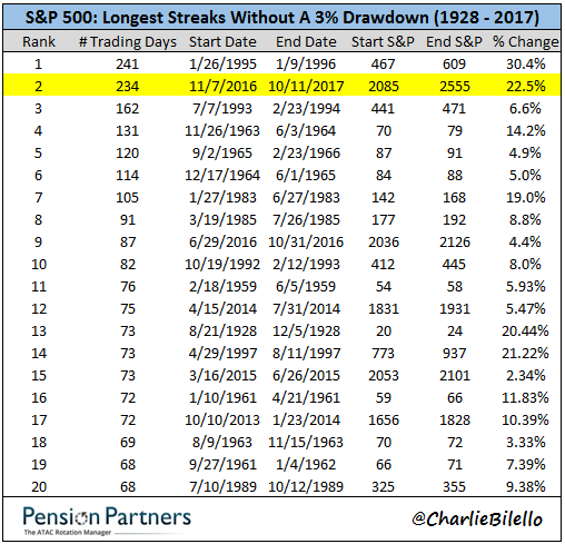
“By at least one measure, the S&P 500 index is on pace to register its lengthiest period of quiescence in more than two decades—and perhaps ever.
The broad-market benchmark hasn’t experienced a decline of at least 3% since Nov. 7, 2016. That 236-day span registers as the second-longest period without a single-session drop of that magnitude since the 241 days from Jan. 26, 1995 to Jan. 9, 1996, according to Pension Partners’ Charles Bilello (see table below):“
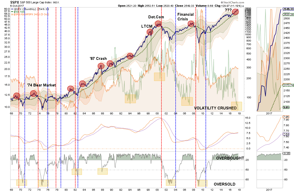
This lack of volatility, flood of liquidity from Central Banks, and a seemingly “bullet-proof” rise in the market has boosted investor confidence to exuberant levels. That consistent push higher, without a correctionary process along the way, has pushed the market into “extremely overbought, extended, and bullish territory.” As shown visually in last weekend’s newsletter:
When I discuss this, I am often asked exactly what is meant by such a statement. This week, I am going provide a basic course in technical analysis as the “overbought, bullish and extended” theme is likely to remain intact for several months to come.
Clarifying Over Bought, Extended & Bullish
What exactly is meant by the markets being overbought, overextended and overly bullish? These are concepts, which once understood, will hopefully lead you to managing your money more successfully over the long term.
What Do You Mean By Overbought?
I am often asked that since there is “always a buyer for every seller,” then how can a market become overbought?
Before we get into the raw technical analysis of showing the “overbought” condition let’s rationalize what one is and how it occurs.
First, while it is true that there is always a buyer and seller in every transaction it is the “supply and demand” of those buyers and sellers at a particular price point that affects the overall price. Let me explain.
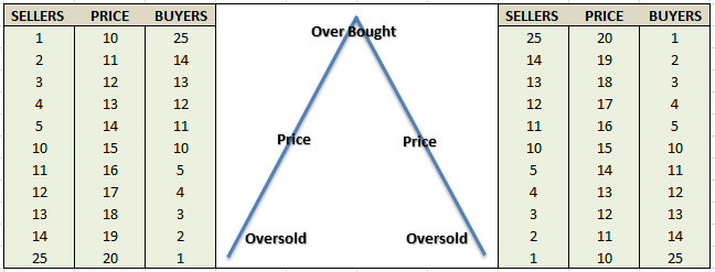
Imagine two rooms of 100 individuals each that want to buy shares of ABC stock. Room A has 100 individuals that currently own ABC stock and Room B has 100 individuals with cash wanting to buy shares of ABC. The table below shows a very simplified model of this process.
At $10 a share, there are numerous buyers but sellers are few. The demand for the shares drives the price higher which entices more sellers. As long as the demand for shares outpaces the supply of sellers – the price is pushed higher. However, at some point, the price reaches a level that exhausts the supply of buyers. The next price decline occurs as sellers have to begin lowering prices to find buyers.
So, while there is always a buyer and seller for every transaction it is the relative supply and demand for those shares at current prices that determine the “overbought” and “oversold” conditions.
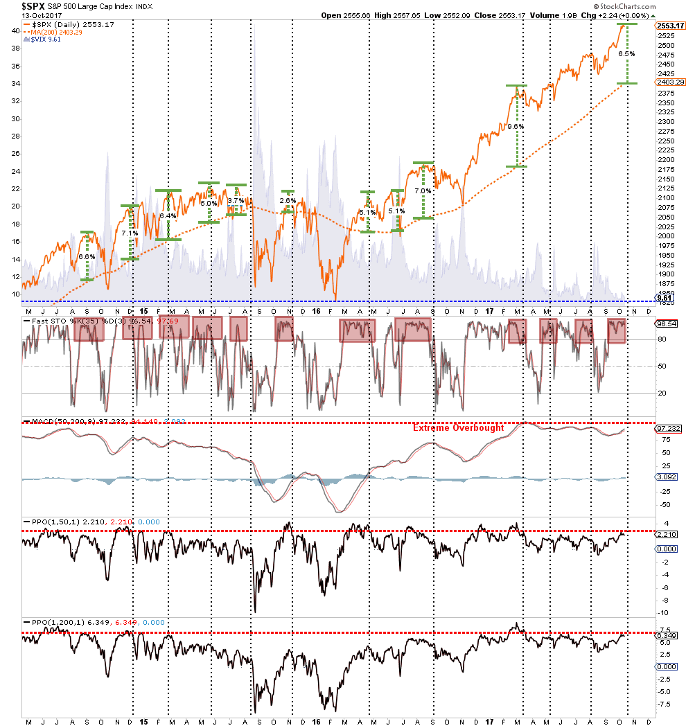
The chart below shows several methods I look at to try and determine if buyers are potentially reaching a point of “exhaustion” which might lead to a price reversal in the short-term. The top of the chart looks at the historic deviation between the price of the market as compared to the 200-dma. The bottom 4-indicators are measures of price movement and participation (The bottom two panels are the number of stocks above the 50 and 200-dma.)
Don’t get too hung-up on trying to understand all the nuances of the chart. The important point, from a money management standpoint, is the determination of the potential risk/reward opportunity for allocating capital to the markets at any given time.
As a portfolio manager, clients tend “not to like” having their capital invested in the markets only to almost immediately suffer a principal loss. By using some measures to determine the current risk/reward outcome, the deployment of capital can be more effectively timed.
While the chart is suggesting the market has reached levels where buyers have typically been turned into sellers, it is important to understand that just because the indicator has reached an extreme level – the market will not necessarily fall apart immediately. It is a warning sign that suggests further upside in the market is relatively limited compared to the downside risk that currently exists.
The average correction that resolved the overbought condition, since the end of the last financial crisis, has been as little as -3% but as much as -19%. It is for this reason that I continue to suggest NOT chasing the markets at the current time. There will be a correction of some magnitude in the near future that will allow for a safer entry of new capital into the markets. Patience, however, will likely be tested before that opportunity presents itself.
How Can A Market Get Over Extended?
Now that we have defined what overbought means – I can explain what I mean by overextended. As I discussed in “Visualizing Bob Farrell’s 10 Investing Rules”:
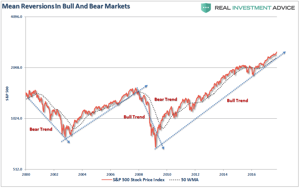
“Like a rubber band that has been stretched too far – it must be relaxed in order to be stretched again. This is exactly the same for stock prices that are anchored to their moving averages. Trends that get overextended in one direction, or another, always return to their long-term average. Even during a strong uptrend or strong downtrend, prices often move back (revert) to a long-term moving average.
The chart below shows the S&P 500 with a 52-week simple moving average. The bottom chart shows the percentage deviation of the current price of the market from the 52-week moving average. During bullish trending markets, there are regular reversions to the mean that create buying opportunities. However, what is often not stated is that in order to take advantage of such buying opportunities profits should have been taken out of portfolios as deviations from the mean reached historical extremes. Conversely, in bearish trending markets, such reversions from extreme deviations should be used to sell stocks, raise cash and reduce portfolio risk rather than ‘panic sell’ at market bottoms.”
The dashed blue lines denoted when the markets changed trends from positive to negative. This is the very essence of portfolio “risk” management.
The idea of “stretching the rubber band” can be measured in several ways, but I will limit our discussion this week to two: Standard Deviation and Distance.
As I noted in this past weekend’s newsletter, “Standard Deviation” is defined as:
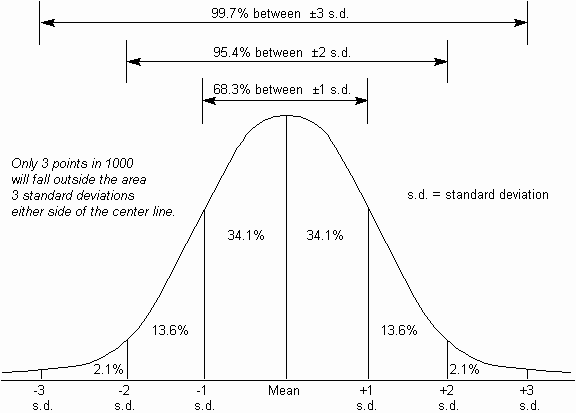
“A measure of the dispersion of a set of data from its mean. The more spread apart the data, the higher the deviation. Standard deviation is calculated as the square root of the variance.”
In plain English this means, and as shown in the chart below, is that the further away from the average that an event occurs the more unlikely it becomes. As shown below, out of 1000 occurrences, only three will fall outside of the area of 3 standard deviations. 95.4% of the time events will occur within two standard deviations.
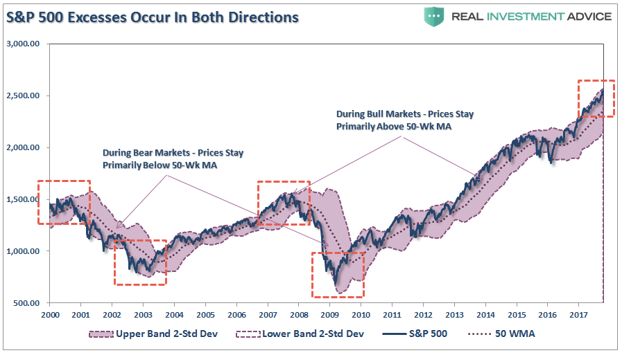
For the stock market, and as shown in both charts above, the standard deviation is measured is with Bollinger Bands. John Bollinger, a famous technical trader, applied the theory of standard deviation to the financial markets.
Because standard deviation is a measure of volatility, Bollinger created a set of bands that would adjust themselves to the current market conditions. When the markets become more volatile, the bands widen (move further away from the average), and during less volatile periods, the bands contract (move closer to the average).
The closer the prices move to the upper band, the more overbought the market, and the closer the prices move to the lower band, the more oversold the market.
The dashed purple line is the 50-week moving average (or mean) with shaded area representing 2-standard deviations. As shown in the chart above, 2-standard deviations encompass 95.4% of all probable price movement.Even during the 2012-15, QE3 driven, stock advance, there were several corrections back to the 50-week moving average which allowed for increases in equity risk.
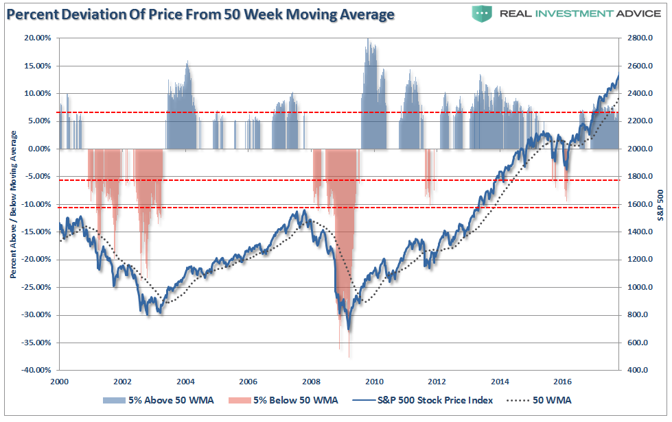
The chart on the next page shows this more clearly. The blue colored vertical bars represent when the price of the index has risen 5%, or more, above the 50-week moving average. The orange-ish bars represent a move of 5%, or more, below the moving average.
Currently, with the index more than 7% above its 50-week moving average, there is little questioning that the markets are extended to the upside. From this point, there are two things that could occur. If this is only an intermediate-term top, and the markets are going to remain in a bullish trend, then any correction should remain confined to a retracement back to the 50-week moving average.
However, if the markets are building a longer term top then a reversion past the 50-week moving average will denote a possible change into a bear market. Bull and bear markets are denoted below by how they trade either above or below the 50-week moving average.
Measuring Extreme Optimism
“It is a bad sign for the market when all the bears give up. If no-one is left to be converted, it usually means no-one is left to buy.” – Pater Tenebrarum
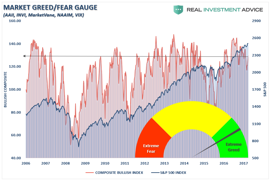
That quote got me thinking about the dearth of bearish views that are currently prevalent in the market. The chart below shows the monthly level of bullish outlooks according to our composite indicator of both individual and professional investors.
The extraordinarily low level of “bearish” outlooks combined with extreme levels of complacency within the financial markets has historically been a “poor cocktail” for future investment success.
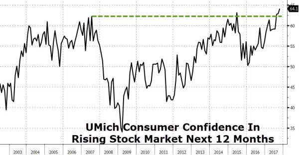
Much like measuring overbought and overextended conditions – overly bullish optimism, or a “lack of fear” of a market correction, are historically seen at intermediate and longer-term market peaks. This is also the case with consumer “sentiment” which also just registered the highest level on record of individuals expecting the markets to rise over the next 12-months.
As I wrote previously, “records are records for a reason.”
With bullish sentiment and complacency at extreme levels, it only further supports the idea that the current risk of investing new capital in the markets outweighs the potential reward. It is very likely that sometime within the next couple of weeks, to a couple of months, the markets will experience at least an intermediate-term correction.
Could it turn into a more serious correction? Sure. However, we won’t know that until we get there.
I hope this helps clarify things.
For now, holding a little extra cash certainly won’t detract significantly from portfolio performance but will provide an opportunity to take advantage of panicked sellers later. It’s not a question of “if,” only of “when.”
Copyright © Clarity Financial


