by Bob Simpson, Synchronicity Performance Consultants
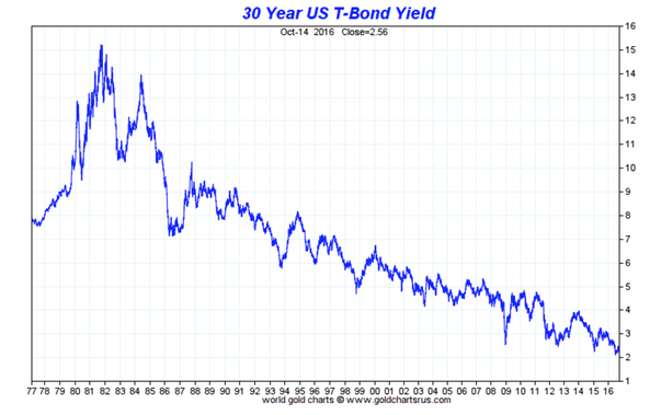
We have experienced a great bull market in bonds that has now lasted over 35 years.
Along the way, there have been some pretty significant corrections, like coming out of the stock market crash in 1988, 1994 and 1999. There was a pretty significant correction in 2009, following strong upward movement in bond prices when the stock market collapsed in 2008. When you look at this chart, the corrections seem very insignificant but if you lived through the corrections, that was not the case.
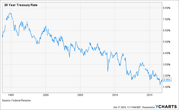
A simple indicator to helps us judged trends is the 200-day simple moving average. Price has been trading above the 200-day MA for most of the past 25 years. The chart below shows 20-year US Bond yields on a shorter scale.
We hit a new low in 20-year bond yields on July 8, 2016 at 1.69% and yields have increased to 2.15% in recent weeks.
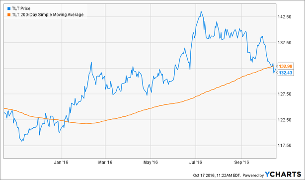
If we change our view to price, using TLT (iShares 20+ Year Treasury Bond) and overlay the 200-day MA, we can see that we have recently violated the moving average. When a security breaks down through a moving average, we call it “turning on a red light”. You will see a similar chart pattern on IEF (7 – 10 year bonds).
You can see in this chart turned negative when we broke through a series of lows at just above $137.50. If we break through the MA, the next support level is $127.50. There is a strong chance that the moving average will hold as the slope is still quite strong. Moving averages are more easily broken when they have flattened.
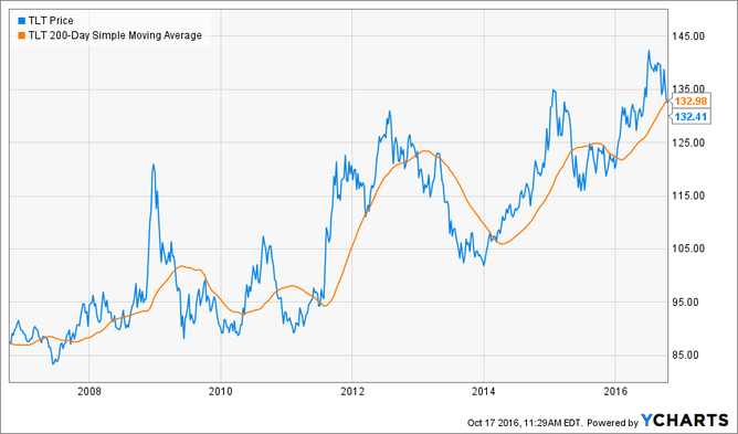
If we take a longer-term view, we can see that there have been some pretty big declines following breaks of the moving average.
In previous posts, we have discussed the risk of longer-dated bond maturities. It is worth being careful at current levels.
Gold
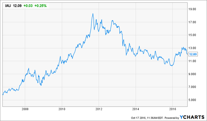
Gold has been on an opposite path to Bonds over recent years but has had a strong move in 2016. Today, price has violated the 200-day MA. Often, when a security breaks on the upside, you will get a retracement back to the moving average to give you a second chance to buy. So, the red light is suggesting to keep a close eye on Gold to make sure that it can recover and resume an upward movement. To confirm the positive move in Gold, we need to break recent highs in the $1300 range. A break to the downside could lead to a retest of recent lows.
Impact On Equity Markets
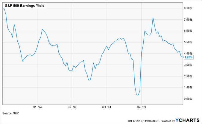
The chart below shows the Earnings Yield for the S&P 500. Notice how Earnings Yields have declined significantly (from 7.5% to 4.2%)? If bond yields increase, you may see earnings yields on stocks increase, caused by lower stock prices.
We have become accustomed to stock and bond prices trading in opposite directions and large moves in bond prices when stock prices collapse, like in 2008. Correlations change over time and stock prices have recently been more correlated to bond prices.
Conclusion
This is not a time for panic. A red light simply signifies that there may be some trouble on the horizon and that you should act more conservatively and monitor bond, equity and precious metals markets more closely.
To view a recording of today's Huddle, click on the video below.
[intense_video video_type="vimeo" video_url="https://player.vimeo.com/video/187689437" autoplay="0"]Copyright © Synchronicity Performance Consultants


