by James Picerno, The Capital Spectator
You can find any answer you want by comparing the current curve to various points in its history. Over the past 30 trading days, for instance, the curve is more or less unchanged. But comparisons over longer periods reveal a modest flattening.
A flatter curve may be a precursor to an inverted curve, which would cast a bearish shadow over the economic outlook. As economists are fond of pointing out, inverted yield curves (short rates above long rates) tend to precede recessions. In other words, the normal state of the curve (higher rates for longer maturities) is turned on its head when the state of macro turns dark.
The question is whether the yield-curve signal for estimating business-cycle risk has been rendered null and void thanks to manipulation of short rates in the extreme by the Federal Reserve via extraordinary monetary policy? That’s an ongoing debate, and threatens to remain so for some time. Meanwhile, let’s take the curve at face value and ask: Is it flattening?
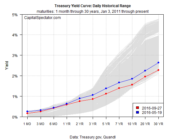
One way to keep the spin to a minimum is to look at the current shape of the curve in context with history. For example, the chart below shows the current set of yields (red line) as of yesterday, Sep. 27, based on daily data from Treasury.gov. The historical range of daily curve data since 2011 is depicted in gray. The main takeaway: short rates are near the top of this range while long rates are approaching the bottom.
In sum, the curve is relatively flat compared with the last five years.
But that’s been true for some time. The question is whether it’s becoming even flatter compared with recent history? Let’s consider one example—90 trading days as the look-back window. By that standard, the curve has become a touch flatter, as shown above by the red line dipping below the blue line across the yield spectrum.
What’s driving the flattening? Two main factors. The Fed, ever so lightly, has raised short rates, albeit with one round of squeezing last December. The central bank has, so far, been reluctant to perform an encore. On the long end, however, gravity is conspicuous.
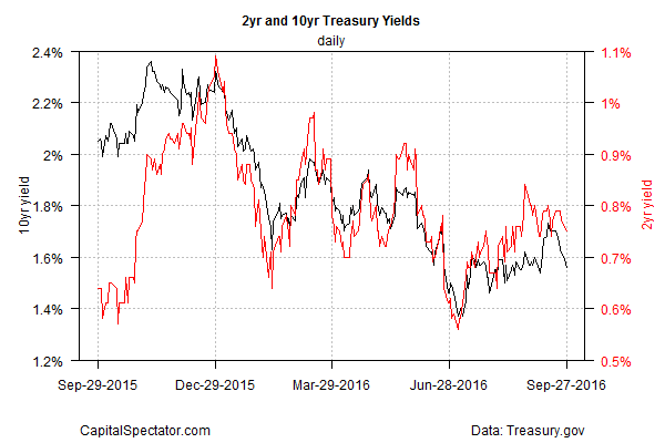
In fact, rates are ticking lower once again. The benchmark 10-year yield, for instance, dipped yesterday, easing to 1.56% on Tuesday, the lowest since Sep. 7.
Keep in mind that recession risk is still low, at least for data published to date, which at the moment runs through the August macro profile in terms of a broad set of indicators. Meantime, economists are projecting that third-quarter growth will accelerate in the government’s “advance” GDP report that’s due next month.
The Treasury yield curve, however, is pushing another narrative, namely, weak growth that’s at risk of sliding into something worse.
The burning mystery is whether the yield curve’s value as a business-cycle indicator has been left high and dry by the grand experiment in monetary policy? The jury’s still out.
But some analysts smell a regime shift in the air and warn that long yields are finally poised to rise. We’ve heard this before, of course, and it turned out to be dead wrong. But at some point the advice will be spot on. When? Right about now, according to Blackrock.
“It’s time to rethink the role of US Treasurys in portfolios, and specifically to be cautious of long-duration Treasurys,” warns Richard Turnill, global chief investment strategist at BlackRock, in a note to clients. “The risk-reward landscape for long-duration Treasurys is shifting.”
In that case, we’ll soon see a steeper yield curve, which implies firmer growth, or so the long run of history suggests. But similar forecasts for a steeper curve have come and gone in recent years as the curve has flattened. The great mystery is whether the autumn of 2016 is a turning point?
Copyright © The Capital Spectator


