


VanEck Vectors Morningstar Wide Moat ETF (MOAT)
by Bob Simpson, Synchronicity Performance Consultants
September 14, 2016
"The VanEck Vectors Morningstar Wide Moat ETF seeks to replicate as closely as possible, before fees and expenses, the price and yield performance of the Morningstar® Wide Moat Focus IndexTM (MWMFTR). The index is intended to track the overall performance of attractively priced companies with sustainable competitive advantages according to Morningstar's equity research team.
Index Description: MWMFTR is a rules-based, equal-weighted index intended to offer exposure to attractively priced companies with sustainable competitive advantages according to Morningstar's equity research team.”
Source: https://www.vaneck.com.au/funds/MOAT/Snapshot/
Let's look "Inside The Numbers."
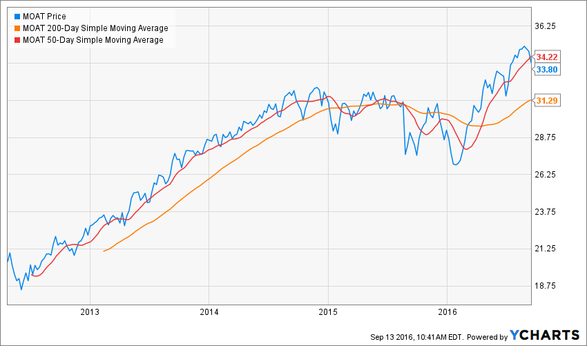
Since inception, MOAT has been a strong performer. It had a great run from 2012 through today with a brief pause in 2015. Moving averages are trending higher but it has recently broken down through the 50-day moving average, and this may result in a pull-back to the 200-day MA.
Price alone only tells part of the story. MOAT is one of the many choices available, when building ETF portfolios. The first question that must be answered is "is this ETF an index beater or is it just another, more expensive ETF that gets us benchmark or poorer than benchmark performance over time."
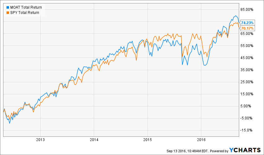
MOAT Total Return Price data by YCharts
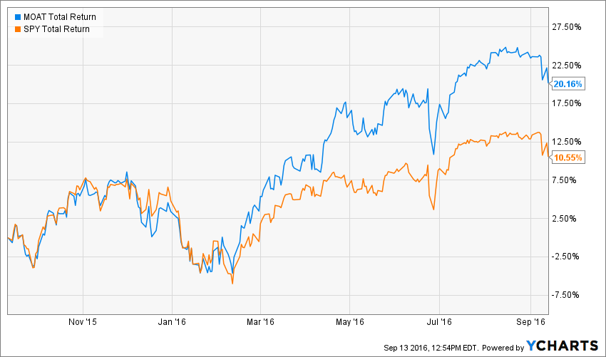
MOAT Total Return Price data by YCharts
Since inception, there has been little difference in performance between MOAT and SPY (S&P 500) but over the past year, MOAT's performance is almost double that of SPY.
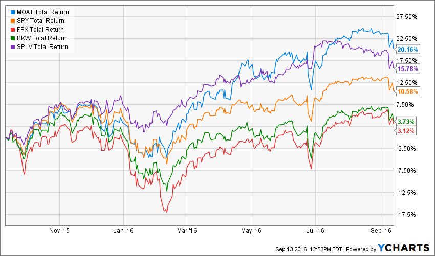
Next, let's compare it to several other smart beta ETFs: FPX (First Trust US IPO Index), PKW (PowerShares Buyback Achievers), RPG (Guggenheim S&P 500 Pure Growth), and SPLV (PowerShares S&P 500 Low Volatility).
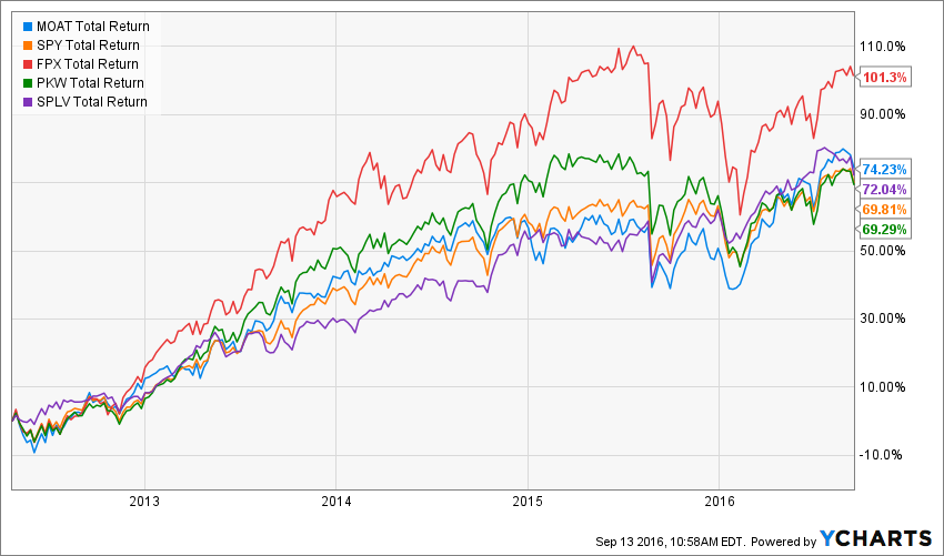
MOAT Total Return Price data by YCharts
MOAT Total Return Price data by YCharts
Over the past five years, MOAT has trailed only FPX, but over the past year, it is the clear winner.
One simple way to determine periods of out and underperformance is to view a ratio chart. A ratio chart divides the price of one security by that of another. The graphic below shows periods of outperformance (Green) and underperformance (Red). You don't need to be perfect in your timing - just try to invest with the trend. 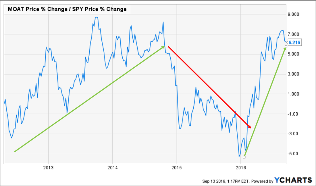 Finally, let’s look at the holdings. Analyzing holdings is helpful when combining ETFs or Mutual Funds in a model, as you can pull the data from YCharts into a portfolio template and see the aggregated asset allocation and sector exposure.
The table below shows the top 25 holdings of MOAT (Sep 13, 2016). 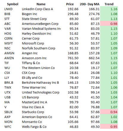 In the graphic above, we have created a simple spreadsheet that pulls price and the 200-day MA, and we can see that of the 25 biggest positions, only three are in a downtrend.
The Bottom Line
MOAT is an ETF that I would consider when building a US Equity portfolio. It currently ranks well against other smart beta ETFs and the US benchmarks. Over the longer-term, MOAT may perform slightly better than the benchmarks, but there will be periods of out and under performance.
Note: These posts are intended to teach you how to evaluate securities and to demonstrate the capabilities of YCharts. This is not a recommendation.
To book a demo and get set up for a 7-day trial, please e-mail bob.simpson@synchronicity.ca.
*****
Inside The Numbers is a three times a week equity/ETF feature for portfolio managers or those aspiring to be. Live sessions are held Fridays at Noon Eastern time. During these insightful sessions, a broad range of topics are discussed, ranging from financial markets, investment strategies, business development and how to use stock screening tools, like YCharts.
Synchroncity has been conducting these sessions each week since 2015 and recorded and posted them on their site. To date, they have conducted over 100 sessions with participation from a broad range of advisors across North America.
If you would like to attend live sessions, contact Bob Simpson at 905-502-0100, or via email at info@synchroncity.ca.
Copyright © Synchronicity Performance Consultants