Superman and Stocks: It's not the Cape (CAPE), it's the Kryptonite (Cash flow)!

Just about a week ago, I was on a 13-hour plane trip from Tokyo to New York. I know that this will sound strange but I like long flights for two reasons. The first is that they give me extended stretches of time when I can work without interruption, no knocks on the door or email or phone calls. I readied my lecture notes for next semester and reviewed and edited a manuscript for one of my books in the first half on the trip. The second is that I can go on movie binges with my remaining time, watching movies that I would have neither the time nor the patience to watch otherwise. On this trip, however, I made the bad decision of watching Batman versus Superman, Dawn of Justice, a movie so bad that the only way that I was able to get through it was by letting my mind wander, a practice that I indulge in frequently and without apologies or guilt. I pondered whether Superman needed his suit or more importantly, his cape, to fly. After all, his powers come from his origins (that he was born in Krypton) and not from his outfit and the cape seems to be more of an aerodynamic drag than an augmentation. These deep thoughts about Superman's cape then led me to thinking about CAPE, the variant on PE ratios that Robert Shiller developed, and how many articles I have read over the last decade that have used this measure as the basis for warning me that stocks are headed for a fall. Finally, I started thinking about Kryptonite, the substance that renders Superman helpless, and what would be analogous to it in the stock market. I did tell you that I have a wandering mind and so, if you don't like Superman or stocks, consider yourself forewarned!


The Stock Market’s CAPE

As stocks hit one high after another, the stock market looks like Superman, soaring to new highs and possessed of super powers.
There are many who warn us that stocks are overheating and that a fall is imminent. Some of this worrying is natural, given the market's rise over the last few years, but there are a few who seem to have surrendered entirely to the notion that stocks are in a bubble and that there is no rational explanation for why investors would invest in them. In a post from a couple of years ago, I titled these people as  bubblers and classified them into doomsday, knee jerk, conspiratorial, righteous and rational bubblers. The last group (rational bubblers) are generally sensible people, who having fallen in love with a market metric, are unable to distance themselves from it.
One of the primary weapons that rational bubblers use to back up their case is the Cyclically Adjusted Price Earnings (CAPE), a measure developed and popularized by Robert Shiller, Nobel prize winner whose soothsaying credentials were amplified by his calls on the dot com and housing bubbles. For those who don’t quite grasp what the CAPE is, it is the conventional PE ratio for stocks, with two adjustments to the earnings. First, instead of using the most recent year’s earnings, it is computed as the average earnings over the prior ten years. Second, to allow for the effects of inflation, the earnings in prior years is adjusted for inflation.  The CAPE case against stocks is a simple one to make and it is best seen by graphing Shiller’s version of it over time.

Shiller CAPE data (from his site)
The current CAPE of 27.27 is well above the historic average of 16.06 and if you buy into the notion of mean reversion, the case makes itself, right? Not quite! As you can see, even within the CAPE story, there are holes, largely depending upon what time period you use for your averaging. Relative to the fully history, the CAPE looks high today, but relative to the last 20 years, the story is much weaker. Contrary to popular view, mean reversion is very much in the eyes of the beholder.

The CAPE’s Weakest Links

Robert Shiller has been a force in finance, forcing us to look at the consequences of investor behavior and chronicling the consequences of “irrational exuberance”. His work with Karl Case in developing a real estate index that is now widely followed has introduced discipline and accountability into real estate investing and his historical data series on stocks, which he so generously shares with us, is invaluable. You can almost see the “but” coming and I will not disappoint you. Of all of his creations, I find CAPE to be not only the least compelling but also potentially the most dangerous, in terms of how often it can lead investors astray. So, at the risk of angering those of you who are CAPE followers, here is my case against putting too much faith in this measure, with much of it representing updates of what my post from two years ago.
1. The CAPE is not that informative
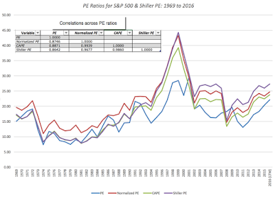
The notion that CAPE is a significant improvement on conventional PE is based on the two adjustments that it makes, first by replacing earnings in the most recent period with average earnings over ten years and the second by adjusting past earnings for inflation to make them comparable to current earnings. Both adjustments make intuitive sense but at least in the context of the overall market, I am not sure that either adjustment makes much of a difference. In the graph below, I show the trailing PE, normalized PE (using the average earnings over the last ten years) and CAPE for the S&P 500 from 1969 to 2016 (last twelve months). I also show Shiller's CAPE, which is based on a broader group of US stocks in the same graph.
Download spreadsheet with PE ratios

First, it is true that especially after boom periods (where earnings peak) or economic crises (where trailing earnings collapse), the CAPEs (both mine and Shiller's) yield different numbers than PE.  Second, and more important, the four measures move together most of the time, with the correlation matrix shown in the figure. Note that the correlation is close to one between the normalized PE and the CAPE, suggesting that the inflation adjustment does little or nothing in markets like the US and even the normalization makes only a marginal difference with a correlation of 0.86 between the unadjusted PE and the Shiller PE.


2. The CAPE is not that predictive

The question then becomes whether using the CAPE as a valuation metric yields judgments about stocks that are superior to those based upon just PE or normalized PE. To test this proposition, I looked at the correlation between the value sof different metrics, including trailing PE, CAPE, the inverse of the dividend yield, earnings yield and the ratio of Shiller PE to the Bond PE) today and stock returns in the following year and the following five years:
There is both good news and bad news for those who use the Shiller CAPE as their stock valuation metric. The good news is that the fundamental proposition that stocks are more likely to go down in future periods, if the Shiller CAPE is high today, seems to be backed up. The bad news is two fold. First, the relationship is noisy or in investment parlance, the predictive power is low, especially with one-year returns. Second, the trailing PE actually does a better job of predicting one-year returns than the CAPE and while CAPE becomes the better predictor than trailing PE over a five-year period, it is barely better than using a dividend yield indicator.  While I have not included these in the table, I will wager that any multiple (such as EV to EBITDA) would do as good (or as bad, depending on your perspective) a job as market timing.

As a follow-up, I ran a simple test of the payoff to market timing, using the Shiller CAPE and actual stock returns from 1927 to 2016. At the start of every year, I first computed the median value of the Shiller CAPE over the previous fifty years and assumed an over priced threshold at 25% above the median (which you can change). If the actual CAPE was higher than the threshold, I assumed that you put all your money in treasury bills for the following year and that if the CAPE was lower than the threshold, that you invested all your money in equities. (You can alter these values as well). I computed how much $100 invested in the market in 1927 would have been worth in August of 2016, with and without the market timing based on the CAPE:

Download spreadsheet and change parameters

Note that as you trust CAPE more and more (using lower thresholds and adjusting your equity allocation more), you do more and more damage to the end-value of your portfolio. The bottom line is that it is tough to get a payoff from market timing, even when the pricing metric that you are using comes with impeccable credentials.


3. Investing is relative, not absolute

Notwithstanding its weak spots, let’s take the CAPE as your measure of stock market valuation. Is a CAPE of 27.27 too high, especially when the historic norm is closer to 16? The answer to you may sound obvious, but before you do answer, you have to consider where you would put your money instead. If you choose not to buy stocks, your immediate option is to put your money in bonds and the base rate that drives the bond market is the yield on a riskless (or close to riskless) investment. Using the US treasury bond as a proxy for this riskless rate in the United States, I construct a bond PE ratio using that rate:
Bond PE = 1/ Treasury Bond Rate
Thus, if you invest in a treasury bond on August 22, with a yield of 1.54%, you are effectively making 64.94 (1/.0154) times your earnings. In the graph below, I graph Shiller’s measures of the CAPE against this T.Bond PE from 1960 to 2016:

Download T Bond Rate PE data
I also compute a ratio of stock PE to T.Bond PE that will use as a measure of relative stock market pricing, with a low value indicating that stocks are cheap (relative to T.Bonds) and a high value suggesting the opposite. As you can see, bringing in the low treasury bond rates of the last decade into the analysis dramatically shifts the story line from stocks being over valued to stocks being under valued. The ratio is as 0.42 right now, well below the historical average over any of the time periods listed, and nowhere near the 1.91 that you saw in 2000, just before the dot com bust or  even the 1.04 just before the 2008 crisis.

4. Its cash flow, not earnings that drives stocks

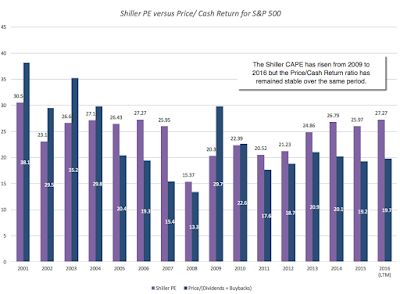
The old adage that it is cash flows, not earnings, that drives stocks is clearly being ignored when you look at any variant of PE ratios. To provide a sense of what stock prices look like, relative to cash flows, I computed a multiple of total cash returned to stockholders by companies (including buybacks) and compared these multiples to Shiller’s CAPE in the graph below:
S&P 500 Earnings and Cash Payout
Here again, there seems to be a disconnect. While the CAPE has risen for the market, from 20.52 in 2009 to 27.27 in 2016, as stocks soared during that period, the Price to CF ratio has remained stable over that period (at about 20), reflecting the rise in cash returned by US companies, primarily in buybacks over the period.
Am I making the case that stocks are under valued? If I did, I would be just as guilty as those who use CAPE to make the opposite case. I am not a market timer, by nature, and any single pricing metric, no matter how well reasoned it may be, is too weak to capture the complexity of the market. Absolutism in market timing is a sign of either hubris or ignorance.

The Market’s Kryptonite

At this point, if you think that I am sanguine about stocks, you would be wrong, since the essence of investing in equities is that worry goes with it. If it’s not the high CAPE that is worrying me, what is? Here are my biggest concerns, the kryptonite that could drain the market of its strength and vitality.

  1. The Treasury Alternative (or how much are you afraid of your central bank?)  If the reason that you are in stocks is because the payoff for being in bonds is low, that equation could change if the bond payoff improves. If you are Fed-watcher, convinced that central banks are all-powerful arbiters of interest rates, your nightmares almost always will be related to a meeting of the Federal Open Market Committee (FOMC), and in those nightmares, the Fed will raise rates from 1.50% to 4% on a whim, destroying your entire basis for investing in stocks. As I have noted in these earlier posts, where I have characterized the Fed as the Wizard of Oz and argued that low rates are more a reflection of low inflation and anemic growth than the result of quantitative easing, I believe that any substantial rate rises will have to come from shifts in fundamentals, either an increase in inflation or a surge in real growth. Both of these fundamentals will play out in earnings as well, pushing up earnings growth and making the stock market effect ambiguous. In fact, I can see a scenario where strong economic growth pushes T. bond rates up to 3% or higher and stock markets actually increase as rates go up.
  2. The Earnings Hangover It is true that we saw a long stint of earnings improvement after the 2008 crisis and that the stronger dollar and a weaker global economy are starting to crimp earnings levels and growth. Earnings on the S&P 500 dropped in 2015 by 11.08% and are on a pathway to decline again this year and if the rate of decline accelerates, this could put stocks at risk. That said, you could make the case that the earnings decline has been surprisingly muted, given multiple crises, and that there is no reason to fear a fall off the cliff. No matter what your views, though, this will be more likely to be a slow-motion correction, offering chances for investors to get off the stock market ride, if they so desire.
  3. Cash flow Sustainability: My biggest concern, which I voiced at the start of the year, and continue to worry about is the sustainability of cash flows. Put bluntly, US companies cannot keep returning cash at the rate at which they are today and the table below provides the reason why:
Year Earnings Dividends Dividends + Buybacks Dividend Payout Cash Payout
2001 38.85 15.74 30.08 40.52% 77.43%
2002 46.04 16.08 29.83 34.93% 64.78%
2003 54.69 17.88 31.58 32.69% 57.74%
2004 67.68 19.407 40.60 28.67% 59.99%
2005 76.45 22.38 61.17 29.27% 80.01%
2006 87.72 25.05 73.16 28.56% 83.40%
2007 82.54 27.73 95.36 33.60% 115.53%
2008 49.51 28.05 67.52 56.66% 136.37%
2009 56.86 22.31 37.43 39.24% 65.82%
2010 83.77 23.12 55.53 27.60% 66.28%
2011 96.44 26.02 71.28 26.98% 73.91%
2012 96.82 30.44 75.90 31.44% 78.39%
2013 107.3 36.28 88.13 33.81% 82.13%
2014 113.01 39.44 101.98 34.90% 90.24%
2015 100.48 43.16 106.10 42.95% 105.59%
2016 (LTM) 98.61 43.88 110.62 44.50% 112.18%

In 2015, companies in the S&P 500 collectively returned 105.59% of their earnings as cash flows. While this would not be surprising in a recession year, where earnings are depressed, it is strikingly high in a good earnings year. Through the first two quarters of 2016, companies have continued the torrid pace of buybacks, with the percent of cash returned rising to 112.18%. The debate about whether these buybacks make sense or not will have to be reserved for another post, but what is not debatable is this. Unless earnings show a dramatic growth (and there is no reason to believe that they will), companies will start revving down (or be forced to) their buyback engines and that will put the market under pressure. (For those of you who track my implied equity risk premium estimates, it was this concern about cash flow sustainability that led me to add the option of allowing cash flow payouts to adjust to sustainable levels in the long term).

So, how do these worries play out in my portfolio? They don’t explicitly but they do implicitly affect my investment choices. I cannot do much about interest rates, other than react, and I will stay ready, especially if inflation pressures push up rates and the fixed income market offers me a better payoff. With earnings and cash flows, there may be concerns at the market level, but I bet on individual companies, not markets. With those companies, I can do my due diligence to make sure that they have the operating cash flows (not just dividends or buybacks) to justify their valuations. If that sounds like a pitch for intrinsic valuation, are you surprised?


The Market Timing Mirage

Will there be a market correction? Of course! When it does happen, don't be surprised to see a wave of “I told you so” coming from the bubblers. A clock that is stuck at 12 a'clock will be right twice every day and I would urge you to judge these market timers, not on their correction calls, which will look prescient, but on their overall record. Many of them, after all, have been suggesting that you stay out of stocks for the last five years or longer and it would have to be a large correction for you to make back what you lost from staying on the sidelines. Some of these pundits will be crowned as great market timers by the financial press and they will acquire followers. I hope that I don’t sound like a Cassandra but this much I know, from studying past history. Most of these great market timers usually get it right once, let that success get to their heads and proceed to let their hubris drive them to more and more extreme predictions in the next cycle. As an investor, my suggestion is that you save your money and your sanity by staying far away from market prognosticators.


YouTube

Datasets

  1. PE ratios from 1960-2016
  2. Shiller CAPE and T.Bond PE (1960-2016)
  3. S&P 500: Earnings, Dividends and Buybacks (2000-2016)
  4. CAPE Market Timing Test
Total
0
Shares
Previous Article

Yellen’s Jackson Hole Remarks Make US Rate Hike More Likely

Next Article

How premier advisors build teams—part 2: The informal team

Related Posts
Subscribe to AdvisorAnalyst.com notifications
Watch. Listen. Read. Raise your average.