ETFs: Process Matters As Much As Fees
by Justin Sibears, Newfound Research
Summary
- Fees are always a prominent topic in ETF selection, but they are not the only cost associated with the product.
- Even with seemingly similar passive ETFs, different index construction methodologies can lead to widely varying performance.
- Taking a holistic view that incorporates both the investment process and the fee can lead to a selecting an ETF with a higher expense ratio if its investment processes has more empirical and theoretical support.
Do a quick Google search for “ETF advantages.” You will notice a few main themes. In 9 of the top 10 links, lower expenses are noted as a key benefit of ETFs vs. other product wrappers.
Fees do matter when picking investment products. There is no way around this. All else being equal, investors are usually best served by minimizing fees.
The problem is that most of the time all else isn’t equal.
When listening to advisors talk about picking mutual funds or SMA strategies, we constantly hear about the importance of investment process. In fact, a 2013 Aberdeen Asset Management survey found that clarity in investment process and strategy was on average the most important factor when picking mutual funds, beating out historical returns and fund rankings.
While ETFs – at least those of the passively managed variety – are simply managed to track an index, they still have an investment process. The only difference is that this investment process is laid out with full transparency in an index methodology document.
As an example, here is the methodology used by S&P Dow Jones Indices for their U.S. equity products.
Last week, we explained why growth is not “not value.” This week, we will highlight a few more general, yet still important points about index construction for ETFs:
- Index construction matters, oftentimes just as much as or more than fees.
- Different index methodologies can lead to surprisingly different outcomes, even for ETFs that sound almost identical.
- In some cases, index methodologies are innocuously different from one another and fees can be an important deciding factor. In other cases, there is strong evidence that one methodology is just plain better than another. In these cases, there may be very good reason to forego the cheapest option in favor of a more expensive, but more sound investment process.
Sticking with value ETFs, we used ETFdb.com to identify all ETFs in the U.S. large-cap category, with value in the name, at least 10 years of track record, and at least $500 million in AUM. There were six ETFs that met these criteria:
- IWD: a iShares ETF tracking the Russell 1000 Value Index
- VTV: a Vanguard ETF tracking the CRSP US Large-Cap Value Index
- IVE: a iShares ETF tracking the S&P 500 Value Index
- PWV: a PowerShares ETF tracking the Dynamic Large Cap Value Intellidex Index
- IUSV: a iShares ETF tracking the Russell 3000 Value Index
- RPV: a Guggenheim ETF tracking the S&P 500 Pure Value Index
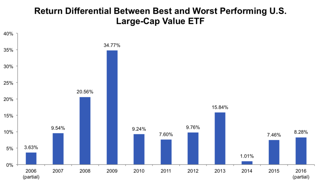
We then calculated the return differential between the best and worst performing ETF in each year (i.e. by how much did the best performing value ETF beat the worst performing value ETF on a year-by-year basis).
The average size of this spread is 11.6% per year. To put this into perspective, the most expensive of these six ETFs costs 0.57% and the least expensive costs 0.09%. The 11.6% average annual performance differential swamps the 0.48% fee spread by 24x!
Source: Data from Yahoo! Finance and ETFdb.com, calculations by Newfound
But maybe the cheaper ETFs are always outperforming the more expensive ETFs?
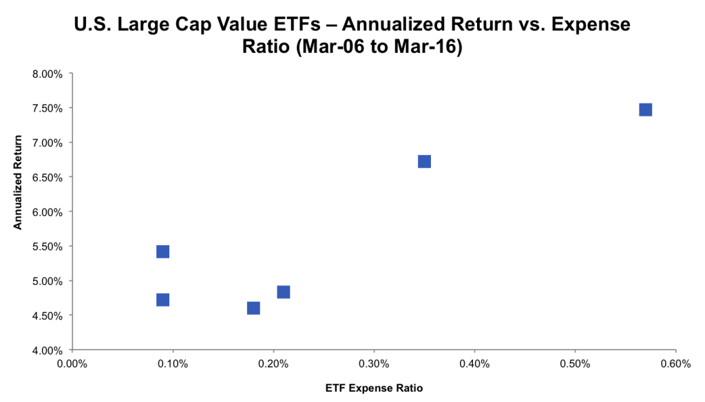
We can explore this question by plotting annualized returns vs. expense ratios. If cheaper value ETFs outperformed, we would expect the points to be downward sloping from the upper left (high returns and low cost) to the lower right (low returns and high cost).
In reality, we see the exact opposite. For this very limited sample, the two best performing ETFs are also the two most expensive. And remember, these are net-of-fee returns. The ETFs in the upper right made up for their higher cost and then some.
Source: Data from Yahoo! Finance and ETFdb.com, calculations by Newfound
One very, very, very important note: we are not implying that higher fees will result in better performance.
We are simply saying that the opposite doesn’t always hold either. Lower fees will not always result in better performance.
So now that we have sufficiently muddied the waters, what are the takeaways?
If two ETFs track the exact same index, go with the cheapest option. However, one caveat makes things even more complicated: the expense ratio is not the only cost of using an ETF. Implicit costs, like bid-ask spreads, also exist. As a tactical manager, we are sometimes willing to pay up – in the form of higher expense ratios – for lower implicit costs (e.g. better liquidity).
If two ETFs track different indices, then we need to dig a bit further. Do we have a view as to whether the expected return of ETF ABC is better or worse than the expected return of ETF XYZ? If not, the cheapest option may still be the best. Just be forewarned that there will be prolonged periods where your cheaper alternative may underperform more expensive options. This is normal. Be wary of performance chasing as this may not only increase your costs, but also hurt performance.
On the other hand, if we have a view that a more expensive ETF has a superior process that will outperform over time and that this outperformance will overcome the fee differential, foregoing the lowest cost option may be totally justified.
One Exposure, Two Very Different Outcomes
U.S. small-cap is a great example of an exposure where index construction reigns supreme. At first, this might come as a bit of a surprise since small-cap is a pretty plain vanilla exposure.
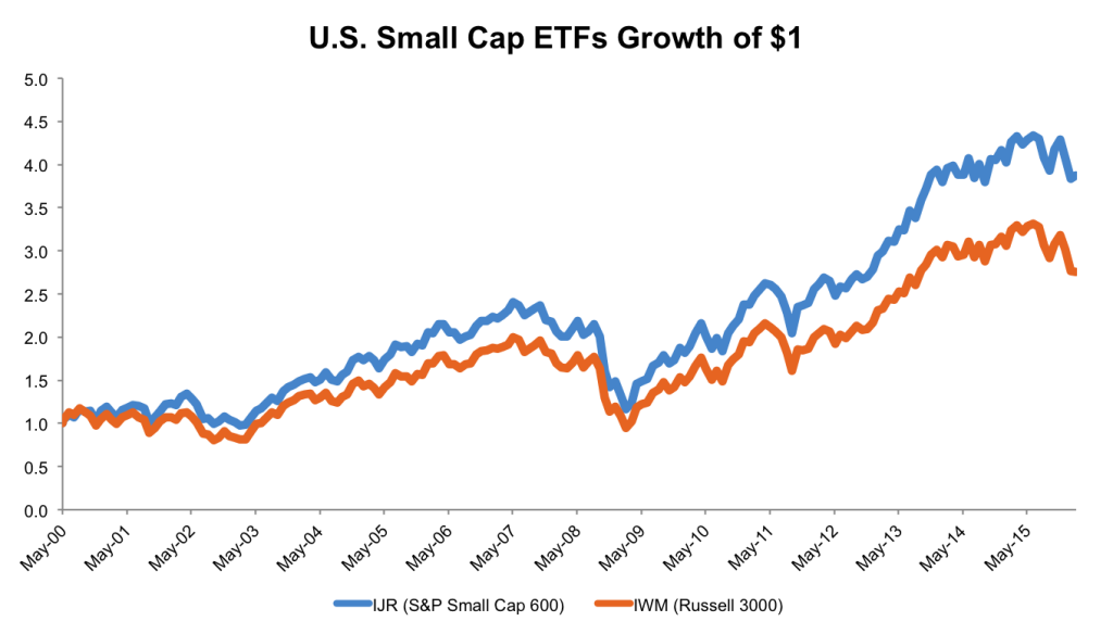
We’ve shown the chart below to a few people over the years and shock is the most common response. It plots the performance of two ETFs: IJR and IWM. IJR and IWM track the S&P Small Cap 600 and the Russell 2000 indices, respectively. While there are many ETFs in the U.S. small-cap space, these two are among the oldest and track the two biggest brand name indices.
Source: Data from Yahoo! Finance, calculations by Newfound
The performance gap is astounding.
- IJR has beaten IWM by 2.33% per year with lower volatility (19.35% vs. 20.51%)
- $100k invested in IJR in May 2000 would be worth $387k today. Had the same $100k been invested in IWM, the current value would be only $276k.
- IJR has outperformed IWM in 10 of the 15 full years that both have been in existence. The last year that IWM beat IJR was 2012, and that was by a measly 40bps. The last year that IWM beat IJR by at least 100bps was 2009.
While IJR’s (and by extension the S&P Small Cap 600’s) performance is impressive, this should not in and of itself be the basis for an investment decision.
We have a saying at Newfound that data should never trump insight, but theories must always be supported by the data.
We have the data that IJR has outperformed IWM. But is there a rigorously supported theory as to why this should be the case? If we have such a theory, we can make an educated forecast around the probability of the outperformance continuing in the future
Without a theory, we have no way of knowing whether or not IJR’s historical outperformance is a fluke, and we could end up chasing performance just when the tides are about to turn.
Fortunately, in this case we do have a theory. And it comes from an AQR paper titled “Size Matters, If You Control Your Junk.”
The authors admit that the size factor has faced a lot of criticisms from opponents. However, they argue that this is because small companies are typically “junky” and “junk” companies tend to underperform “quality” companies.
Once AQR controlled for quality/junk, the size premium re-emerged with force.
Practically speaking, this implies that it is not small-caps broadly that provide a positive risk premium, but rather higher quality small-caps.
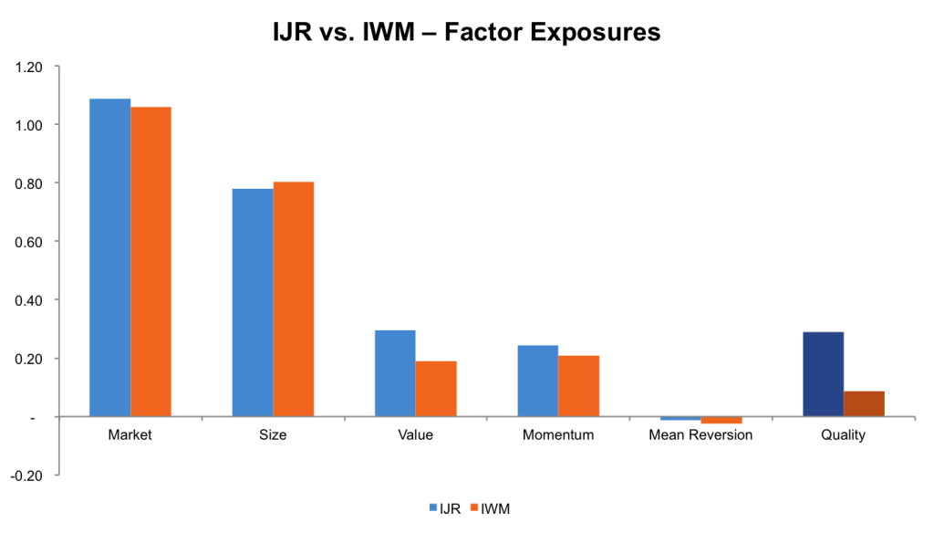
When we explore the performance of IJR and IWM with a factor model, we see that this is exactly what is going on. IJR and IWM both have relatively similar exposures to the market, size, momentum, and mean reversion factors. IJR does have a bit of a value tilt. But it’s really the quality factor where we see the difference arise. IJR has 3x more exposure to “quality” vs. “junk” companies.
Source: Data from Yahoo! Finance and AQR, calculations by Newfound
When we return to our trusty index methodologies, we see exactly why this is the case. In the S&P Small Cap 600 methodology, we see that “financial viability” is one of the eligibility criteria.
Quoting from the document:
“Financial Viability. The sum of the most recent four consecutive quarters’ as-reported earnings should be positive as should the most recent quarter. As-reported earnings are Generally Accepted Accounting Principles (GAAP) net income excluding discontinued operations and extraordinary items. For equity REITs, financial viability is based on as-reported earnings and/or Funds From Operations (FFO), if reported. FFO is a measure commonly used in equity REIT analysis. Another measure of financial viability is a company’s balance sheet leverage, which should be operationally justifiable in the context of both its industry peers and its business model.”
No such criteria are baked into the Russell 2000 process.
Positive earnings and reasonable leverage? Sounds a lot like quality to me.
While fees remain an important deciding factor in ETF selection, investment process may make a more expensive TEF a better option. In order to make a fair comparison, you must make sure that one apple is not merely an orange in disguise.
Copyright © Newfound Research


