A surprise from rotational analysis
by Cam Hui, Humble Student of the Markets
One of my tools in my market analysis toolbox is leadership analysis. In particular, I found that in bull phases, it pays to buy the market leaders (see Momentum + Bull market = Chocolate + Peanut butter). I was playing around with Relative Rotation Graphs, or RRG, the other day and what I found was a surprise.
RRG charts are a way of visually depicting sector rotation. Here is the way they are described at stockcharts:
Relative Rotation Graphs (“RRG charts”) show you a security’s relative strength and momentum relative to a collection of other securities. RRG charts were developed by Julius de Kempenaer and have been available on Bloomberg terminals since 2011. RRG charts differ from most other financial charts in that the horizontal axis does not represent time. An RRG chart is a scatter plot with Julius’ Relative Strength Ratio indicator as the horizontal axis and his Relative Strength Momentum indicator as the vertical axis.
Note: Both “Relative Rotation Graph™” and “RRG™” are registered trademarks of RRG Research.
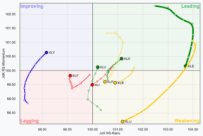
Here’s an example of an RRG chart:
The example chart above shows an idealized view of sector rotation. Sectors move from the lower left lagging quadrant in a clockwise fashion to improving, leading, weakening and back to lagging again.
Country and regional relative strength
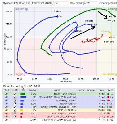
The standard approach to RRG analysis is to measure the relative strength of individual sectors against the market index, such as SPX. In my instance, I looked at the returns of different countries and regions against the MSCI All-Country World Index (ACWI). The country and regional returns are US-listed ETFs, which trade in USD, and therefore all currency effects are included in this analysis.
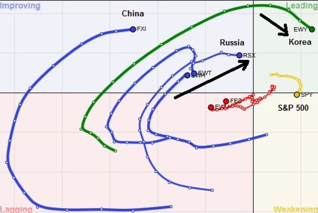
When I looked at this chart, the surprise to me is how market leadership is evolving. The leader was South Korea, followed by Russia (!) as a fast improving country. The US market (in yellow) remains in the leadership quadrant, but it is weakening.
Russian (oil) and South Korean (capital goods) stocks are classic bellwethers of late cycle markets, which confirms my past views that we are entering into a phase where deep and late cyclical stocks are outperformers (see How to energize returns even as momentum fades and Profiting from a late cycle market).
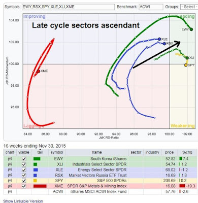
Here is an RRG chart that mixes Russia and South Korea with US energy, mining and industrial stock ETFs, which illustrates how closely correlated these groups are, with the exception of the faltering mining stocks. Like the previous chart, performance for these ETFs are measured against ACWI.
Confirmation from Europe
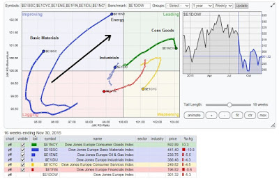
I further found confirmation of my analysis by looking at the behavior of European sectors. As the chart below shows, basic materials, energy and industrial sectors are all in the top-left improving quadrant and poised into moving into the top-right leadership quadrant.
In conclusion, the ascendancy effect seen in late cycle sectors and countries are global. Investors should therefore start moving into these sectors for better returns in the first half of 2016.
Copyright © Humble Student of the Markets


