


A new way to visualize sector momentum
A couple of months ago I wrote a post about the behavioral principals behind the momentum effect in the markets. In that post, I highlighted some reasons why momentum persists and how to internalize the process. I wanted to create a visual reference to help understand just how these winning and losing streaks manifest over time.
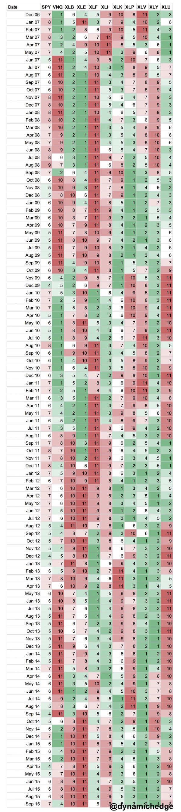
Below is a table which ranks the 12-month returns for the S&P 500 ($SPY), Real Estate ($VNQ) and the constituent sectors which make up the S&P 500 index ($XLB, $XLE, $XLF, $XLI, $XLK, $XLP, $XLV, $XLY, $XLU.
The rankings are color coded so the best relative returns are green and the worst relative returns are red.
Simply look at the streaks in returns. Jaw dropping.
It highlights some of the most important themes of the last 5-years:
- Energy 2007: 13-months of outperformance
- Financials 2007-09: 30-months of underperformance
- Consumer Discretionary 2009-10 21-months outperformance off the bottom of crisis lows
- Healthcare 2012-15: 36-months of outperformance
- Financials 2012: 12-months of outperformance (and leadership in an uncertain tape).
- Energy 2014-15: 13-months (and counting) of underperformance
The takeaway for me is that this relatively simple filter helps you participate in the most important uptrends and avoiding the most destructive downtrends. It’s easy to look backwards and connect the dots, but hopefully this will provide confidence going forward to trust more in the momentum of the market and keep investors from missing out on the big moves.
Disclaimer: Nothing on this site should ever be considered to be advice, research or an invitation to buy or sell any securities, please click here for a full disclaimer.
Copyright © Dynamic Hedge