James Picerno, The Capital Spectator
History shows rather clearly that the stock market is prone to extreme events, aka crashes. The challenge is deciding when the risk for a repeat performance is unusually high. The literature offers endless possibilities, which is a reminder that the market can crumble for any number of reasons. The leading factor, of course, is the business cycle. But internal market issues can’t be ignored either, including abnormally high valuation. All of which inspires a relatively broad-minded system for monitoring the key risk factors.
With that in mind, I’ve developed what I think of as a crash-risk index for the US stock market (S&P 500), which draws on signals from ten metrics that are reflecting different factors. (As a preview, crash risk as of yesterday (June 24) was low. Before we look at the chart, let’s review a few details.)
The idea here is that by monitoring a broad set of signals with a history of providing early warnings, we can spot those periods when the potential for a crash is elevated.
A few caveats before we review the history. First, a comparatively high risk isn’t a guarantee. There’s an old saying that markets can remain irrational for longer than you can stay solvent. That doesn’t mean we should ignore danger signs. But it’s all about odds—skewed odds, in this case.
Keep in mind too that no one really knows what will trigger a crash in the future. The possibility is always lurking for the confluence of unprecedented and therefore unexpected events. Nonetheless, prudence strongly suggests that we should keep a close eye on the known risk factors. That’s a high bar, of course, in part because reasonable minds can come up with a long risk of factors. But we can certainly take a hefty bite out of this problem by systematically monitoring a carefully selected list of indicators.
Here are ten that have a history of providing timely warnings, albeit not necessarily at the same time. But that’s intentional. Ideally, we should be looking at a broad set of indicators that exhibit a degree of independence from one another. In short, a diversified set of signals.
What follows isn’t comprehensive, but the list that follows is a long way from cherry-picking one or two indicators, which can lead to misguided conclusions about market risk. Several of these indicators have been discussed previously on these pages—the econometric measure of bubble risk, for instance. For now, I’ll offer only a brief summary of each before looking at the historical results.
As for combining the ten signals into one index, the process is quite simple, albeit with a degree of subjectivity. In all cases I’m converting the raw data into binary signals: zero (no risk) or 1.0 (extreme risk). This is accomplished by translating most of the raw data into percentile ranks based on the historical record (rolling one-year S&P 500 return, for instance). In some cases, the raw numbers are better suited to direct use and so the the task is choosing tipping points (S&P 500 drawdown, for instance).
The subjectivity is introduced by deciding when an indicator has crossed into the red zone. Minds will differ, of course, in part based on the goals of the analysis. In this project, the focus is on extreme events rather than a garden-variety correction. Think 2008-2009, for example. In any case, choices about parameters have to be made. For the rolling one-year market return, for instance, only trailing performance that falls below the 20th percentile relative to history is considered an elevated level of risk, in which case that condition is labeled with a 1.0. Otherwise, the market state is labeled with 0.0, which is to say a neutral/low-risk climate.
The ten signals are aggregated on a daily basis and divided by 10 so that a crash-risk level of 1.0 reflects extreme risk—all ten indicators are flashing a warning. At the opposite extreme, zero indicates low risk–no indicators are flashing red.
One other note: the choice of the indicators is partly a reflection of the goal of developing an index with daily signals that are immune to revision risk. Why? To maximize timeliness and reliability. There’s a tradeoff between the two, and so one has to pick one’s poison. Accordingly for this project, all the inputs are drawn from the financial markets.
Here’s a brief summary of the ten indicators, followed by a look at the historical record for the aggregated index:
1. Rolling 1-year % return for the S&P 500
2. The VIX Index, which measures market expectations for stock market volatility
3. Error-adjusted momentum for the S&P 500, which provides a quantitative measure of how a naïve forecast of market volatility compares with actual results. For details, see this post.
4. Credit spread, based on BofA Merrill Lynch US High Yield Master II Option-Adjusted Spread.
5. A quantile-based review of a simple 10-day moving average of the S&P 500 in connection with the historical record. The premise is that when the current moving average falls below the 5th percentile (based on the trailing 252-day period) of the moving average, downside risk is elevated.
6. Drawdown of the S&P 500. Risk is considered elevated when drawdowns rise above the 50th percentile of severity.
7. A quantitative test for the presence of bubble risk in the S&P 500. For details, see this post.
8. A quantitative test for the presence of a bear-market regime. For details, see this post.
9. A proxy for fundamental market valuation based on a combination of 3-, 4- and 5-year trailing return. Some researchers find that a return-based measure of medium-term performance serves as a useful guide for estimating market valuation.
10. A market-based proxy for estimating US business-cycle risk. For details, see this post.
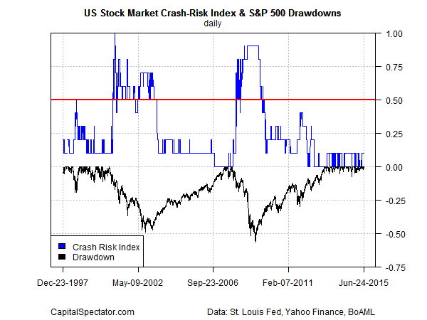
Here’s how the crash-risk index stacks up from the end of 1997 through yesterday (June 24). Note that risk is low at the moment, as shown by the blue line in the upper half of the chart. The only warning signal these days is coming from the 3-5-year valuation proxy, which implies that the market valuation is elevated compared with the historical record.
The major market downturns over the last 20 years have been accompanied by a rise in the crash risk index above 0.5 (red horizontal line), a state that reflects that half of the indicators are flashing red. For some market perspective, downturns are indicated below via drawdowns for the S&P 500, as shown by the black line in the lower half of the chart. The scale on right for drawdowns shows percentage losses. For example, a 50%-plus drawdown marks the extreme point during the 2008-2009 financial crisis.
All of which leaves us with a question: Is the relatively high valuation in the stock market enough to create a severe market correction? No, according to history, which is to say that there needs to be other risk factors in play that conspire to create a tipping point. For the moment, there are no obvious catalysts, at least nothing that’s in the extreme. Of course, that could change rather quickly, which is why routinely monitoring a broad set of risk indicators is essential.
Copyright © The Capital Spectator


