


#5. Mortgage refinancing
The Mortgage Bankers Association reported that refinancing applications soared by about 50% in the last month, as mortgage rates reached new 18 month lows. Bill McBride has the graph:
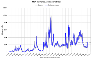
Refinancing is coming back to life. This puts more money in the pockets of the homeowners who get lower monthly mortgage payments.
#4 Gas prices
Here is a graph of gas prices (blue) compared with average hourly earnings (red) since the turn of the Millennium:
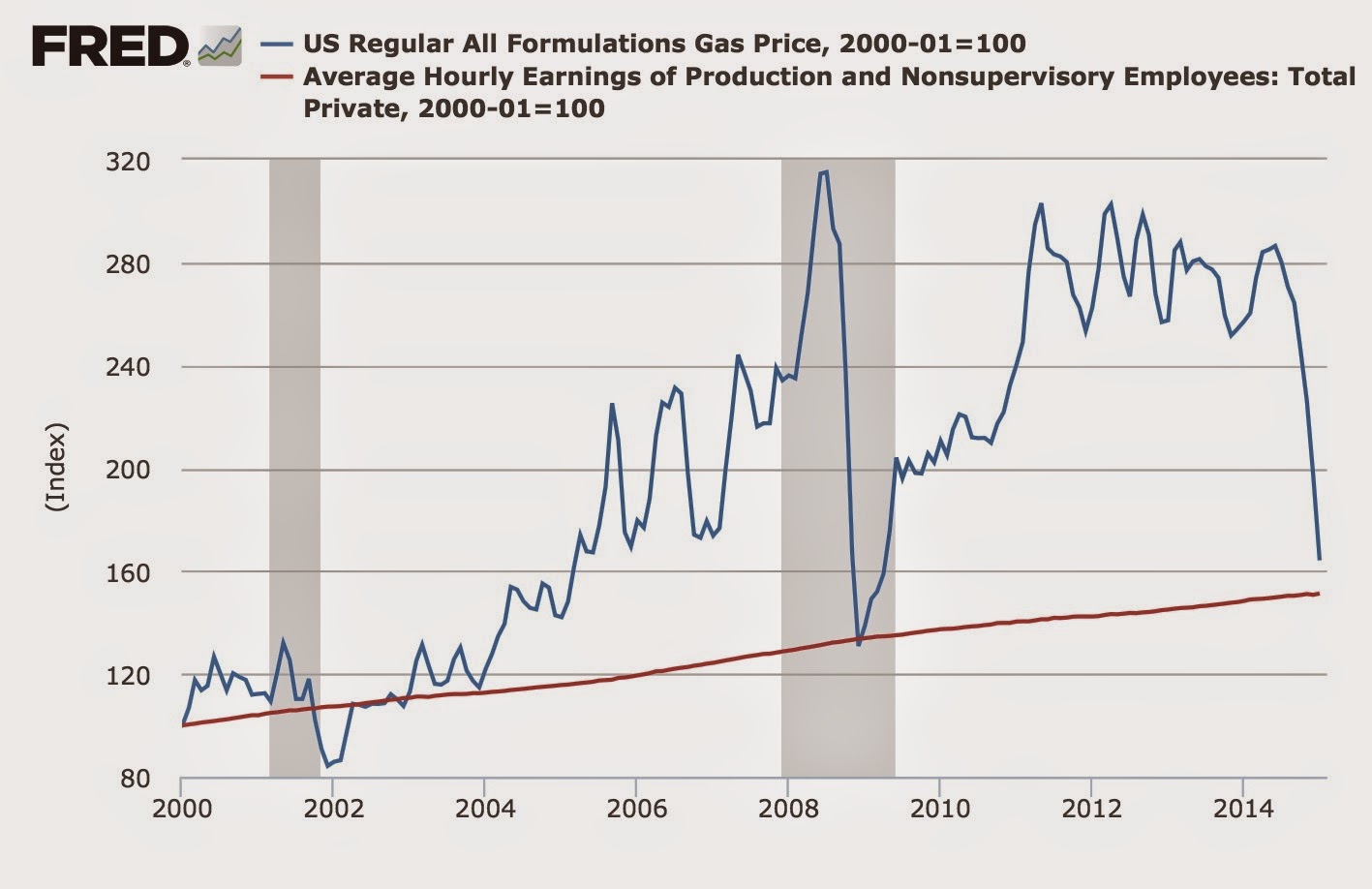
With the exception of a few months in the worst of the Great Recession and late 2001 through 2003, an hour's wage now buys more gas than at any time in the last 15 years. Again, this puts more money in the pockets of virtually all consumers.
#3 Part time employment for economic reasons
This is a graph of part time workers for economic reasons expressed as a percentage of the labor force:
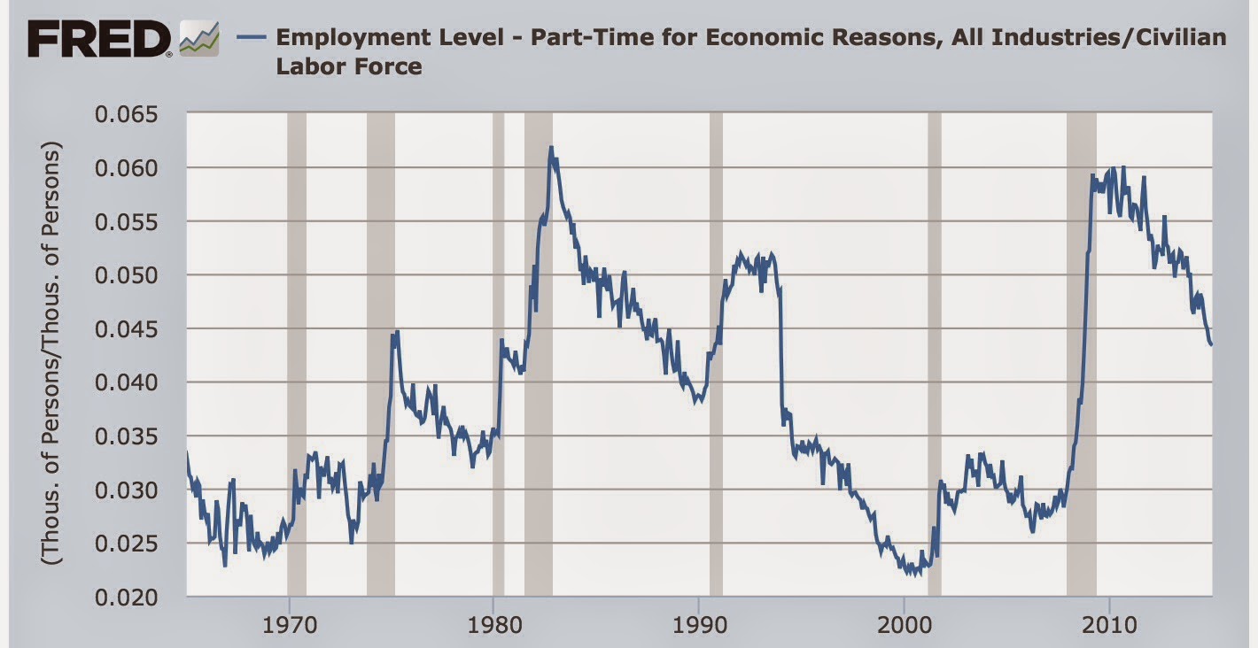
In January this ratio improved slightly, bringing us equivalent to its levels in 1988, but still 2% (about 3 million) above the boom level of 1999 and about 1.5% (2.25 million) above the level of 2007.
#2 Not in Labor force but want a job now:
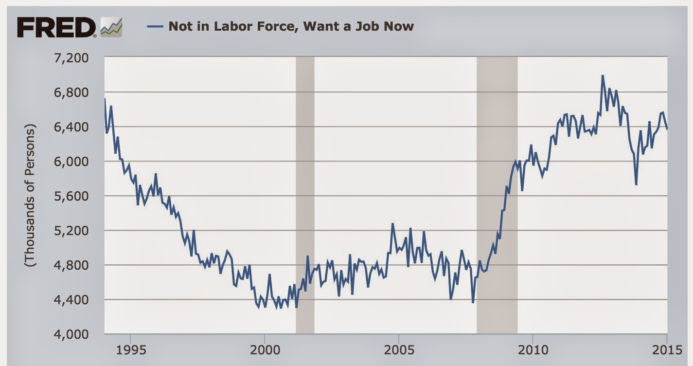
This also moved in the right direction in January, although it is still about 600,00 above its post-recession low of November 2013 (just prior to Congress's cutoff of extended unemployment benefits) and some 1.9 million above its 1999 and 2007 lows.
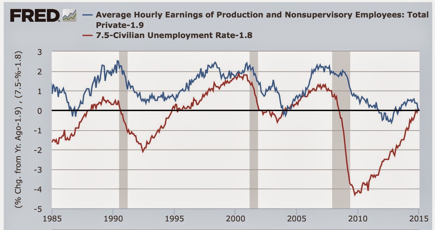
#1 Nominal wage growth
After an anomalous decline in average hourly wages in December, between revisions and a big increase in January we have seen the best reading for real average wages since 1979, but nominal wages came in at 2% or less for the second month in a row:
This is the only metric among the 5 I think are most important this year, that has moved in the wrong direction. The decline in the last 5 months is frankly troubling.