For this week's SIA Equity Leaders Weekly, we are going to examine the Nasdaq Composite Index and also compare it to the S&P500 Index using a PnF Comparison Chart.
Nasdaq Composite Index (NASD.I)
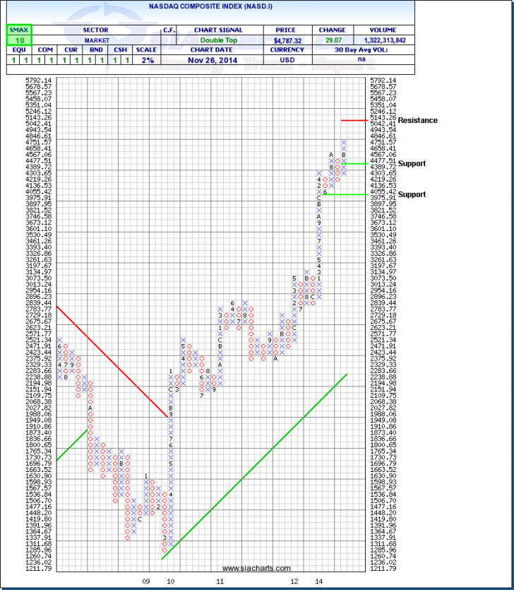
The Nasdaq Composite Index is having a strong year and is up ~20% over the past 12 months. However, unlike the S&P500 which experienced 47 new all-time high closing prices in 2014 and the Dow Jones Industrial Average which experienced 30, the Nasdaq Composite has yet to reach its all-time high closing price of 5049 which it set on March 10, 2000. This target is not far away, only 5.50% from its closing price on Nov.26, 2014. Should this strength continue, this all-time high price is its next potential resistance level. To the downside, support can be found at 4389.72 and strong support at 3975.91. With an SMAX Score of 10 out of 10, NASD.I is showing near term strength across all asset classes.
Interestingly, while the NASD.I is closing in on its all-time high price from back in 2000, this index looks very different today than it did back then. It is a little more diversified. While technology makes up ~48% of this index, ~17% and ~16% are in consumer discretionary and health care respectively. The rest is in financials, industrials and consumer staples. There are also 45% less stocks in this Index today than in 2000, and only 4 of the Top 10 stocks by market cap in 2000 are still in the Top 10 today. Finally, the P/E Ratio of the NASD.I back in 2000 was 175 whereas today it is at 23.
Click on Image to Enlarge
Nasdaq Composite Index (NASD.I) vs S&P500 Index (SPX.I)
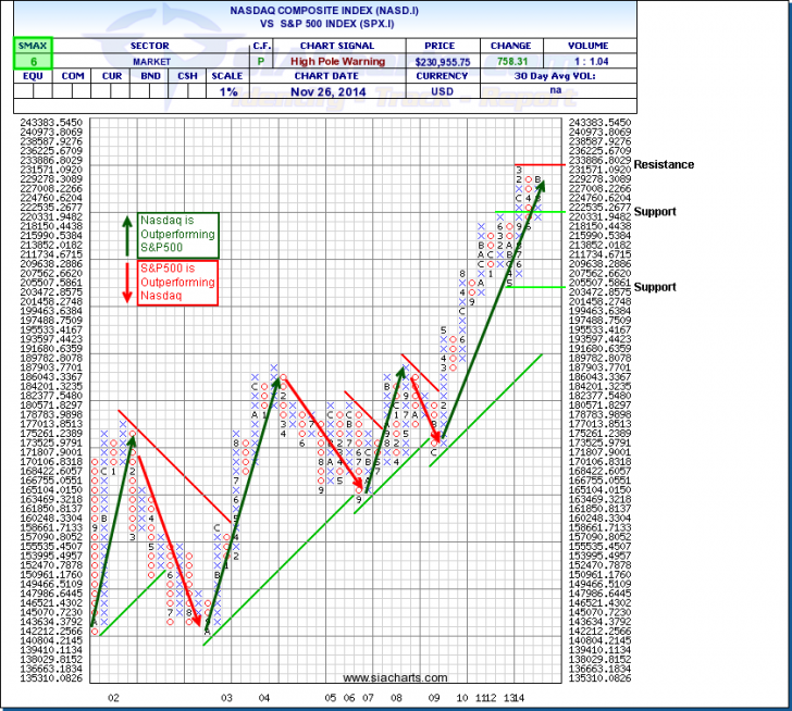
Over the past 12 years the Relative Strength has shifted back and forth between the Nasdaq Composite Index and the S&P500 Index. However, since the bottom of the last Bear Market in March 2009, the relative strength has been in favour of NASD.I. Since this time, NASD.I has outperformed SPX.I by ~4.5% CAGR. However, the NASD.I has been more volatile with an Annualized Standard Deviation of 12.19% vs 9.88% for SPX.I. Furthermore, NASD.I has experienced 4 market declines of greater than 10% vs only 2 for the SPX.I over this timeframe. Additional analysis of the NASD.I shows it had ~65% positive months and ~35% negative months with an average monthly gain of 4.78% and an average monthly loss of -3.13%. The SPX.I had ~69% positive months and ~31% negative months with an average monthly gain of 3.77% and an average monthly loss of -3.02%. Finally, the Correlation Coefficient (which measures how two investments move in relation to each other) between NASD.I and SPX.I since March 2009 has been 0.95, showing very high positive correlation.
Click on Image to Enlarge
SIACharts.com specifically represents that it does not give investment advice or advocate the purchase or sale of any security or investment. None of the information contained in this website or document constitutes an offer to sell or the solicitation of an offer to buy any security or other investment or an offer to provide investment services of any kind. Neither SIACharts.com (FundCharts Inc.) nor its third party content providers shall be liable for any errors, inaccuracies or delays in content, or for any actions taken in reliance thereon.
For more information on how to generate these statistics using SIACharts' Investment System, please call or email us at 1-877-668-1332 or siateam@siacharts.com.
Copyright © SIACharts.com


