For the bulk of 2014 the Financials Sector ($XLF) has been one of the worst performers. There have been some interesting developments on the chart for this sector, and that’s what I want to take a look at today.
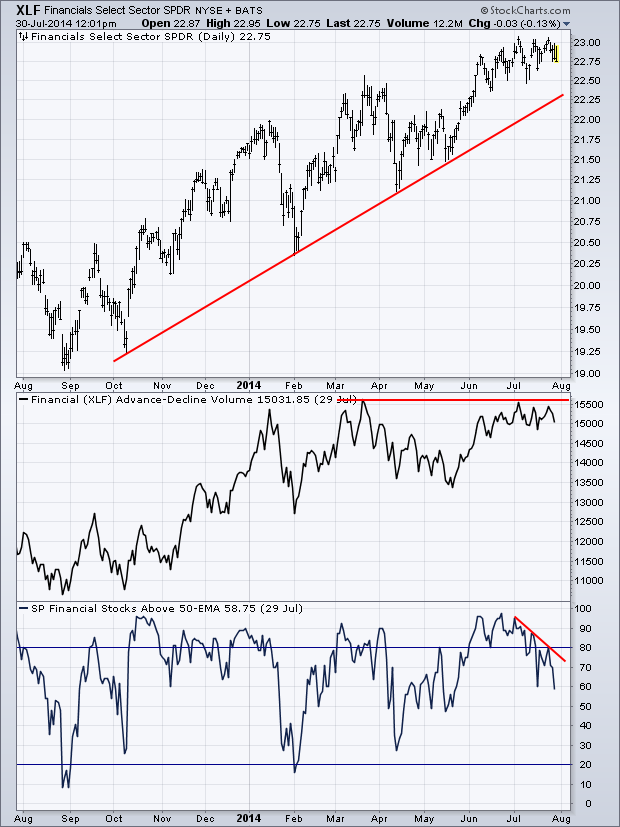
First up is a chart of $XLF, its Volume Advance-Decline Line and the Percentage of Financial Stocks Above Their 50-Day Moving Average. These two breadth indicators can help us understand the ‘health’ of the financial sector by seeing how the underlying stocks of the sector are performing.
As we can see with the Volume Advance-Decline Line, while price has been going higher, this breadth indicator has been essentially flat as it hasn’t made a fresh high since March. As price keeps running into resistance at $23 the A-D line has begun to slightly weaken but has yet to make a lower low.
Meanwhile, the number of Financial Sector stocks that are above their respective 50-EMA has been dropping over the last couple of weeks, creating a negative divergence with price. This is a sign that each time $XLF has hit $23, fewer stocks in this sector have been able to stay above their intermediate-term Moving Average. Based on these two breadth indicators, it does not appear things look overly bullish based on the internals of the Financial Sector.
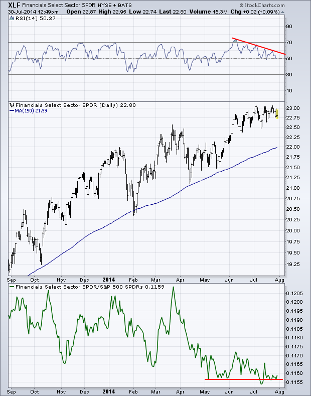
Next lets take a look at momentum and the relative performance of $XLF vs. the S&P 500 ($SPY). On the top panel of the chart below we have the Relative Strength Index (RSI). Since June the RSI indicator has been making a series of lower highs as it creates a negative divergence. Even though price has been rising/consolidating, momentum has been weakening.
Currently RSI is at the 50 level which has acted as support during previous declines. If momentum weakens and creates another lower low then we may begin seeing $XLF decline as well.
Looking at the ratio between $XLF and $SPY in the bottom panel of the chart we can see the strong under-performance out of the financial sector so far this year. However, things have begun to flatten as the sector starts to perform more in-line with the overall equity market. I’ll be watching to see if the ratio between these two can hold above support or if Financials continue to decline relative to the S&P.
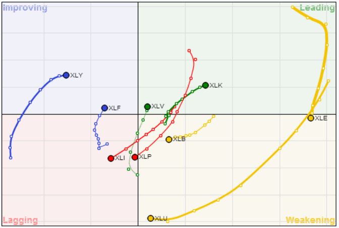
Looking at the latest Relative Rotation Graph (shown below) we can see that $XLF has been attempting to strengthen as it moves from “Lagging” to “Improving”. The RRG acts as another way to look at sectors, assets, etc. in their relative performance with an Index.
Copyright © Andrew Thrasher


