by Adam Grimes
I want to share a brief look at longer-term market structure in the Canadian dollar today. We have a situation in which a few timeframes appear to be in conflict with each other. Perhaps there is a trading opportunity, but there certainly is a good lesson. There are two points to keep in mind here: 1) how patterns can interact and intersect across timeframes, like those nesting Russian Matroyshka dolls, and you keep finding something new every time you drill deeper. Though this is interesting, even more important is 2) how to trade these apparently conflicting timeframes and avoid paralysis by analysis?
First, take a look at the monthly chart of the USDCAD. What do you see? A nearly textbook simple pullback (i.e., a bull flag). We should buy this , right?
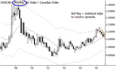
The pullback, by the way, does have a statistical edge, depending on how you quantify it. We looked at the edge behind pullback trades in considerable depth in my free trading course, and it is one of the patterns that has been most useful to me in actual trading over the years. So, we have a really clean bull flag on the monthly chart; let’s take a look at the weekly:
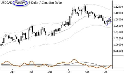
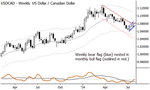
Hmmm… life just got a little bit more complicated. On this timeframe, we have a bear flag, which we should short. In fact, with a little bit of training, you can get your eye to see both at the same time. Take a look at this chart, where the monthly structure is outline (on weekly bars, still) in red, and the weekly in blue:
Last, let’s take a quick look at the daily chart, to see what is going on there:
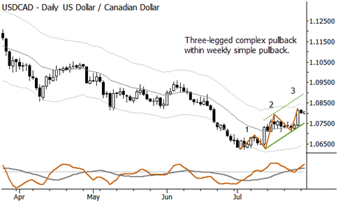
Now, what do you do with this information? We have a weekly bear flag, which we might think is more likely to fail because of the influence of the monthly bull flag. However, there could well be enough play within that monthly flag to at least get our stops on the weekly trade to breakeven, and the monthly pattern could fail. Furthermore, if it does fail, a clean breakdown of the weekly flag is a likely way for it to fail. We could also watch for a failure of the weekly pattern, anticipating a possible failure test at the pivot low from last month, and then use that to enter long into the monthly pattern. In all of this, we haven’t even addressed the daily chart…
STOP. You get an idea how complex this type of analysis can be, and why it is easy for traders to get lost , confused, and suffer from paralysis by analysis. There are two simple solutions here, and both make sense. One, you could simply focus on your trading timeframe and not complicate the analysis by looking at the higher timeframe. That is certainly a valid approach, and is probably right for the majority of traders. The other way to use multiple timeframe information might be as a filter: if you want to take the weekly short, but see the monthly long aligning against that trade, skip the trade. Personally, I tend toward the first solution as a general rule, but that is probably due to my obsession with simplicity. The exception is intraday trading—having a rule that did not allow me to trade in the presence of conflicting timeframes saved me a lot of money and emotional capital when I was daytrading heavily.
Think about the lessons from these charts. (By the way, we also might have overlooked the message that there appears to be a pretty interesting trade setting up in the looney. Don’ forget that!) I think it is very important for you to have a consistent way to process multiple timeframe data. You do not want to be reinventing the wheel with every trade, but, rather, you want a fixed, disciplined process, and a trading plan that clearly lays out what you will and what you will not do in the market. Once you’ve done the analysis, then a trade is just a trade. Put it on, manage the risk, get out when appropriate. And repeat, and repeat, and repeat. Then, you’re a trader.
Copyright © Adam Grimes


