by Cam Hui, Humble Student of the Markets
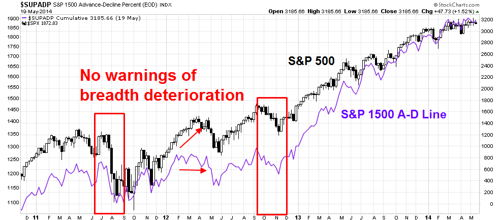
In numerous discussions with technical analysts, I have heard from many people who say that since the Advance-Decline line continues to make new highs, the bull remains alive and stock prices are likely to continue to grind higher.
As the chart below shows, the A-D Line (in purple) has not always given warnings of breadth deterioration before corrections. In particular, the A-D Line gave no warning in the correction of 2011. It did move sideways while the SPX rise in the first correction of 2012, but gave no warning in the second correction of 2012.
Another way to measure breadth
Here is another way of thinking about breadth. Since breadth is designed to measure whether the generals (large caps) are leading the market or if the troops (broader market) are leading the market, then the easy way is to analyze the relative performance of an equal-weighted index against the cap-weighted index. If the equal-weighted index is outperforming and the market is rising, then the troops are leading the charge, which is bullish. On the other hand, if the cap weighted index is outperforming, then it is a sign of narrowing leadership, which can be a warning sign of deteriorating breadth.
With that in mind, consider this chart of the equal weighted SPX against the cap weighted SPX (shown in purple). In the period leading up to the corrections of 2011 and 2012, the shaded areas show periods when the equal vs. cap weighted ratios deteriorated before the actual correction. The lead times lasted anywhere from four weeks to nine weeks. To be sure, this measure of breadth did not warn of trouble during the second corrective period of 2012 - in fact, it was rising.
Now we are seeing negative divergence between the equal and cap weighted SPX. Should it be construed as a warning?
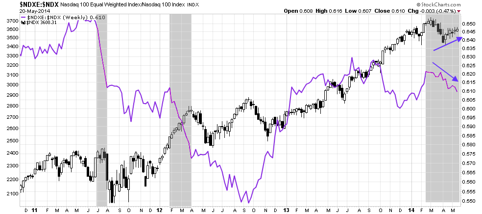
Now consider this chart of the equal vs. cap weighted NASDAQ 100. The pattern was the same as the equal vs. cap weighted SPX chart. We saw the same kind of breadth deterioration in 2011 and 2012 just before market weakness set in. Now even as the NDX is rallying, this breadth indicator is falling - a negative divergence.
In short, despite the positive performance of the A-D Line, other breadth indicators are flashing warning signals. Don`t say that you were not warned.
Cam Hui is a portfolio manager at Qwest Investment Fund Management Ltd. (“Qwest”). The opinions and any recommendations expressed in the blog are those of the author and do not reflect the opinions and recommendations of Qwest. Qwest reviews Mr. Hui’s blog to ensure it is connected with Mr. Hui’s obligation to deal fairly, honestly and in good faith with the blog’s readers.”
None of the information or opinions expressed in this blog constitutes a solicitation for the purchase or sale of any security or other instrument. Nothing in this blog constitutes investment advice and any recommendations that may be contained herein have not been based upon a consideration of the investment objectives, financial situation or particular needs of any specific recipient. Any purchase or sale activity in any securities or other instrument should be based upon your own analysis and conclusions. Past performance is not indicative of future results. Either Qwest or I may hold or control long or short positions in the securities or instruments mentioned.
Copyright © Humble Student of the Markets


