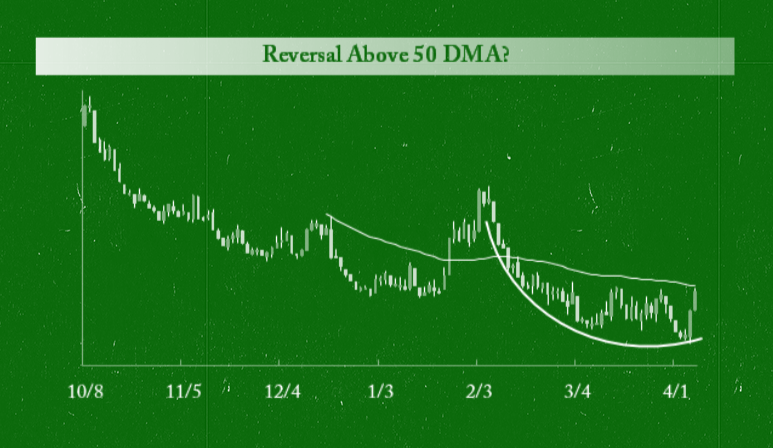
Bespoke takes a multi-pronged approach to investing, and one of our preferred approaches is to look at recent price action in a name or index using six month charts. Take a look at the six charts below and see if you like or dislike any of the patterns.
Some of these charts look very bullish. Unfortunately, they are all actually inverted: the vertical axis goes from low at the top to high at the bottom. They are, in order, the S&P 500, the Nasdaq Composite, the Nasdaq Biotech Index, the Nasdaq Internet Index, the Dow Jones Industrial Average, and Netflix (NFLX). Below we've re-oriented the same charts with their vertical axis arranged in the traditional format. It's no surprise that the inverted charts for biotech and the internet group look so bullish, but it should be a concern for bulls that the inverted chart for the Nasdaq looks like a clear buy given that the downtrend has been broken. The Dow and S&P 500 inverted charts don't look too bullish yet, so that's a good sign for now.
In general, we think this is a good exercise to run from time to time just to change things up a little and help keep your perspective in check. If you really liked the look of the inverted charts, you shouldn't like the look of the actual charts.
Copyright © Bespoke Investment Group


