by Jesse Felder, The Felder Report
“Best investments for a rising rate environment” “The coming crash in the bond market” “How to prepare for an interest rate spike”
I’m seeing these kinds of headlines and stories everywhere. Everyone and their mom is expecting long-term interest rates to rise now that the Fed is tapering its bond buying programs. (Actually, interest in the term “bond market crash” peaked last Summer, ironically right at the time bonds bottomed in price. See chart below.)
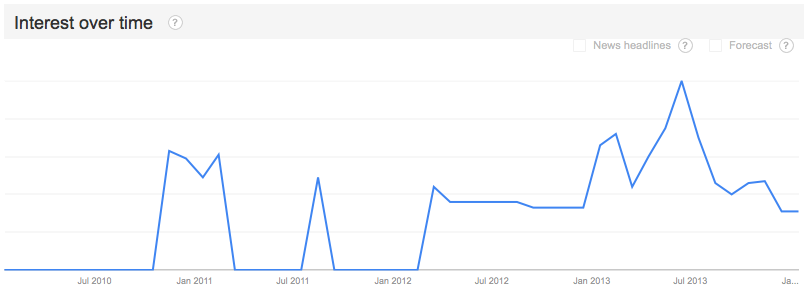 I have a couple of problems with this line of thinking. First, although it seems like reducing demand for a security (i.e. tapering QE) would result in a drop in price, when you really think about how quantitative easing works this makes no sense. Second, the market is telling us this makes no sense. Let me explain.
To the first point, quantitative easing has been effective in supporting the economy through the wealth effect. It has encouraged investors to shun low-risk, low-yielding investments for higher-risk investments (if you can even classify them as investments). This has resulted in a surge in the prices of stocks, corporate bonds, real estate, etc. over the past five years with a greater effect on the riskiest categories within those asset classes: money-losing tech and biotech stocks, junk bonds and leveraged loans, etc. As a result investors feel wealthier and thus they spend more. They’re happy and the Fed’s happy because the economy’s happy.
But now that all of this is ending what should we reasonably expect as a result? To my mind, if QE is an inflationary force, intended to boost the economy, its removal can only have a net deflationary effect on the economy. For those unaware, inflation is bearish for bonds (rising rates = lower bond prices) and deflation is bullish (lower rates = higher bond prices).
To the second point, this isn’t just my personal opinion. This is exactly what the market is telling us. I’ve shared this chart before. It shows the history of quantitative easing and how various assets have been affected:
At the end of the prior QE programs it’s plain to see that not only did bonds fail to “crash” they actually surged in price. I believe investors fled to bonds in these two prior circumstances for two reasons: First, many traders were heavily short bonds anticipating a fall in price as the Fed ended purchases:
All these shorts were forced to cover when… Second, the economy showed brief signs of weakness, aka deflation, which sent bond prices higher/rates lower inspiring the Fed to take up QE yet again. (This is probably what Richard Koo means when he says the Fed is in a “QE trap.” They can’t end their bond purchases without harming the economy.)
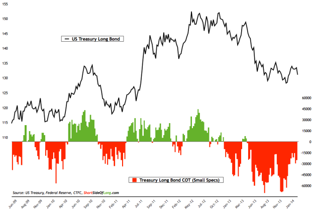
Notice that traders are once again heavily short the long bond. In the past this sort of positioning has led to strong moves higher as traders cover their shorts.
Now the Fed isn’t technically ending QE right now; it’s merely tapering it’s purchases. I think this is why this trade has been a bit messier than those QE end trades of the past few years. Bonds have risen but they haven’t quite “surged” as they have in the past. Still, Janet Yellen has said that the Fed intends to continue tapering until the bond buying is ceased entirely so the result should eventually be the same. (Time will tell if they are actually capable of removing this stimulus completely without seeing the economy stumble.)
This is exactly what the charts are saying. JC Parets, of All Star Charts, recently called the daily chart of the long bond, “one of my favorite charts in the world,” as it looks like it is now breaking out to new highs, a very bullish development:
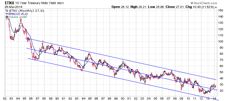
Conversely a long-term look at the yield on the 10-year treasury bond shows it is still well within a very clear downtrend:
I wouldn’t consider this a “rising rate environment” until this downtrend is convincingly broken. In fact, the only rates that seem to be rising lately are on the short end of the yield curve which has flattened considerably since the Fed began its tapering its QE program:
Note that, “the slope of the yield curve is one of the most powerful predictors of economic growth, inflation and recessions.” The curve is still positive but the fact that it’s flattening suggests we should be more worried about a reduction in “economic growth” and “inflation” than the opposite.
The bottom line is I just don’t see any evidence to suggest that we are in anything resembling a “rising rate environment” or that one is even anywhere on the horizon. This is not to say that somewhere down the road there may be consequences for the Fed’s easy policies and one of those may be rising rates. It’s just not happening right now.
Copyright © The Felder Report


