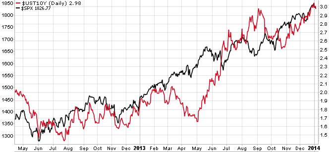
A few months ago, I discussed the relationship between the 10-year UST yield and equities (S&P 500). In short, the two have been highly correlated over the last several years. This tight relationship can be seen in the following chart:
Source: Stockcharts.com
Since the summer of 2012, the yield on the 10-year T-note (red line) has been in an uptrend, doubling from approximately 1.5% to 3%. In that time, the S&P 500 (black line) has likewise been in an uptrend, rising by about 40%. I wrote then:
Why would rising interest rates be good for stocks, and vice versa? Three related reasons come to mind: 1) rising yields = falling bonds, inferring capital is being reallocated from bonds into stocks, 2) rising interest rates infer a stronger economy and less need for Fed assistance via QE, with a healthy economy being bullish for stocks, and 3) capital very often flows into US T-bonds for safety reasons, driving down rates or yields, and because such capital flow indicates risk-off, it's bearish for equities.
With the Fed recently indicating that tapering was certainly in the cards, albeit modestly, the 10-year UST yield has continued to rise and the bullish inference for equities is the economy has been improving well enough for QE to no longer be an absolute necessity.
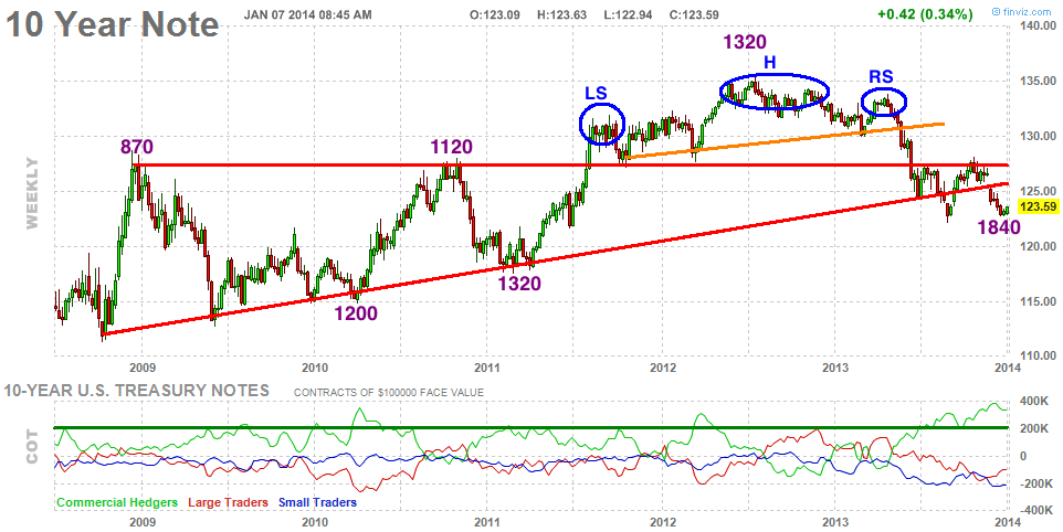
Also during October of last year, in a post entitled, "10-Year UST Note Has Dandruff," I presented the following weekly chart of the 10-year T-note:
A bearish head-and-shoulders formation is highlighted (blue circles), including the breakdown in the rising trend line (orange) and breach of the neckline (red line). At the time I wrote, "$127 has become a key level for the 10-year note, something to monitor closely. I do expect the neckline to hold and for the UST to roll over." As shown in the chart above, the 10-year note did rally to the $127 neckline only to roll over and decline to its current $123-$124 level.
The purple numbers in the chart indicate S&P 500 levels at key turning points for the 10-year UST note. In contrast to yield, when the T-note rises, equities have tended to fall, and vice versa. Since the UST note peaked in 2012 (at the "head"), breaking down through the neckline last year, the S&P 500 has enjoyed a nice run from 1320 to its current peak of about 1840. The $127 neckline area for the T-note will continue to serve as significant overhead resistance, but now so too will the breached multi-year rising trend line residing at about $126.
Such a bearish longer-term chart for the T-note bodes well for equities. However, in the chart above I would point out the COT data plotted in the lower inset. Commercial hedgers, typically the smarter money, are currently very long the UST note, attaining their highest level of long exposure in years. In the past, when their exposure has reached elevated levels (beyond 200K, green horizontal line), the UST note has more often than not responded by rallying. If that were to happen in the near future, I would expect equities to stall or retreat in kind.
Copyright © Charts, Etc. Blog


