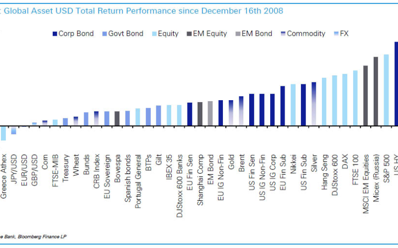
I thought sharing this chart would be extremely interesting, since we are closely approaching two major milestones. The first is year end performance and the second is a five year anniversary of the bull market in equities. Since majority of assets bottom between late 2008 and early 2009, the chart above also shows how they have performed for the overall investment cycle.
Chart 1: Performance of various major assets for the investment cycle
Source: Deutsche Bank Research
I bet if I told you that the top two performing assets are Copper and European High Yield, considering all of the issues both China and Europe have been through since 2011, you would tell me I am lying. Remaining in the top 5 best performers, the ones that are easier to pick would be US assets such as S&P 500 and US High Yield. Interestingly Russian equities as well as the overall Emerging Market stock complex is also seen near the top. The fact is that these assets had tremendous moves out of their lows and funnily enough, just about all of the investors missed it.
Not too many assets have lost ground, but a couple come to mind, such as the Greek stock market and the Japanese Yen (with its recent crash). Surpassingly, Euro Dollar exchange rate has been essentially flat. Despite on going media coverage of bond performance during the Euro Crisis (2011 and 2012) Treasures and Bunds have really lagged rest of the asset classes. One could argue that these assets outperform during recessions, like that did during 2007/08 period.
Observing this chart, where do you see value and what do you rate overly expensive?
Copyright © Short Side of Long


