Two Charts Illustrate How to “Follow the Money”
By Frank Holmes
CEO and Chief Investment Officer
U.S. Global Investors
Too often investors get caught up in their political allegiance or parties, focus on the negative and lose confidence in stocks. As a result, they can miss great bull markets. I believe when it comes to finding investment opportunities, it’s not about the political party, it’s about the policies, both monetary and fiscal.
This was a main theme of mine when I was speaking at the Agora Financial Investment Symposium, and throughout my presentations, I encouraged investors to follow the money. With that in mind, here are two of my favorite charts that I believe demonstrate how investors can do exactly that.
1. Global Manufacturing Activity
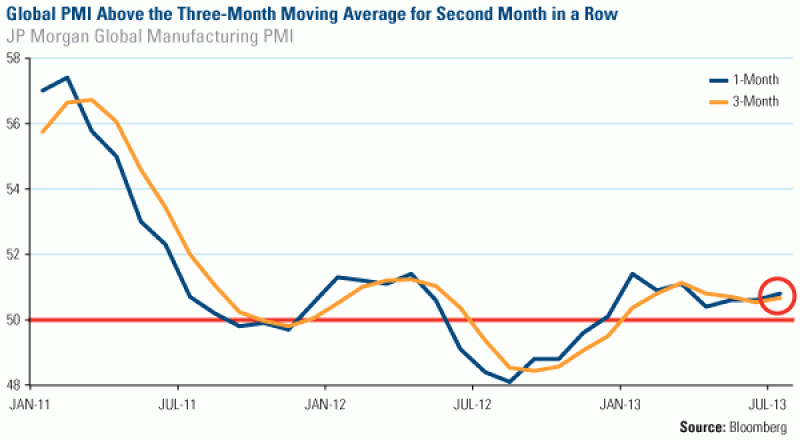
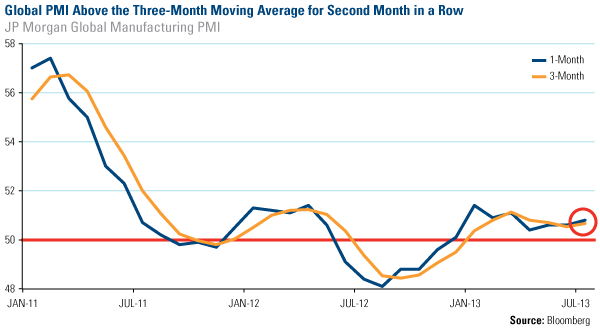
Manufacturing data among numerous countries has recently been moving in the right direction. For the month of July, the JP Morgan Global Manufacturing Purchasing Manager’s Index (PMI) stayed above the three-month moving average for the second month in a row. Global output continues to expand, rising to 50.8 from 50.6 in June.
To us, the PMI is not only a gauge of economic well-being for the manufacturing sector. Last month, after the PMI initially crossed the three-month reading in June, I explained that this “crossover” has historically signaled higher prices for many commodities.
Here are the details, using the SPDR S&P Metals & Mining ETF (XME) as an example. Since the beginning of 2009, history suggests that one month after the crossover, 60 percent of the time, the XME has gained an average of 7.4 percent.
Consistent with its historical pattern, in July, the XME rose 7.6 percent.
There may still be room for these stocks to grow, too, as the next two months look promising for metals and mining companies. If you look at the three-month average after the “crossover,” 80 percent of the time, the XME gained 12.6 percent.
2. Presidential Election Cycle
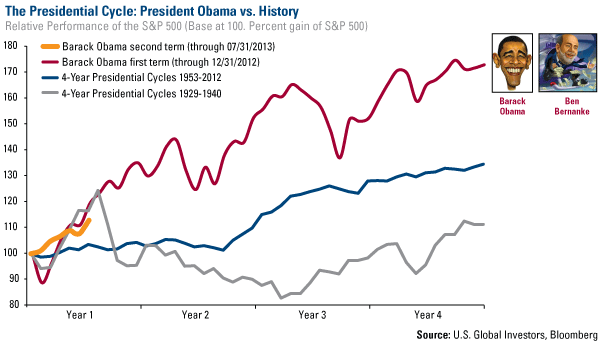
Last fall, I said that all the excess money in the system, compliments of the Federal Reserve’s policy decisions, helped the S&P 500 Index to climb significantly. In fact, President Barack Obama’s first-term presidential cycle beat the average of all other presidential cycles going back to 1929. You can visually see this substantial growth in the red line below.
Now, a few months into his second term, Obama’s presidential cycle remains remarkable, as stocks continue to climb a wall of worry. The yellow line shows this upward trend, an outcome of the continued easing policies in the U.S.
At U.S. Global, we believe that government policy is a precursor to change, and the change appeared to be significantly positive for the S&P 500. To me, this chart indicates that many investors who have been following the Fed’s quantitative easing trail have found a very profitable path in U.S. stocks.
Looking Forward: Positive with a Chance of Rally?
After the S&P 500 Index climbed 4.9 percent in July, our team wanted to find out if this positive trend might continue over the next month and three months. The results may surprise you.
And finally, at Agora, I had the pleasure to talk about what Agora believed to be “the no-brainer investment of all of our lifetimes.” The topic was gold and in my presentation, you can find 60+ pages of charts and trends. Download your copy of the presentation here.


