by Charts, Etc.
I continue to survey the market landscape, trying to get a better sense of just how much further this rally has to go. I've written here before that I expected a correction last month, however I obviously underestimated the magnitude of internal strength in this recent move higher, despite the many developing bearish divergences. Until a few weeks ago, I maintained a bullish outlook on the market, a stance dating back to last September. During that period, I fully detected and appreciated the impressive underlying thrust that would propel the market to new highs. But again, it's only been during these last several weeks that I've increasingly observed disturbing negative divergences, many of which I've discussed on this blog.
I will emphasize that it's very important to avoid getting seduced into a particular mindset at any point in time. Becoming "married" to a viewpoint and constantly seeking out confirmation of this view is a behavioral finance cardinal sin. I am always trying to poke holes in my current take on things, ever fearful that I might have missed something. That said I continue to uncover items that just serve to foster more concern.
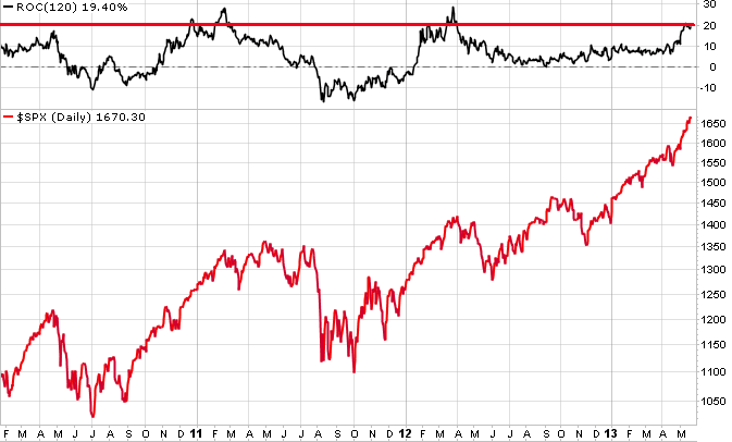
For one, the market's advance as per the S&P 500 appears stretched historically:
The chart above shows the 120-day rate-of-change (ROC) in the upper inset and the S&P 500 in the lower inset. The more/less 6-month ROC is just shy of 20%, a level that in the past has identified peaks in the market.
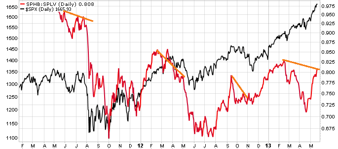
In addition, I continue to find nagging bearish divergences.
The chart above shows the relative performance of the PowerShares S&P 500 High Beta Portfolio vs. the Power Shares S&P 500 Low Volatility Portfolio (represented by the red line), with the S&P 500 appearing behind it (black line). Admittedly, the history is short given the PowerShare funds have not been in existence all that long, but you can see that when the S&P 500 rises, higher beta stocks tend to outperform lower beta stocks as represented by the rising red line. Over the last few weeks, we have indeed seen this red line surge with the S&P 500's advance, however also note that this red line has yet to surpass its prior high achieved in February. Until the red line is able to surpass that prior high, it remains categorized as a negative divergence. You'll see I flagged such negative divergences in the past with orange lines and they do often give a decent heads-up before overall market weakness takes hold.
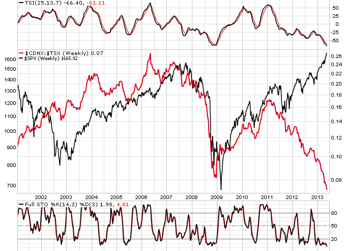
Finally, I found the following chart to be very interesting, and possibly alarming.
The weekly chart in the middle shows the relative performance of the TSX Venture Index versus the TSX Composite (represented by the red line), with the S&P 500 overlaid in the background (black line). The TSX Venture Index is comprised of 500 small- and micro-cap Canadian stocks, compared to Canada's TSX Composite which is primarily a large-cap index. The Canadian equity market in general is heavily natural resource-oriented as the country is dominated by energy and mining companies. As a result, Canada's economic fate is very much dependent on and sensitive to the global economy.
Over time, the return of the TSX Venture/TSX Composite ratio has tended to move in tandem with the S&P 500. If anything, the red line has frequently led moves in the S&P 500 with it rising well ahead of the S&P 500 low in late 2002, peaking in 2006 before the S&P 500 peak a year later, and bottoming in late 2008 a few months before the S&P 500 low in March 2009. And yet since the start of 2012, there has developed a massive divergence between the red and black lines. Note also that in the past, when the TSI indicator and Stochastic Oscillator have registered oversold levels -- as is the case now -- the S&P 500 has typically been at a significant low. That does not appear to be the case this time around.
I don't wish to overstate the relationship between the TSX Venture/TSX Composite and the S&P 500 as I'm certainly aware of what has occurred with smaller-cap mining stocks, no doubt severely depressing the relative performance of the TSX Venture Index. However, it is a relationship that has broken down completely over the last year or so and I felt it was worth mentioning, do with it what you will.
As I've strongly suggested of late, I remain wary and cautious about the market's recent leg higher.
Copyright © Charts, Etc.


