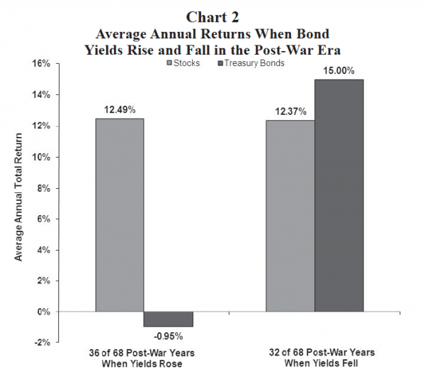
At best, bond yields will move sideways in the next several years but it would not be surprising if yields trend higher again. While bonds have provided very competitive returns relative to the stock market since 1980, this era has probably ended. As this chart suggests, investors should prepare for much lower sustained bond returns relative to returns which are likely to be generated by the stock market.
Bonds to provide much less diversification?
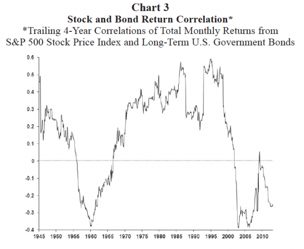
Chart 3 illustrates the trailing four-year correlations between the total monthly returns of stocks and long-term government bonds. Throughout most of the post-war era, stock and bond returns have been positively correlated but with a correlation coefficient of less than 1.0. That is, although stock and bond returns have most often moved in the same direction, their correlation is not perfect implying some diversification benefits from investing simultaneously in both asset classes.
In two periods during the post-war era, however (i.e., between 1955 to 1965 and again since 2000), the correlation between stock and bond returns has been notably negative significantly improving the diversification impact of bonds. With a strong negative correlation between stock and bond returns since 2000, the current investment culture has come to assume bonds will significantly help to stabilize the return stream of their portfolio.
Will this continue in the years ahead? Perhaps, but more likely the correlation structure between stocks and bonds will slowly return to normal in the next several years as crisis fears continue to diminish. Similar to the late 1960s, we expect stock and bond return correlations to soon turn positive again substantially lessening the degree of diversification benefits investors have come to expect from their bond investments.
Risk-return frontier to steepen!
The investment dichotomy created by the two faces of the post-war bond market is probably best illustrated by a dramatic shift in the risk-return frontier. Chart 4 compares the risk-return frontiers (a plot showing the actual annualized returns and return volatilities from various percentage stock-bond allocations) for the post-war era when bond yields rose (1948 to 1980 represented by the black squares) and for the era when bond yields declined (1981 to 2012 represented by the gray circles).
Normally, the risk-return frontier slopes upward and to the right. That is, as stocks are increasingly added to the portfolio both the return and risk tend to increase. As shown in Chart 4, the early post-war (rising bond yield) investment era had a very traditional risk-return frontier. An all bond portfolio delivered an annualized return of only about 2.5 percent with an annual risk of slightly more than 7 percent compared to an all stock portfolio generating about a 12.5 percent annualized return with almost 14 percent annual risk. Traditional diversification properties can also be seen. Following the black squares from an all bond portfolio to an 80 percent bond/20 percent stock portfolio, the overall return is enhanced while risk is slightly reduced. Beyond the 80/20 bond-stock mix, however, both risk and return are increased by continuing to lift stock exposure.


