

GMO Asset Allocation Insights | Oct 2017
by Anna Chetoukhina and Rick Friedman, GMO LLC
Introduction A small group of technology stocks have recently delivered stellar returns. Facebook, Apple, Amazon, Netflix, and Alphabet (Google), the so-called “FAANG” stocks, are up 36% on average year to date through September. This superlative performance, in such a narrow group of large cap names, has led many to raise questions about the current valuation of the S&P 500, its sector composition, and comparisons to other markets. These questions have included:
- Do the old rules apply? The Information Technology (IT) sector, which has and deserves to trade at a higher multiple, is a larger part of the market today, so comparing today’s price multiples to history doesn’t make sense, right?
- How can the market be expensive if no sector is trading at extreme valuations relative to its own history as measured by P/E 10 multiples?1
- Isn’t the valuation gap of the US vs. non-US markets justified by the higher weight in IT in the US?
We know that the higher weight in the relatively expensive IT sector is driving some of the expensiveness of the S&P 500, but this does not fully explain the bulk of its high absolute and relative valuation level. In this short note, we’ll try to address some of the questions asked above.
1 The P/E 10 ratio, or cyclically adjusted price-to-earnings ratio (also known as the Shiller P/E), is a commonly used valuation measure. It is defined as the current price divided by the average of 10 years of earnings (moving average), adjusted for inflation. The P/E 10 ratio uses smoothed real earnings to eliminate the fluctuations in net income caused by variations in profit margins over a typical business cycle.
Do the old rules apply to a “new” S&P 500?
The sector composition of the S&P 500 has changed meaningfully over the last four decades (see Exhibit 1). As we entered the roaring 1980s, the S&P 500 was dominated by lower-price-multiple, cyclical companies. The Energy, Materials, and Industrials sectors accounted for 45% of the S&P 500 while IT and Health Care made up 15% of the index. IT and Health Care’s weight has expanded to 38% today, while the lower-multiple cohort has declined to under 20%.
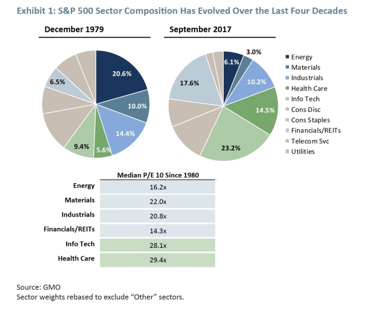
Sector weights rebased to exclude “Other” sectors.
But that shift to higher-multiple sectors explains only a portion of today’s overvaluation as Exhibit 2 suggests. The blue line in the display plots the P/E 10 of the S&P 500 based on GMO’s bottom-up calculations.2 The red line is the long-term median P/E 10 of the market, essentially the “fair value anchor” for the S&P 500. Today, at 27.3x, the P/E 10 of the S&P 500 is quite elevated, trading 46% above its long-term median dating back to 1970. The static fair value measure, however, doesn’t account for the concern we’ve been hearing so much about recently – the changing sector composition of the market.
Comparing today’s P/E 10 of the market to its long-term median valuation level makes the assumption that the level the S&P 500 traded at on average in the past is “fair” today. If index composition along some risk dimension one cares about, such as country or sector weights, changed over time, history might not be a very relevant anchor. Or so the argument goes. For any investor, such as GMO, who has considered the fair value of emerging markets, these issues are familiar and part of the assessment process given the dramatic changes the MSCI Emerging Markets index has seen in its country and sector membership over the last few decades.
2 GMO P/E 10 differs from Robert Shiller’s data due to a number of implementation choices made in aggregating bottom-up data.
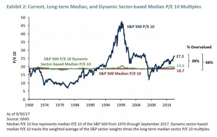
Median P/E 10 line represents median P/E 10 of the S&P 500 from 1970 through September 2017. Dynamic sector.based median P/E 10 tracks the weighted average of the S&P sector weights times the long.term median sector P/E 10 multiples.
We asked ourselves what the long-term fair value multiple of the S&P 500 would look like if we accounted for the shift in sector weights. That’s what the green line captures by applying long-term, median sector valuations to the shifting weights in the index. As the S&P 500 has rotated in and out of lower- and higher-multiple sectors (based on long-term sector median multiples), the fair value line has shifted between 17.6x and 20.6x P/E 10.
The September 30, 2017 “dynamic fair value” multiple of 19.6x, for instance, accounts for the S&P 500’s higher concentration in IT and lower weights in Financials and Energy relative to a decade earlier. Incorporating dynamic sector weights acknowledges that some of today’s higher valuation is due to a shift in market structure, but it is hardly enough to call the S&P 500 fairly valued.
On a dynamic sector basis, the S&P 500 is still a lofty 39% overvalued. While the sector composition of the S&P 500 has migrated to higher-multiple sectors like IT (and Health Care as well), that shift does not render historical multiples useless or relative valuations justified.
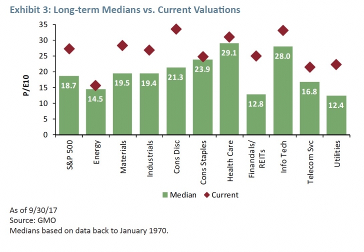
If the sector shift to IT accounts for only some of today’s expensiveness, what gives? Quite simply, pretty much every other sector, save Energy, is trading expensively relative to its median valuation since 1970 (see Exhibit 3). Yes, more of the S&P 500 is in the IT sector, which is relatively expensive versus other sectors historically and to itself today. But, with every other sector trading at P/E 10 levels far above long-term sector medians, it is easy to see why the overall market is overheated.
The Financials, Utilities, and Consumer Discretionary sectors are particularly expensive relative to their own history, trading at premiums of 95%, 80%, and 58%, respectively. We ought to be careful, however, reading too much into valuations of Financials as the sector’s 10-year trailing earnings are still materially affected by post-GFC write-offs.
Interestingly, the three sectors that don’t look particularly expensive, Consumer Staples, Health Care, and Information Technology, have historically been Growth sectors. Growth prospects for Consumer Staples and Health Care today are far from obvious to us and might not justify valuations normal by historical standards.
P/E 10 multiples tell only part of the story
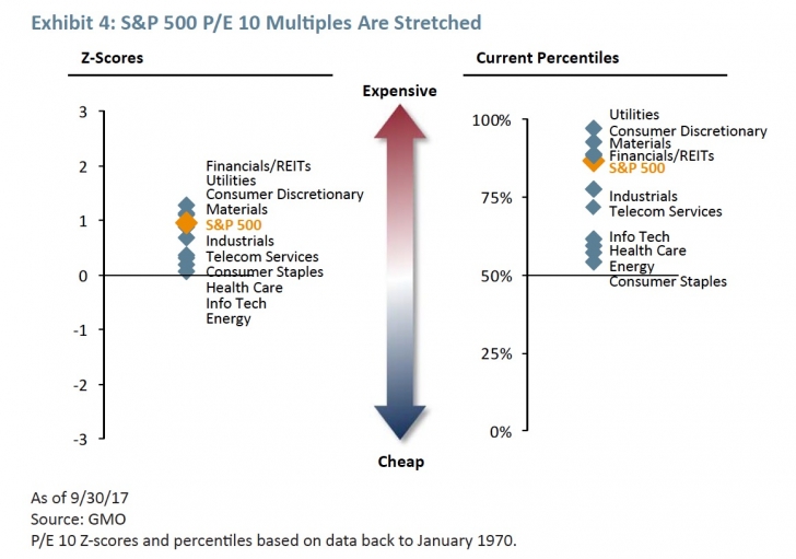
While Exhibit 3 makes it clear that S&P sectors are trading expensively relative to the long-term medians, it is true that on a Z-score3 (or standard deviation) basis current levels are not too extreme. Few sectors, as the display on the left of Exhibit 4 indicates, are trading above 1 standard deviation expensive. Z-scores don’t look that extreme in large part because both means, and especially standard deviations of the distributions, were pulled up by Internet (TMT) bubble. The right side of the display, however, makes it clear that on a percentile basis, current P/E 10s are among the most expensive we’ve seen dating back to 1970. P/E 10s, however, are just one way to view valuations.
3 A Z-score measures distance from the mean in terms of standard deviations. Z-scores in this exercise are calculated on the natural logarithm of multiples. A log transformation helps map Z-scores to well-defined probabilities given multiples are log-normally distributed. Moreover, log transformation makes Z-scores indifferent to whether one uses multiples or yields (inverted multiples) in calculations, which is convenient and not the case with the simple Z-scores.
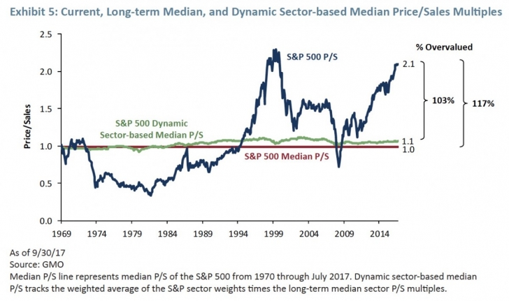
P/E 10 multiples happen to be one of the more friendly valuation metrics we look at courtesy of the high earnings we’ve seen over the last decade. When viewed through a sales lens (i.e., Price/Sales, or P/S), today’s valuations look even more disturbing. The S&P 500’s current 2.1x P/S ratio is 117% overvalued relative to its long-term median and trading just under the peak valuation it reached in March 2000 (see Exhibit 5). Though the dynamic sector approach applied to P/S multiples suggests the S&P 500 warrants a modestly higher P/S multiple due to sector shifts, the S&P 500 would still be 103% overvalued by this measure.
In fairness, many of today’s larger capitalization IT companies should trade at higher than historical P/S multiples given their cost structures are significantly more attractive (less traditional cost of goods/higher gross margins) than “old school” technology companies and the broader market.
Quite simply, more of a dollar of revenue for these less asset-intensive companies drops down to gross profit and ultimately earnings, the metric that drives equity valuations in the long run. So while these companies typically have higher-than-market P/S multiples, look quite expensive, and pull up the overall market multiple, they do not look as stretched on a Price/Gross Profits (P/GP) basis, which considers revenues net of cost of goods sold.
When we look at the P/GP multiple, the S&P 500 looks “only” 64% overvalued adjusting for sector composition (versus 75% expensive without sector adjustments). However you look at it, with valuation discrepancies this high it is still fair to say the S&P 500 is significantly overvalued even after adjusting for sector shifts.
Does EAFE deserve to trade at a lower multiple given its lower weight in IT?
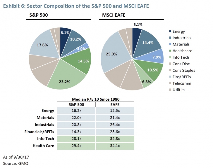
Just as some investors are questioning whether today’s S&P 500 is analogous to yesterday’s, others are asking if comparing the US to other developed markets is appropriate given the different sector exposures in each geography. Developed ex-US markets as measured by the MSCI EAFE index do look quite different than the US (S&P 500) based on sector weights. At the end of September, 27% of the MSCI EAFE index was in Energy, Materials, and Industrial companies while the S&P 500 had only 19% exposure to those lower-multiple, cyclical sectors (see Exhibit 6). On the other hand, IT and Health Care make up a measly 17% of the MSCI EAFE index while they account for a whopping 38% of the S&P 500. Surely these are disparate assets that should be valued differently. Not so fast.
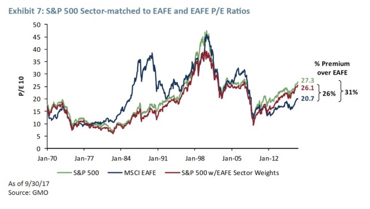
As Exhibit 7 illustrates, there is a wide gap today between the P/E 10 multiple for the S&P 500 (green line) and the MSCI EAFE index (blue line) at 27.3x and 20.7x, respectively. At GMO, we would expect equities in the US and developed ex-US markets to be priced to deliver similar returns on capital and thus be priced at similar P/E 10 ratios.
The red line in the display layers MSCI EAFE sector weights on top of S&P 500 sector valuations. Under that approach, the P/E 10 multiple for the S&P 500 falls to 26.1x given lower weights in the more expensive IT and Health Care sectors being applied. However, even after neutralizing the S&P 500 index for sector differences, the index is trading at a significant 26% premium to the MSCI EAFE index.
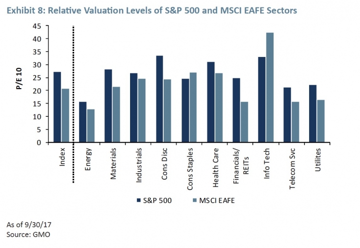
The S&P 500’s premium, even after adjusting for sector differences, to the MSCI EAFE index is easily explained by looking at the relative valuation levels of the two markets (see Exhibit 8). In 8 of 10 cases, MSCI EAFE sectors are trading at modest to significant discounts to the S&P 500. Only the IT sector outside the US is trading much above the US level, a sector the MSCI EAFE index is meaningfully underweight relative to the S&P 500.
Conclusion
Significant sector differences exist across markets and within the same market over time. As economies and markets continue to evolve, so too will shifts in sector composition. Importantly, though, broad equity markets that bear similar levels of risk should deliver similar levels of returns and thus be priced in line with each other.
Today’s higher S&P 500 weight in the relatively expensive Information Technology sector is cause for some of its expensiveness (both vs. history and other developed markets), but it does not explain away the bulk of its high absolute and relative valuation level. No matter how you cut it, the S&P 500 (and most other markets for that matter) is expensive.
*****
Anna Chetoukhina.
Ms. Chetoukhina is a member of GMO’s Asset Allocation team. Prior to joining GMO in 2011, Ms. Chetoukhina was a fixed income quantitative analyst for Wellington Management. Previously, she was a research associate for State Street Associates, LLC. Ms. Chetoukhina earned her B.S. in Economics from Voronezh State University in Russia, her B.A. in Mathematics and Economics from Huntingdon College and her M.S. in Applied Mathematics from Northeastern University. She is a CFA charterholder.
Rick Friedman.
Mr. Friedman is a member of GMO’s Asset Allocation team. Prior to joining GMO in 2013, he was a senior vice president at AllianceBernstein. Previously, he was a partner at Arrowpath Venture Capital and a principal at Technology Crossover Ventures. Mr. Friedman earned his B.S. in Economics from the University of Pennsylvania and his MBA from Harvard Business School.
Disclaimer: The views expressed are the views of Anna Chetoukhina and Rick Friedman through the period ending October 2017, and are subject to change at any time based on market and other conditions. This is not an offer or solicitation for the purchase or sale of any security and should not be construed as such. References to specific securities and issuers are for illustrative purposes only and are not intended to be, and should not be interpreted as, recommendations to purchase or sell such securities.
Copyright © 2017 by GMO LLC. All rights reserved.