


by Lance Roberts, Clarity Financial
Last week, I received the following email from a reader which I thought was worth further discussion.
“In a recent article “Signs of Excess – Crowding and Innovation” Lance stated ‘Note the chart above is what has happened to a $100,000 investment in the S&P Index. While the S&P index has soared past previous highs, a $100,000 dollar investment has just recently gotten back to even. This demonstrates the important difference about the impact of losses on a dollar-based portfolio on investments versus a market-cap weighted phantom index.” – M. Fitzpatrick
It’s a great question.
Almost daily there is an article touting the soaring “bull market” which is currently hovering near its highest levels in history. The chart below is based on quarterly data back to 1990 and is nominal (not adjusted for inflation) which is how it is normally presented to investors.
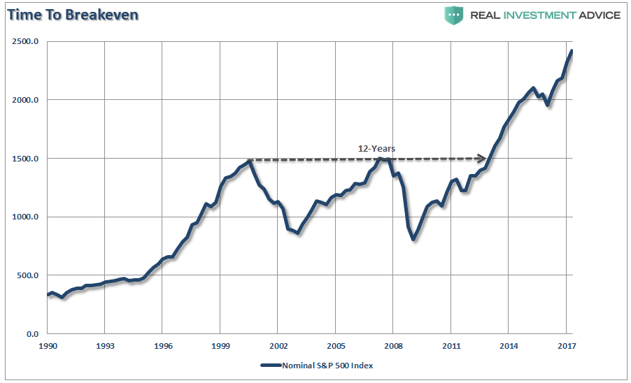
The Big Lie
The “Big Lie” is that you can “beat an index” over an extended period of time.
You can’t, ever.
Let me explain.
While individuals are inundated with a plethora of opinions on why the index is moving up or down from one day to the next, a portfolio of dollars invested in the market is vastly different than the index itself. I have pointed out the problems of benchmarking previously stating:
- The index contains no cash
- It has no life expectancy requirements – but you do.
- It does not have to compensate for distributions to meet living requirements – but you do.
- It requires you to take on excess risk (potential for loss) in order to obtain equivalent performance – this is fine on the way up, but not on the way down.
- It has no taxes, costs or other expenses associated with it – but you do.
- It has the ability to substitute at no penalty – but you don’t.
- It benefits from share buybacks – but you don’t.
Furthermore, it is also not representative what happens to real dollars invested in the financial markets which are impacted by changes in inflation. The chart below compares the break even times for the nominal index versus an inflation-adjusted index and $100,000 investment into the index.
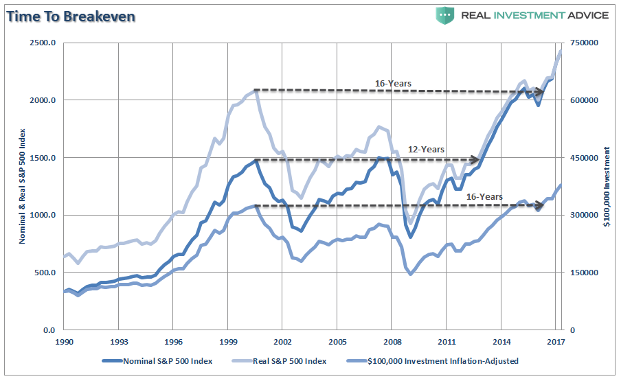
You will notice in the $100,000 portfolio that investors, once the impact of inflation is added, just got back to even after 16-years of their investment time horizon was lost. The problem with that, as I noted in “The World’s Second Most Deceptive Chart” is the impact of life expectancy on reaching investment goals. To wit:
“For consistency from last week’s article, we will assume the average starting investment age is 35. We will also assume the holding period for stocks is equal to the life expectancy less the starting age. The chart below shows the calculation of total life expectancy (based on the average of males and females) from 1900-present, the average starting age of 35, and the resulting years until death. I have also overlaid the rolling average of the 20-year total, real returns and valuations.”
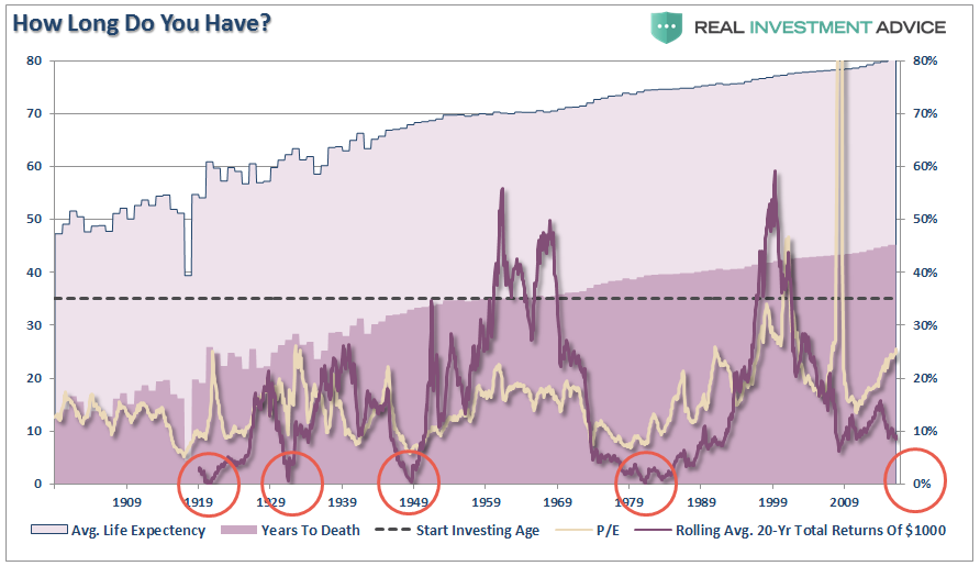
Here is what you should take away from the two graphs above. Assuming that an individual was 35 at the peak of “Dot.com” bubble, they are now 51 years of age and are no closer to their goals than they were 16 years ago. Assuming they will retire at 65, this leaves precious little time to reach their retirement goals.
Of course, this is repeatedly proved out in survey after survey which shows a majority of Americans are woefully behind in their savings goals for retirement.

Of course, this is due to one of the most egregious investing “myths” in the financial world today:
“The power of compounding is the most powerful force in investing.”
Markets Don’t Compound
There is a massive difference between AVERAGE and ACTUAL returns on invested capital. The impact of losses, in any given year, destroys the annualized “compounding” effect of money.
The chart below shows the impact of losses on a portfolio as compared to the commonly perceived myth that investors “average 8%” annually in the stock market.
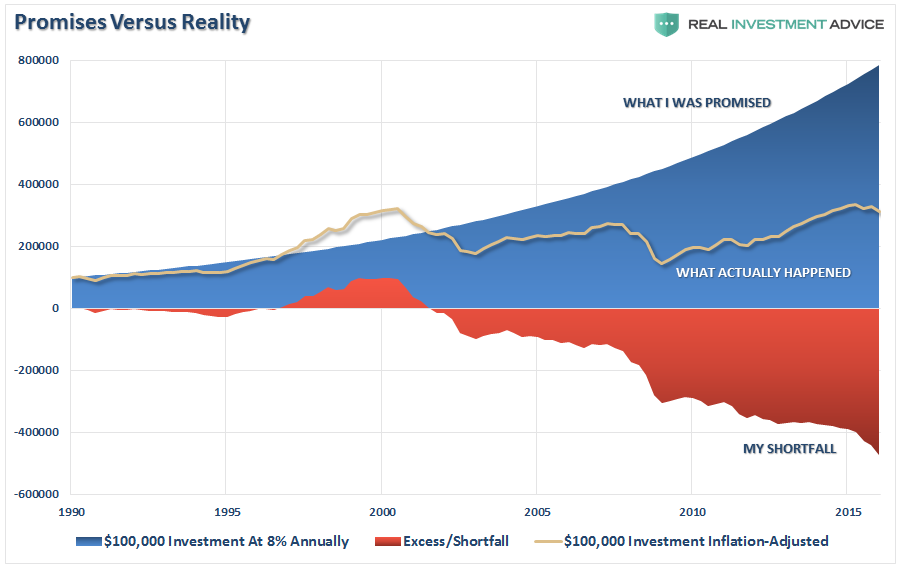
As you can see, while investors did finally get back to even by just “buying and holding” their investments, they are far short of the goals they needed to achieve financial security. The problem is due to the fact we “anchor” to our original “peak investment valuation” rather than our ultimate goal.
However, let’s take this one step further and look at a $1000 investment for each peak and trough valuation period with the assumption of a real, total return holding period until death based on life expectancy tables. No withdrawals were ever made. (Note: the periods from 1983 forward are still running as the investable life expectancy span is 40-plus years.)
The gold sloping line is the “promise” of 6% annualized compound returns. The blue line is what actually happened with invested capital from 35 years of age until death, with the bar chart at the bottom of each period showing the surplus or shortfall of the goal of 6% annualized returns.
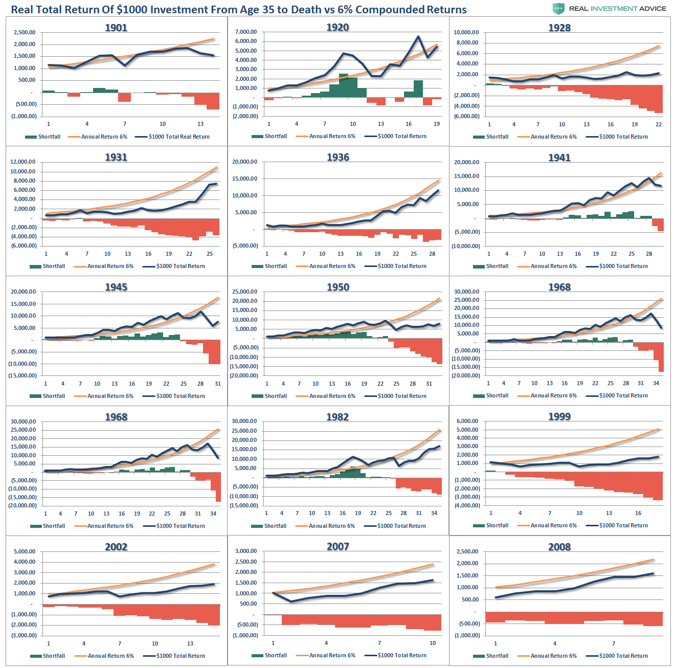
Again, in every single case, at the point of death, the invested capital is short of the promised goal.
The difference between “close” to goal, and not, was the starting valuation level when investments were made.
This is why, as I discussed in “The Fatal Flaws In Your Retirement Plan,” that you must compensate for both starting period valuations and variability in returns when making future return assumptions. If you calculate your retirement plan using a 6% compounded growth rates (much less 8% or 10%) you WILL fall short of your goals.
Hang On…That’s Not The End Of Story
There is one more calculation that needs to be accounted for that is too often left out of the “just buy an index because you can’t beat the index” meme.
Let me just state again, as noted above, NO ONE can beat an arbitrary, hypothetical, index. PERIOD.
Why?
Because of inflation, taxes, and expenses.
The chart below once again returns us to our $100,000 invested into the nominal index versus a $100,000 portfolio adjusted for “reality.”
$100,000 invested in 1998 has had a compounded annual growth rate of 6.72% on a nominal basis as compared to just a 4.39% rate when adjusted for reality. The numbers are far worse if you started in 2000 or 2008.
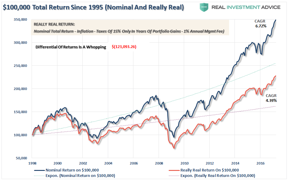
Furthermore, both numbers also fall far short of the promised 8% annualized rates of return often promised by the mainstream analysts promising riches if you just buy their investment product or service and hang on long enough.
The reality is, as proven repeatedly over time, such an outcome will likely prove to be extremely disappointing.
In order to win the long-term investing game, your portfolio should be built around the things that matter most to you.
– Capital preservation
– A rate of return sufficient to keep pace with the rate of inflation.
– Expectations based on realistic objectives. (The market does not compound at 8%, 6% or 4%)
– Higher rates of return require an exponential increase in the underlying risk profile. This tends to not work out well.
– You can replace lost capital – but you can’t replace lost time. Time is a precious commodity that you cannot afford to waste.
– Portfolios are time-frame specific. If you have a 5-years to retirement but build a portfolio with a 20-year time horizon (taking on more risk) the results will likely be disastrous.
As I wrote previously:
“The index is a mythical creature, like the Unicorn, and chasing it takes your focus off of what is most important – your money and your specific goals. Investing is not a competition and, as history shows, there are horrid consequences for treating it as such.”
So, do yourself a favor and forget about what the benchmark index does from one day to the next. Focus instead on matching your portfolio to your own personal goals, objectives, and time frames. In the long run, you may not beat the index but you are likely to achieve your own personal goals.
But isn’t that why you invested in the first place?
Lance Roberts

Lance Roberts is a Chief Portfolio Strategist/Economist for Clarity Financial. He is also the host of “The Lance Roberts Show” and Chief Editor of the “Real Investment Advice” website and author of “Real Investment Daily” blog and “Real Investment Report“. Follow Lance on Facebook, Twitter and Linked-In