


Relative Strength vs. Relative Strength Index (RSI)
It’s a Difference in Perspective
By Paul Kornfeld, President, SIACharts
Many advisors that use SIACharts.com, Canada’s leading technical analysis website, ask us: “What is the difference between Relative Strength and the Relative Strength Index (RSI)?” The short answer is that there is NO connection, as they are completely different measurements.
This is a confusing aspect of technical analysis since the names are so similar. RSI is a momentum oscillator that measures the up and down closing days over a certain period, usually 14 days scoring between 0 and 100, and displaying recent overbought or oversold conditions. Relative Strength looks at a relationship between two investments, comparing the price of one investment versus the price of another investment. It shows whether the investment is stronger or weaker than the comparison investment or index used.
 The key difference between the 2 terms is perspective. For example, if you are running a 10k every day and measuring your times, you may notice that you are slightly improving your times over the last 2 weeks. Or you may notice that your times over the past 2 weeks actually got slower because you have been feeling sick and not at 100%. This would be like using RSI in investing which helps you measure the recent price movement of a stock over the prior 14 periods letting you know if the direction is moving up or down, which would fluctuate a lot over the course of a longer period of trading.
Now, imagine you take your running times for the 10k every day, and compare them against your friend’s 10k running times to see who has been going faster. This is a relative strength comparison as you are now getting more information on how fast your times are compared to someone else.  This would be like using Relative Strength in investing to compare the performance of one stock versus another stock. But now imagine you don’t just compare your 10k running time to your friend, but to all your friends, or everyone in your city, or everyone in your age group, or everyone in the world. You are now using Relative Strength to compare your running times to a much larger universe, to give you exponentially more information and perspective on if your running times are below average, middle of the pack, or above average!
At SIACharts, we believe perspective is very important in investing as ultimately you are trying to find the best investments for your portfolios. As there are thousands of stocks, ETFs, mutual funds, options, etc. and millions of combinations of these investments to choose from, you need a tool to help you choose the right investments and combinations as we lack enough time in a day to do individual analysis on all choices. 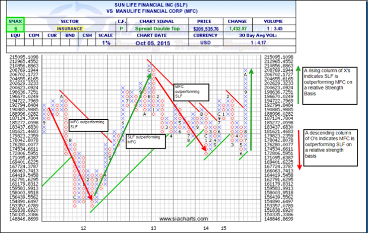 Relative Strength can compare stocks against each other in a peer group (cap size, type, sector, yield, index, etc. attributes) or other investments against each other so you can increase your scope of analysis yet still find the winners from a specific universe quickly, without having to do multiple individual analysis like you would with RSI. The Power of SIACharts takes Relative Strength to a whole new level, doing billions of calculations and millions of comparisons on over 500 reports and thousands of custom universes advisors have made for their own unique practice every night!
The calculation of relative strength is found by taking the prices of two securities and dividing the price of one of those securities by the other. SIA uses an adjusted price for each investment that could include a currency, dividend, split, spinoff, etc. adjustment so it is a true apples-to-apples relative comparison. However, SIACharts uses the power of Point and Figure comparison charts to eliminate some of the short-term movement in the market and create powerful rankings. It goes deeper than just looking at the performance of two stocks next to each other which doesn’t tell you anything about the current trend or potential outlook going forward. So by using point and figure comparison charts on a massive scale, you can understand the money flows and price action to better align yourself with the relative strength of the market and stay away from the relative weakness!
Is it time to change your perspective in investing?
Copyright © SIA Charts