


How has the world managed to increase both population and living standards on a finite planet?
by Econbrowser
A key feature of raw commodities is that they are ultimately produced from a finite resource base. The classic example is agricultural products, which require land to grow. As we try to produce more and more crops on a finite number of acres, the familiar economic theory of diminishing returns suggests that the marginal cost of food production should increase over time. This basic calculus led Thomas Malthus two centuries ago to predict that, if population growth was not held in check, the world’s masses were headed for a future of starvation and misery.
That didn’t happen, and the reason was technological progress and use of machines. As we discover better ways to grow crops, that can be a factor reducing marginal cost. Which of these two competing forces ends up dominating– diminishing returns or technological progress– is ultimately an empirical question.
A recent paper by Hiroshi Yamada and Gawon Yoon (2014) revisits this question, looking at the behavior of relative prices of a number of commodities over the last century. Rather than insist that one influence (technology or diminishing returns) dominates over the entire sample, the authors used a method that allows the possibility that different broad trends may characterize different subsamples.
The graph below displays their results for a number of agricultural commodities. The blue lines record the price of the indicated commodity relative to the price of manufactured goods. The relative price is measured on a natural log scale, so that a vertical move of 0.1 roughly corresponds to a 10% increase or decrease. Huge changes are often observed over a short period of time. The red lines indicate the authors’ measures of broad trends in the real prices of the different commodities.
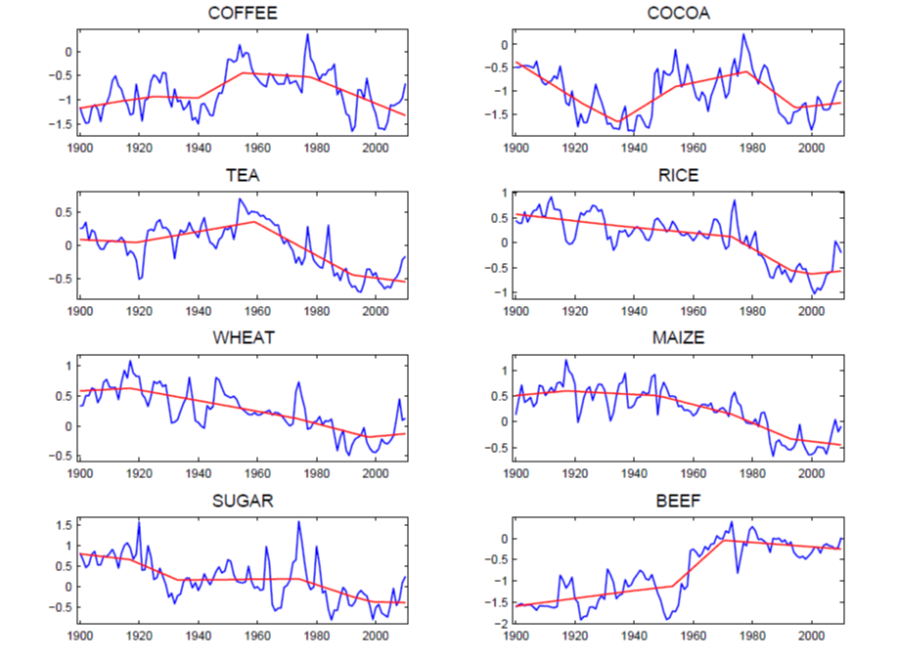
Relative prices of most agricultural commodities rose sharply over the last decade, as growing incomes in the emerging economies led to increased demand. That pushed prices up (the blue lines) as a result of the diminishing-returns effect described above. But it is interesting that the Yamada-Yoon red trend lines typically dismiss the dramatic price increases over the last decade as a temporary blip up within the context of a longer-run trend of stable or declining relative prices.
The technological advances that led to the broad trend of falling real food prices often seen in the graphs above are well understood. The Green Revolution– improvements in irrigation, fertilizer, pesticides, and hybridization– managed to keep significantly ahead of Malthus’s diminishing returns.
And technological progress in agriculture continues at an amazing pace. Advances in genetic engineering and precision agriculture based on geographic information systems, global position systems, remote sensing, and variable-rate technology are developing new ways to get more out of every acre of farmland. One could make a case that Yamada and Yoon’s statistical trend lines, which see the world as still in the midst of a broad downward trend in the relative price of many agricultural products, will turn out to be a correct prediction of what we’ll see over the next decade.
In the case of commodities that are produced from mines under the ground, Malthus’s principle of diminishing returns could take an even bigger bite. Typically the easiest-to-produce ores (that is, those associated with the lowest marginal cost) would be mined first, leading us to anticipate that, even to produce the same number of tons (let alone an increasing quantity) of the resource each year, we would face an increasing marginal cost over time. The graphs below include a number of extractive commodities. Aluminum prices show an even more convincing downward trend than most agricultural commodities– for this commodity again technological advances appear to have kept ahead of depleted mines and growing demands for over a century. But for other goods, such as copper, tin, and lead, it’s more difficult to dismiss the price surge over the last decade as a temporary anomaly.

The graph below displays the real price of crude petroleum since 1870. For the first century of the industry, the long-run trend was unmistakably down, with technological advances keeping ahead of growing demand and depleting reservoirs. The price shot dramatically up during the temporary supply disruptions associated with the OAPEC oil embargo of 1973, Iranian revolution in 1978-79, and Iran-Iraq War beginning in 1980. The price subsequently plunged, though it remained well above the average value seen in most of the earlier twentieth century. The price of oil spiked back up pretty dramatically over the last decade.

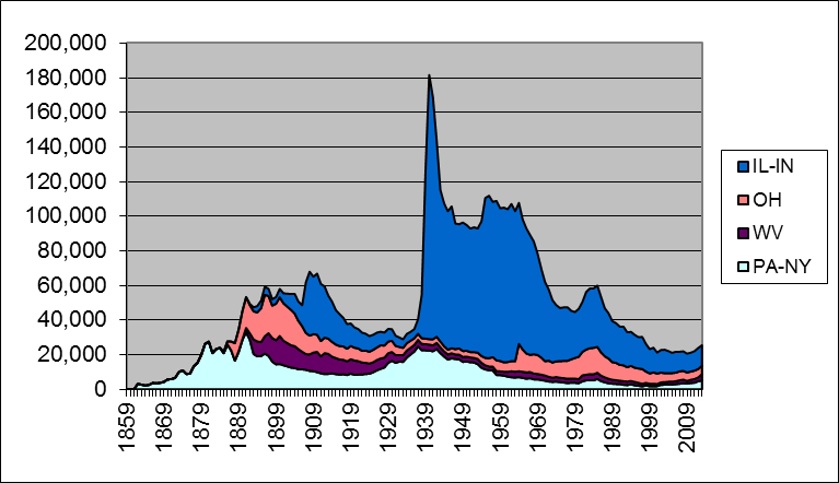
In a recent analysis written for the Handbook of Energy and Climate Change I looked into the details behind the advances in oil production that account for the broad downward trend in the real price of oil over the first century of the industry. I concluded that a primary driver of growing production was moving on to new oil fields rather than improving technology for getting more oil out of older fields. The graph below shows that oil production from Pennsylvania (where the industry began) peaked in 1891, a reality that none of the remarkable technological advances of the following century would ever change. Total U.S. production continued to grow, despite falling output from Pennsylvania, because we moved on to other states like Ohio, West Virginia, and Illinois. Their oil production peaked in 1896, 1900, and 1940, respectively. Each individual state eventually faced diminishing returns and falling production, but total U.S. production nonetheless continued to grow, because for a while there were always new states and new oil fields to which we could turn.
U.S. production continued to climb (and marginal costs continued to fall) as the industry moved into oil fields with much more potential than those in the states where the industry began. The black liquid that initially came gushing out when you drilled into the ground in Texas is the most important example. But each U.S. state (other than North Dakota– more on that below) eventually reached its peak and then began a decline, with total U.S. oil production peaking in 1970.
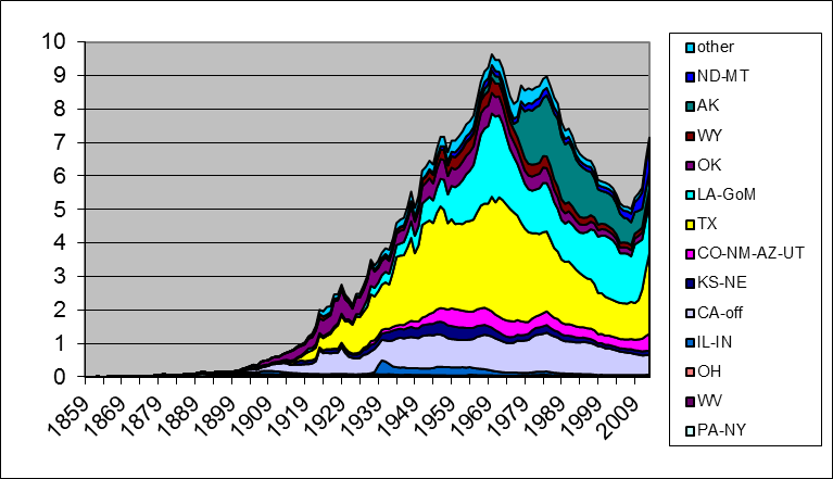
U.S. field production has been climbing back up since 2008, thanks to new methods for getting oil out of tight geologic formations by horizontal fracturing of the rock. It is important to note that these methods are not a technological advance like those mentioned for agriculture that allowed us to produce more of the product at a lower marginal cost than previously. Indeed, fracking would not be profitable at the prices paid for oil over most of the first century and a half of the industry. I think the correct way to view shale oil production is as a specific mechanism by which the industry has figured out how to maintain production in the face of a depleting resource base by moving along an upward-sloping marginal cost curve.
It’s also worth noting that more than 100% of the increase in global crude oil production since 2005 has come from U.S. shale oil. Without it, global field production would be lower today than it was in 2005. The U.S. Energy Information Administration had been expecting U.S. shale oil production to peak around 2021. Last week Reuters reported that the EIA has cut its estimates of recoverable oil from California’s Monterey Shale by 96%.
There is no question that the relative price of any commodity is subject to competing long-run pulls from increasing marginal cost on the one hand and improving technology on the other. Many people seem to just pick one or the other factor as a one-size-fits-all sweeping generalization for all commodities and all time. But a little reflection and inspection of the data should convince an objective observer that the broad trends appear to be different for different commodities and at different points in history. A careful look at the historical record leads one to reject both unbounded optimism in the potential of technology as well as unrelenting pessimism about Malthusian dynamics as universal truths.
Copyright © Econbrowser