


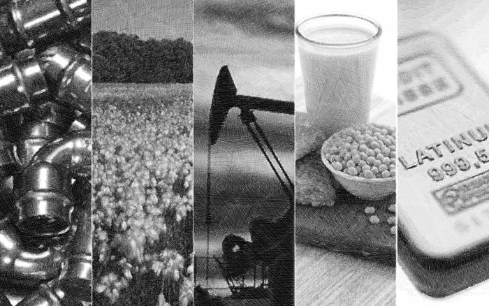
Below is an updated look at our trading range charts for ten major commodities. In each chart, the dark blue line represents the commodity's price, while the green shading represents its trading range. The trading range is set at two standard deviations above and below the commodity's 50-day moving average. Volatile prices cause a trading range to widen, while a decrease in volatility causes the trading range to tighten. A move to the top of or above the trading range is considered overbought, while a move to the bottom of or below the trading range is considered oversold. The trading ranges allow you to look for "reversion to the mean" trades, because most of the time, when something gets too extended above or below its range, it begins to trend back towards its 50-day. The range also allows you to better track the long-term directional trend of the commodity and remove some of the noise that the daily price action causes.
As shown below, oil is currently trading closer to the top of its range than the bottom, but it's still in neutral territory and trending sideways with a slight upward slant. Natural gas has really seen its volatility decrease in recent months after surging in late 2013 and earlier this year. You can see how much natural gas' range has tightened recently due to its sidways action.
The precious metals were in steep downtrends for most of 2013, but you can see that they have stabilized into a sideways pattern so far this year. While the charts for gold, silver and platinum aren't necessarily bullish, it's good to see them forming a base. Platinum especially looks like it's gearing up for a move higher if it can just break above the top end of its sideways range.
Corn and wheat are two commodities that have fallen recently after rallying over the past few months. Corn was at the top end of its range at the end of April, but now it is well into oversold territory. Wheat was overbought just a week or two ago, but now it is at the very bottom of its range.
Finally, the two breakfast drink commodities -- orange juice and coffee -- have some of the best chart patterns of the bunch. Coffee is consolidating after a big jump in price earlier this year, while orange juice has been slowly and steadily trending higher since making a low in the fourth quarter of 2013.
Copyright © Bespoke Investment Group