

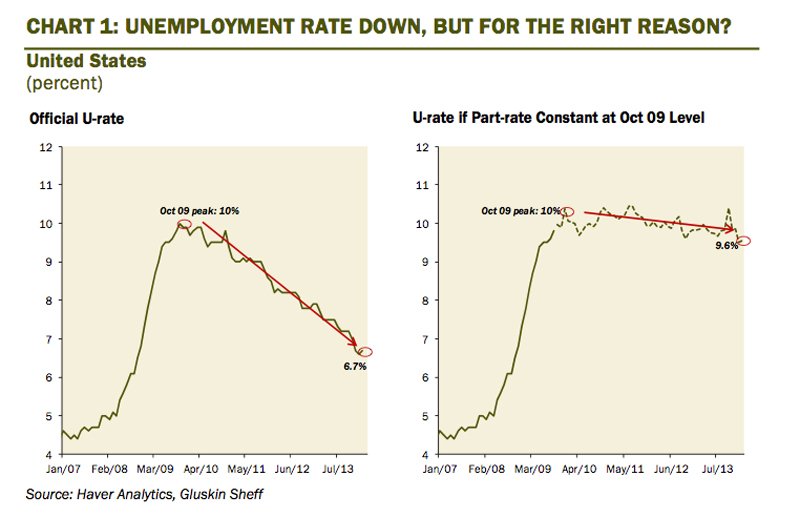
The unemployment rate has fallen sharply from its recessionary peak, however, a large portion of this reflects a decline in the participation rate. In fact, many pundits (including several Fed officials) are completely dismissing the drop in the traditional U3 unemployment rate as a true barometer of labour market tightness (I think that is a mistake, by the way).
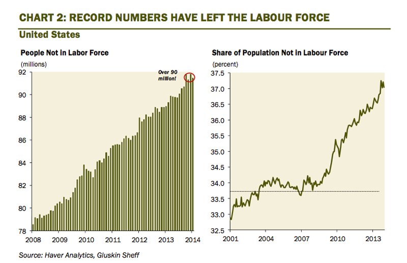
The participation rate has fallen from pre-recession levels of 65% to 63% in February as record numbers of Americans have left the workforce — it hasn’t been this low since the late 1970s. The rise in the number of people leaving the labour force entirely is running about double the pace of new job creation. Over 90 million Americans now reside outside the traditional borders of the labour market. Five years ago, the number was closer to 80 million. This indeed is a mystery and a huge socio-economic phenomenon.
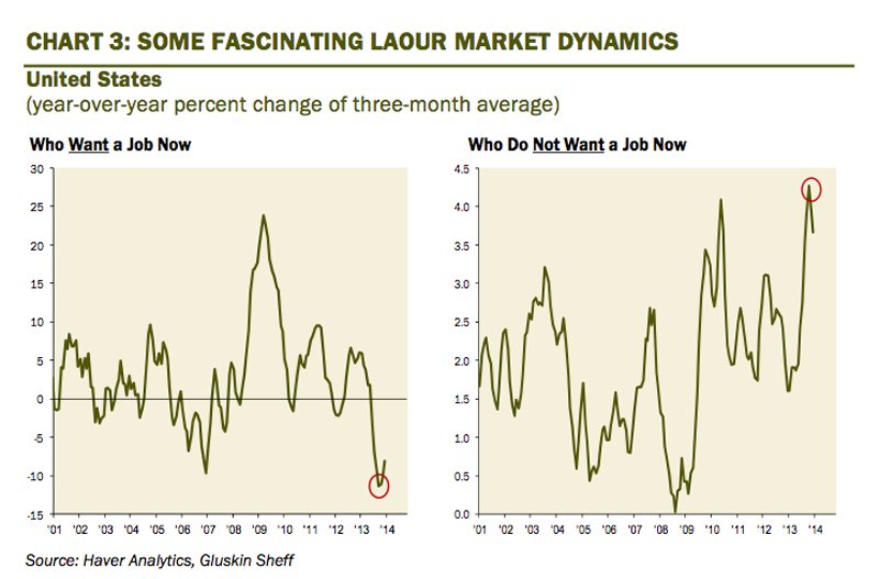
Interestingly, of the folks who have decided to leave the workforce — by definition are not looking for work actively — and do not want a job are down more than 10% from year-ago levels. Moreover, those who don’t want a job at all have seen a visible uptrend. It would be interesting to see how they are getting by (Uncle Jack’s generosity? The underground/barter economy? The lottery?).
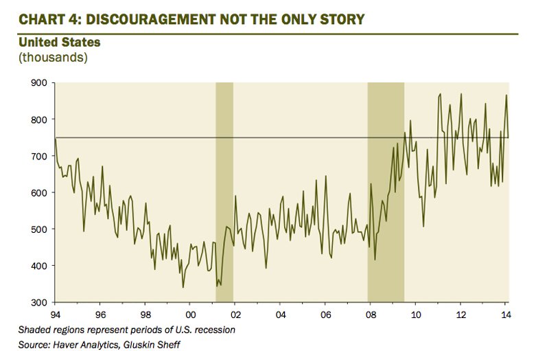
While many point to the impact of discouraged workers on the falloff in the participation rate, this is not the only story currently playing out. The number of people who left the labour force and claim they did so without being discouraged is running far above historical norms. One example are people who have headed to school — accounting for 7% of the overall decrease in labour force participation over the past three years (assuming they intend on graduating with a degree, it will be sometime before they resurface into the classic job search — in other words, waiting for the participation rate to rise again and thwart the decline in the unemployment rate will be akin to waiting for Godot).
 David Rosenberg
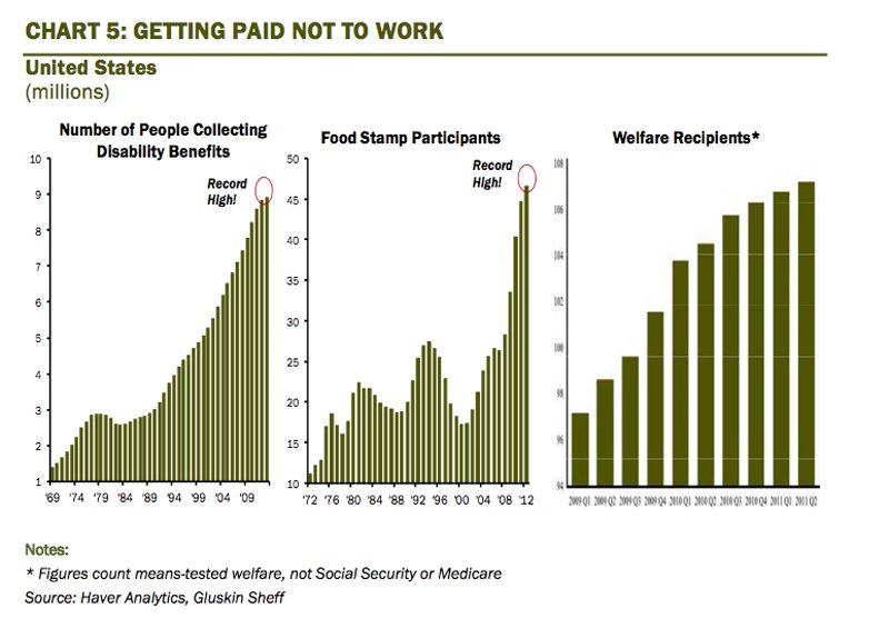
The social safety net is supporting a record number of Americans. In fact, the Cato Institute published a controversial study last summer, concluding that in 39 states, those individuals astute enough to tap the myriad of government benefit programs at all levels got paid at least as much as an administrative assistant (in 11 states, as much as a school teacher)! Now not everyone is lazy, but at the margin, when governments create disincentives to work, some will choose not to. From 2010 to 2013, the data show that individuals leaving the labour force due to disability accounted for an unprecedented 28% of the overall tally — this compares to 18% who were classified as “disabled” from 2007 to 2010.
 David Rosenberg
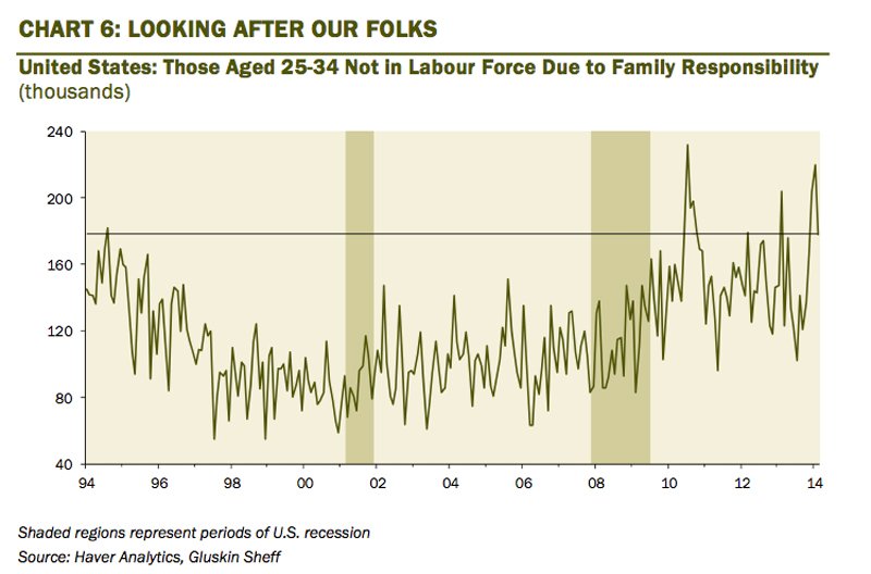
The key 25-34 age demographic is seeing a change in priorities, with a noticeable upward trend in those not in the labour force due to family responsibilities — like taking time off and tending to our aging parents.
 David Rosenberg
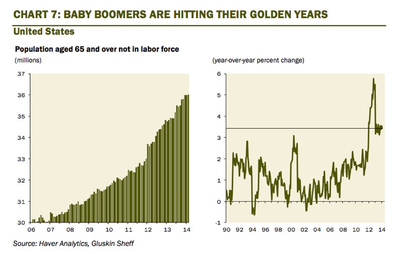
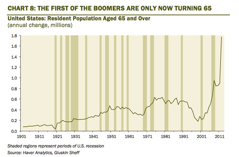
Speaking of which, the first of the Baby Boom generation (those born between 1946 and 1964) turned 65 years old three years ago. The retirement wave is just starting. This is the primary reason for the secular decline in the participation rate. Indeed, from 2010 to 2013, more than 60% of labour force dropouts were retirees — more than double the share for the prior three years.
 David Rosenberg
This is not a chart of a dot-com stock circa 1999. This is the annual increase in the number of Americans turning 65 — this number is going to be at least 1.5 million per year for at least the next fifteen years. We are seeing record high numbers of people falling into the 65 and over age bracket, resulting in a significant shift in U.S. demographics and thus the labour market.
 David Rosenberg
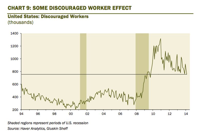
There is some discouraged worker effect on the participation rate to be sure, but while the level is above pre-crisis norms, it is on a discernible downward trend of late. This is but a small part of the story despite all the attention it gets.
 David Rosenberg
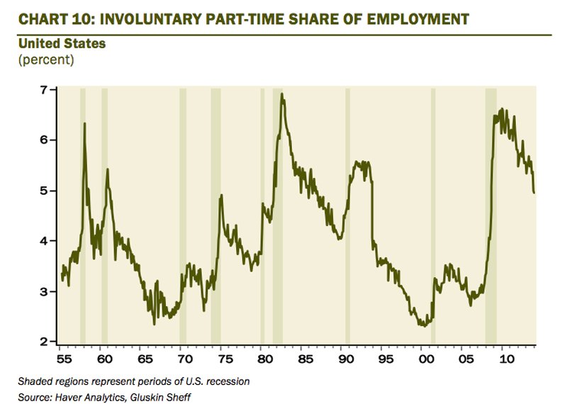
Janet Yellen mentioned in a recent speech that the involuntary part-time share of the employment pie is a good proxy for the ‘discouraged worker’ effect so all of a sudden, this arcane metric has jumped to the top of the list of what economists now pay attention to. Yes, it is high by historical standards but is far off the peak at 5% presently, and in past episodes when this measure was this high, the headline unemployment rate was well north of 7% as opposed to today’s 6.7%. Again, nobody is saying that there is no discouraged worker effect at all — but that it is a two-bit player in this game.
 David Rosenberg
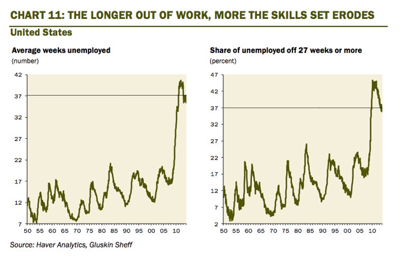
The longer people remain out of work, the greater the erosion in their skills sets which can make finding a new job even tougher. To be sure, the share of the ranks of the unemployed who have been looking for work fruitlessly for at least six months at 37%, while off the highs, is still uncomfortably high — in past recessions, this metric rarely got much above 22%, and today, almost five years into the recovery, it is 15 percentage points above those prior cycle peaks. The problem is that over time, the idleness of these workers renders then increasingly unemployable — I think it is a false premise that these people, as they fall out of the labour force in the future (as some of their predecessors already have — only 10% of the long-term unemployed actually end up getting a job) will somehow come back into the labour force when things get better (as an aside, things aren’t great but they have been getting better for five years now; what exactly needs to happen to lure these folks back into a job search in the future, especially if they have found a way to get by either by doubling up, tapping the benefits system or working in the underground economy?).
 David Rosenberg
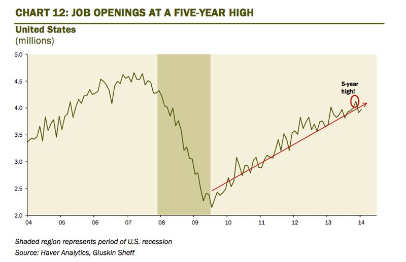
Job openings have rebounded nicely from recessionary lows as firms look to add to payrolls. If all four million openings were filled, the jobless rate would plunge to 4% (do you believe in miracles? Fairy tales?). But this goes to show that contrary to popular opinion, business demand for labour is on a rising path.
 David Rosenberg
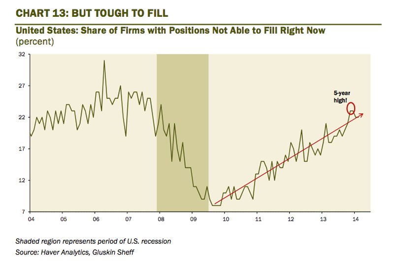
The problem, especially for small companies, is filling these positions. Then again, when Uncle Sam pays you to stay at home and watch Breaking Bad re-runs ...
 David Rosenberg
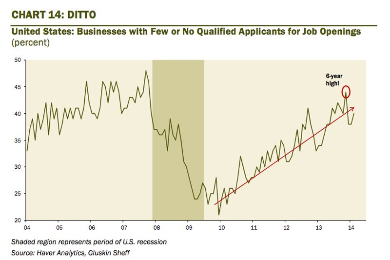
Firms are reporting difficulty in finding qualified applicants for the job openings they have available. The latest Fed Beige Book highlighted labour shortages in health care, technology, transportation services, engineering and construction.
 David Rosenberg
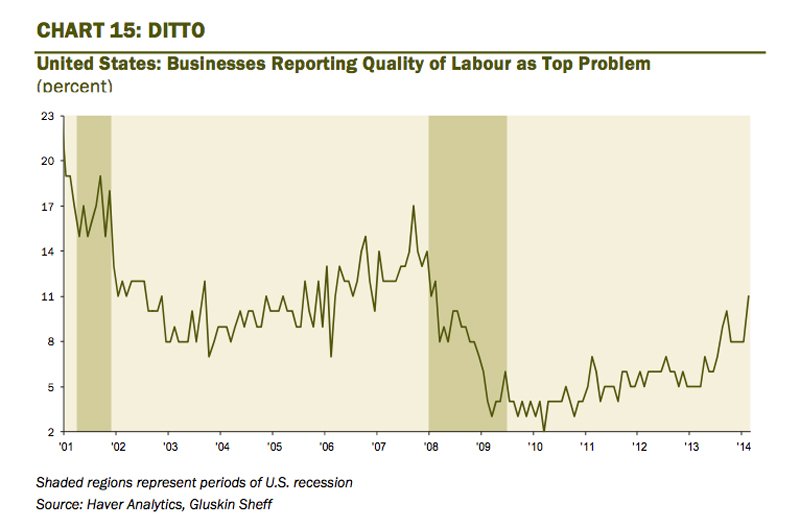
Accordingly, quality of labour is increasingly becoming a problem for firms — small businesses citing this as their top concern at a level we have not seen in nearly six years.
 David Rosenberg
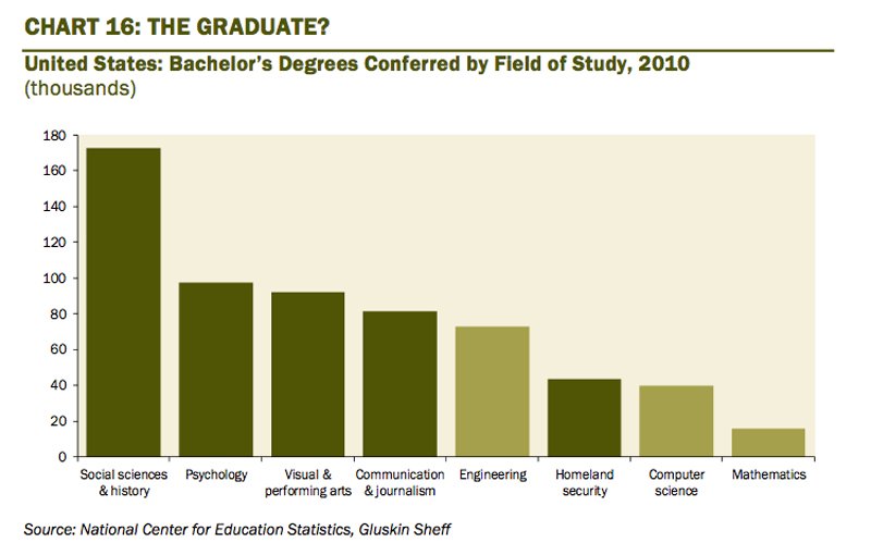
Perhaps part of the problem is that the U.S. education system is churning out graduates that are not really in great demand by the private business sector — we didn’t read much about the demand for social scientists and psychologists in the Beige Book. We’ve reached a state where more people are graduating with expertise in homeland security than in either computer science or math.
 David Rosenberg
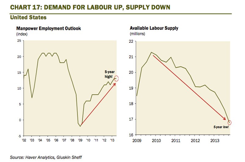
Demand for labour is going up to cycle highs while the available pool of labour has shrunk to cycle lows. The case for immigration reform has rarely been stronger from an economic perspective. According to an op- ed piece in the March 26th WSJ (How America Loses a Job Every 43 Seconds), the H-1B visa program is still being capped at 85,000 annually — but the applications far outnumber that ceiling. It is estimated that we are seeing 500,000 of those four million job openings not being filled just by overly restrictive immigration policy alone.
 David Rosenberg
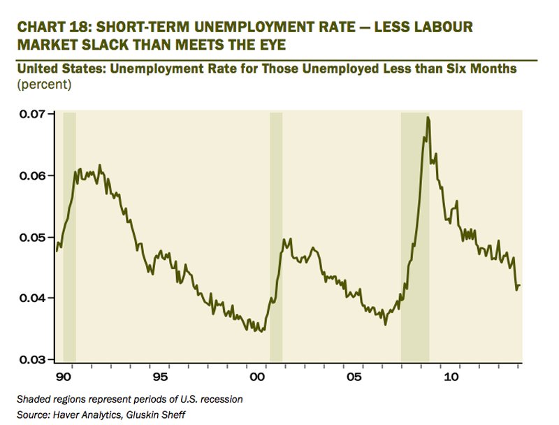
One measure of labour market tightness is the unemployment rate for those folks who had been out of work for six months or less — this metric at 4.2% is already a full percentage point below the average so far this cycle — and the number or short-term joblessness is back down to 2004 levels (even as long-term unemployment is more than double).
 David Rosenberg
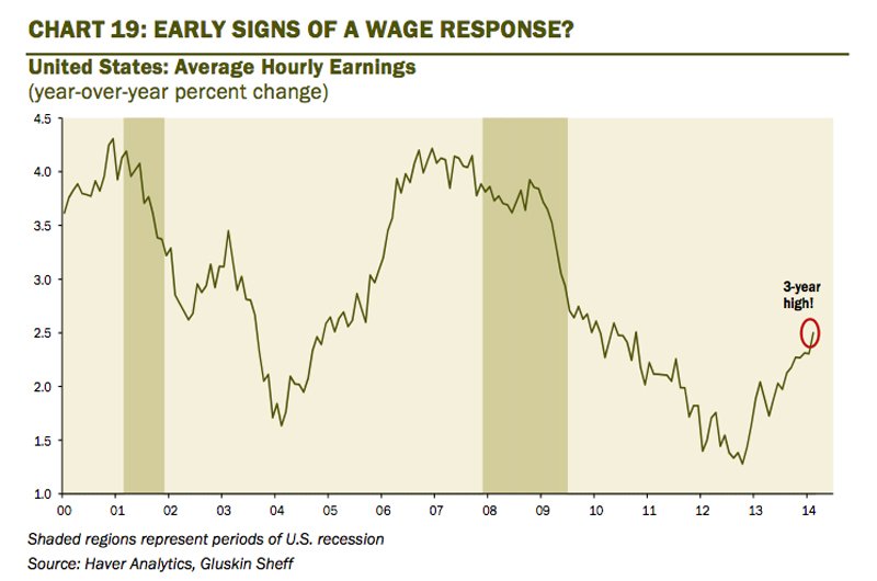
The wonderful thing about economics is that in first-year university, you learn how to draw supply and demand curves — important because at the point the two lines intersect generates the equilibrium price. In this particular case, it is about the price of labour. There is still not yet a boom of any sorts, but the wage trend has clearly improved.
 David Rosenberg
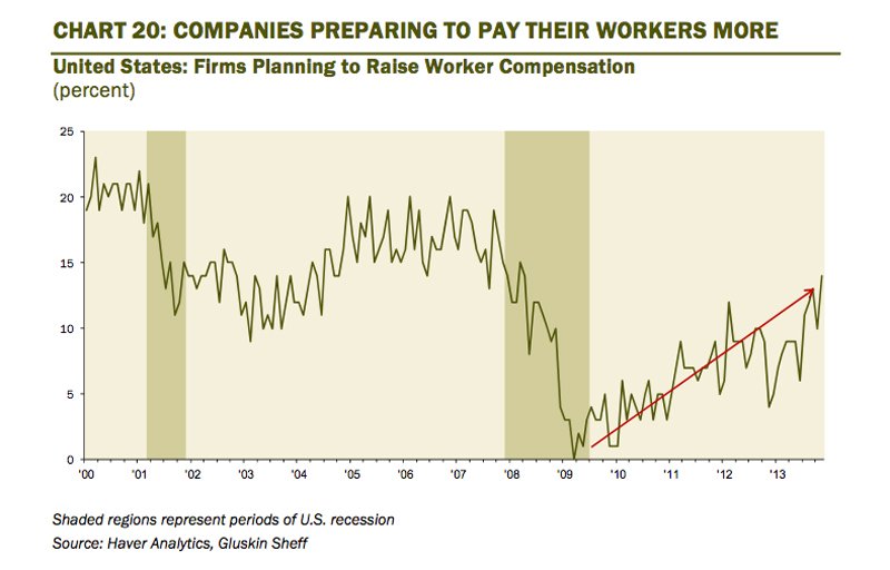
Firms are preparing to increase compensation in order to retain and acquire qualified workers — again, the laws of supply and demand at work. I am not sure why there are so many economists out there predicting a continued absence of wage inflation — I mean, economists may be the forecasters, but it is the businesses who are the ones who actually set the wage pattern. If they are saying they are now willing to pony up more in light of a dwindling pool of labour, why would anyone assume that they are not going to (unless they are band of liars)?
 David Rosenberg
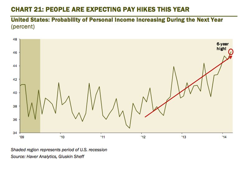
It’s not just the business sector that see the arithmetic of tighter labour markets precipitating higher wages ahead, but a growing number of workers are expecting a fatter paycheck in coming quarters as well.
Maybe it is a hope. Maybe just a prayer. I call this above chart the Marx- Engels slide — if I am right, that the returns to work will rise in lagged response to the sustained tightening in the labour market, then we will finally start to see the wage share of Gross Domestic Income begin to carve out a bottom and finally embark on the mean-reversion process. I realize what this means for profit margins, but in the name of ensuring that capitalism is sustained, my friends, we need to start seeing this chart reverse course.
This post originally appeared at Gluskin Sheff. Copyright 2014.