
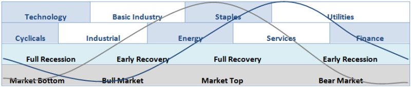
We're finally back to seeing an "orderly" sector rotation situation on the 3-month S&P Sector PerfChart:

The "offensive sectors" on the left of the chart are all positive while the "defensive sectors" are all now below zero. Comparing this to the Sector Rotation Model (located at the bottom of the PerfChart page) shows that, if this pattern holds, this configuration is bullish for the market.
To recreate this chart, follow these steps:
- Click on the "S&P Sector PerfChart" link located in the middle of our homepage.
- Click on the "Show Histogram Chart" button located in the lower left corner of the chart.
- Right-click on the middle of the date slider in the lower right corner of the chart (where it says "200 days") and then select "Past Three Months" from the menu that appears
- Right-click in the middle of the chart itself, then select "Show Cycle Line" from the menu that appears.
- Click and drag the yellow cycle line until it is in position
Why three months? John Murphy often says that 3 months (~60 days) is a good intermediate timeframe to use when looking for sector effects. You can move/shrink/expand the date slider to see different time periods.
- Chip