Why Usability Matters
by Lori Yaverbaum, Commonwealth Financial Network
My husband is a commercial airline pilot, and it’s easy for him to talk with almost anyone about his job. After all, who doesn’t have a good travel story to share? It’s not quite the same when I tell people that, as the vice president of user experience at Commonwealth, part of my job is to ensure that our products and services are “usable.” They don’t seem all that interested in hearing why usability matters. But it does matter, quite a lot! So, let’s take a look at what usability is, why it's important (using some real-world examples), and some of the ways we improve usability here at Commonwealth.
The usability of a product or service is based on how efficiently and effectively a person can use it—and just how satisfied he or she was with the process. There are many formal definitions of usability out there, but here’s my simplified one:
Usability = 0% frustration + 100% satisfaction
When this basic formula isn’t met, some of the costliest, most embarrassing, and even deadliest mistakes have resulted. Here are just a few examples of usability gone wrong.
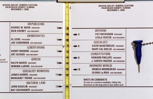
Unclear forms. As you might recall from the November 2000 election, an unclear ballot in Palm Beach County, Florida, resulted in many voters accidentally casting their votes for Pat Buchanan, necessitating a costly recount. In the image below, you can see that Al Gore is listed second down on the left, but a voter would have to choose the third selection button to vote for him. The alignment is quite confusing and the instructions unclear. Why are the arrows numbered but the corresponding candidate selections are not?

Poor readability. Recently, a well-publicized issue at the Oscars highlighted the importance of readability. Although the presenters were in fact given the wrong card when announcing the Best Picture award, what if that incorrect card had been easier to read? The color contrast of the print on the envelope and the format of the text on the announcement card itself contributed to this mix-up. The text was simply not legible enough, particularly given the stage lighting.

Cluttered display. One thing I’ve come to realize from watching Why Planes Crash with my husband is that many air disasters are related to usability issues. For instance, an Airbus 320 crash in January 1992 was partly caused by a mode switch that was turned to the wrong position. How could an experienced pilot make this mistake? The small switch was located among a large bank of other switches. Adding to the confusion was the fact that different types of information were displayed in close proximity, making it difficult to distinguish at a glance.

In the financial services industry, usability issues can be costly and frustrating. Let's use the web portal that Commonwealth has built for our advisors, called COMMunity Link®, as an example. The site averages more than 350,000 page views per day. Given this traffic, we put a great deal of focus on ensuring that our advisors and their staff can find what they need quickly and easily. Our goal is that they spend their time using our services as productively as possible and not wasting it trying to figure out how to get what they need.
We know that any shortcoming in creating the most usable experience possible will have a significant impact both on our service delivery and on our advisors’ bottom line. Consider this: If we can save one second on every page view, we can (collectively) give back more than 35,000 hours a year to our site visitors, which they can then spend on something else. At an average billing rate of $250 per hour, that translates into more than $8.75 million in savings. Wow!
So, how exactly do we go about creating the most usable experience possible? For starters, we continuously seek out and incorporate the feedback from the people who will ultimately be using our products and services into our development process. These efforts to improve usability revolve around quantitative data, informal feedback, and formalized research and testing sessions.
Analytics. We review analytics—or hit counts—on a monthly basis. Although the data is collected anonymously to avoid any bias, we aggregate these numbers to provide us with quantitative data on what is accessed and how often. We then meet with content and product owners to remove information that is no longer needed or to make information more prominent if it is important but just not being found.
E-mails and phone calls. We provide very visible feedback links so those using our products can easily report suggestions or frustrations as soon as they occur. Product owners and subject-matter experts respond immediately to this feedback, and we consolidate everything into a database. The data is subsequently retrieved and reviewed as we work on enhancements. Plus, when our employees receive phone calls, we enter this feedback in the same system, so all the information we need is in one easily accessible location.
Personal visits and Compliance audits. Information collected during Compliance audits, when our advisors come out of transition, and when they consult with our Practice Management team is also categorized, analyzed, and entered into the same database mentioned above.
Surveys. We periodically run surveys, which help us prioritize what is needed and how we can best present information.
User feedback sessions. As we work on a section of COMMunity Link or a new service, we turn to our advisors and their staff for more “formal” feedback. We use a number of methods, depending on where we are in the development cycle:
- Visit offices to observe how different products and services are being used throughout the day, soliciting additional needs or suggestions.
- Set up online “card sort” exercises, where the best naming conventions and groupings to use for navigation are determined.
- Show paper mock-ups and working prototypes, leading the intended audience through tasks they would complete when using a product to identify areas of confusion.
Beta testing. The initial rollout of any new product or service is beta tested; that is, we allow a limited number of advisors and their staff to access it prior to a full rollout. This way, we can fix any bugs we might not have caught during our internal testing process, plus identify any problem spots we might have missed and determine how to address them. We might then go back to our Development team or perhaps add an online tip to help at the point where the confusion occurred.
Closing the loop. Once we roll out a new feature or piece of content, we monitor the feedback outlined in all of the steps above to keep enhancing its functionality and ease of use.
We understand that our advisors’ primary responsibility and passion is helping their clients, not learning new technology. At the same time, the industry has moved from face-to-face interactions to online service and transactions. By continuously trying to improve the usability of our products and services, we’re doing our part to eliminate any frustration and confusion and providing the best possible user experience for our advisors and their clients.
Have you encountered examples of poor usability? Do you think usability matters in the financial services industry? Please share your thoughts below!
Commonwealth Financial Network is the nation’s largest privately held independent broker/dealer-RIA. This post originally appeared on Commonwealth Independent Advisor, the firm’s corporate blog.
Copyright © Commonwealth Financial Network


