by Tiho Brkan, Short Side of Long
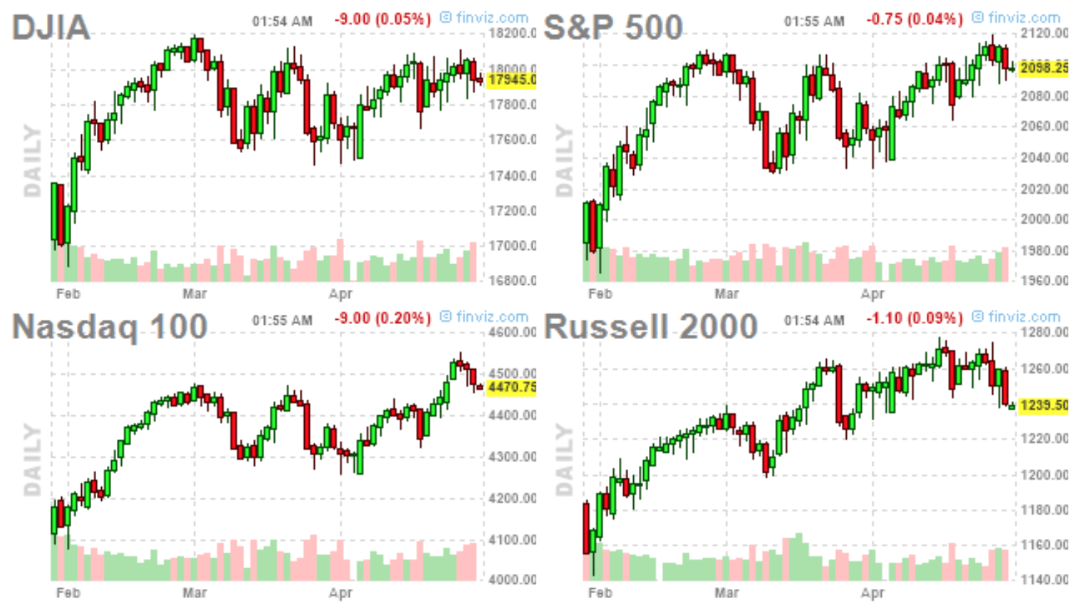
Chart 1: Equities recently suffered a technical reversal at record highs...
Source: FinViz.com
This weeks trading sessions in the US equities continue to show evidence of weakness, as majority of the US equity indices stalled at resistance levels. Couple of days ago, the S&P 500 opened at intraday record highs but closed with an outside reversal of the previous price range, which could be a cause for concern. The bearish reversal was even more pronounced in the Russell 2000 small caps index, which has been struggling to gain any traction since it broke out to new highs in late February.
What is even more interesting, is the fact that Dow Jones Industrial actually failed to register an intra day new highs this week (like the S&P) and has made no progress since December of 2014 (despite abundance of favourable news). Even the market darling sectors, such as Biotech, seem to be breaking down and possibly prime for a more meaningful correction. From my own experience, whenever a market fails to make new highs on favourable news or new lows on unfavourable news, a reversal of current trend might be around the corner.
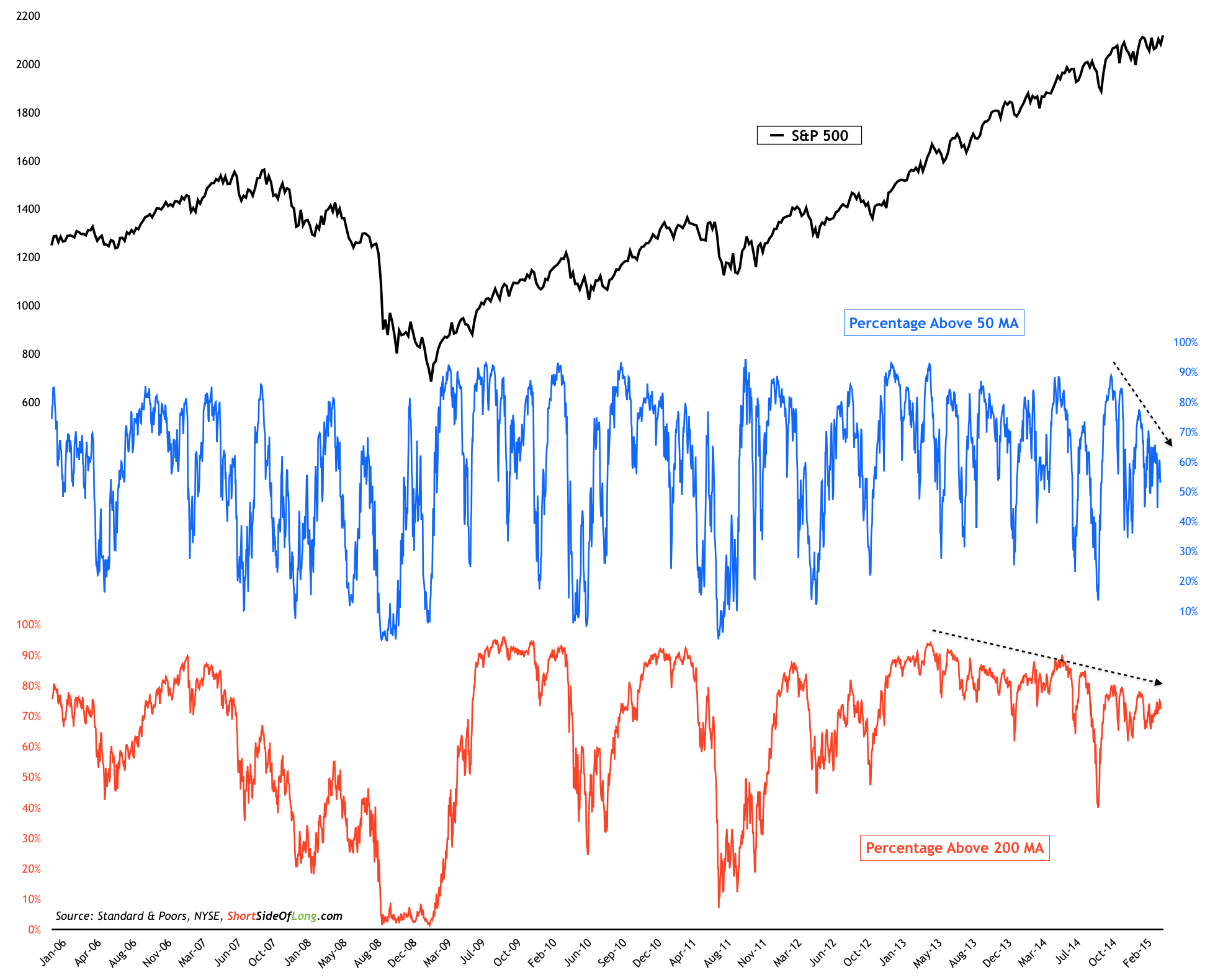
Chart 2: Fewer & fewer stocks are in an uptrend, despite the index rally
Source: Short Side of Long
The truth is, equity market rally has been ongoing since November 2012 and has been extremely powerful. While the broad index itself has been pushing ever higher, it should be noted that fewer and fewer stocks have been participating as the rally progresses. If we observe Chart 2, we can clearly see that the percentage of stocks trading above the 200 day moving average has been on the decline for several quarters now. Moreover, the percentage of stocks trading above the 50 day moving average (a shorter term breadth measure), has also been on a rapid decline since December 2014, around the same time that Dow Jones Industrial stalled.
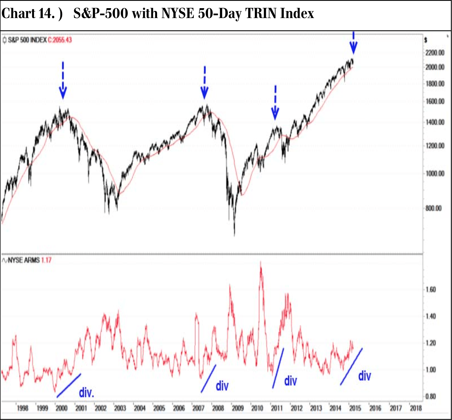
Chart 3: Quite few breadth warning signals similar to 2000, 2007 & 2011
Source: Michael Riesner / UBS Research
Confirming the breadth developments discussed above, we have Michael Riesner and the team from UBS Research write:
...we nonetheless have an increasing number of technical warning signals, which a) are very classic and b) they give us a rather high conviction that our base case scenario to see a short but potentially sharp correction (of around 15%) in the SPX this year is still intact. Our preferred time frame to see this correction remains deeper summer.
In particular, he notes the divergence between price, breadth and volume (refer to Chart 3):
The NYSE TRIN Index is a volume related breadth indicator, where super spikes are a reflection of massive fear and selling panic (as a contrarian buy signal) and via forming a major divergence in lower territory this indicator is showing increasing selectivity and fading buying power, which is toppish particularly if we look at the 50-day NYSE TRIN index.
Since Q4 2014, we have a major divergence forming in the strongly increasing TRIN index versus the December and February high in the SPX. This is just another of the major divergences, which are a point for an important top and subsequent significant correction in H2 2015!!
So do all these warning signals matter and will the market sell off from here onwards?
These questions are always hard to answer, unless you own a crystal ball. Personally, I do not. With all major central banks still engaged in "super-easy" monetary conditions, it has been impossible to fight the rising tide of the market. So maybe it isn't that smart to turn bearish just yet. Those with higher risk tolerance can always attempt the short side with prudent risk management.
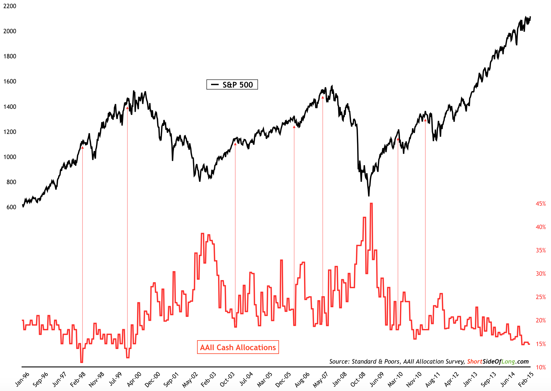
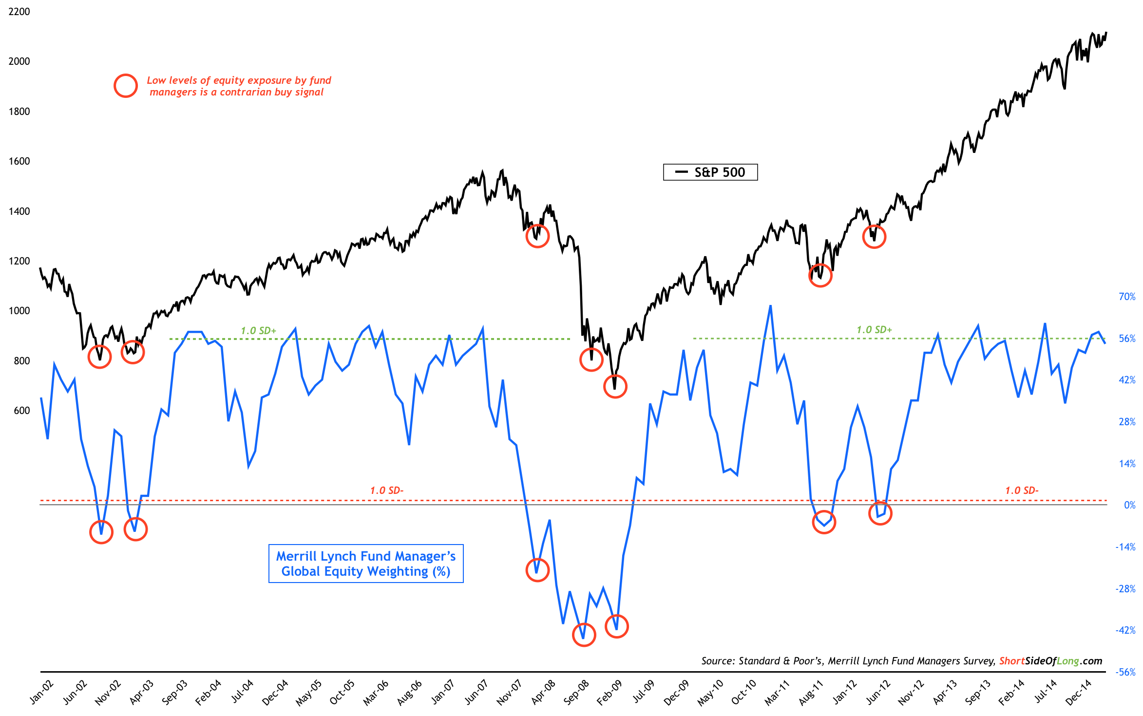
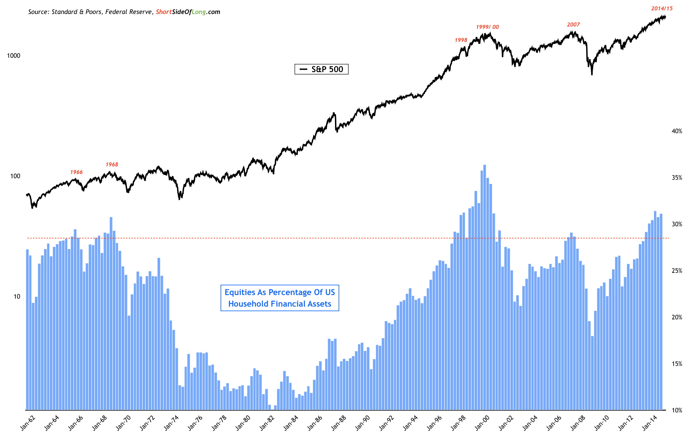
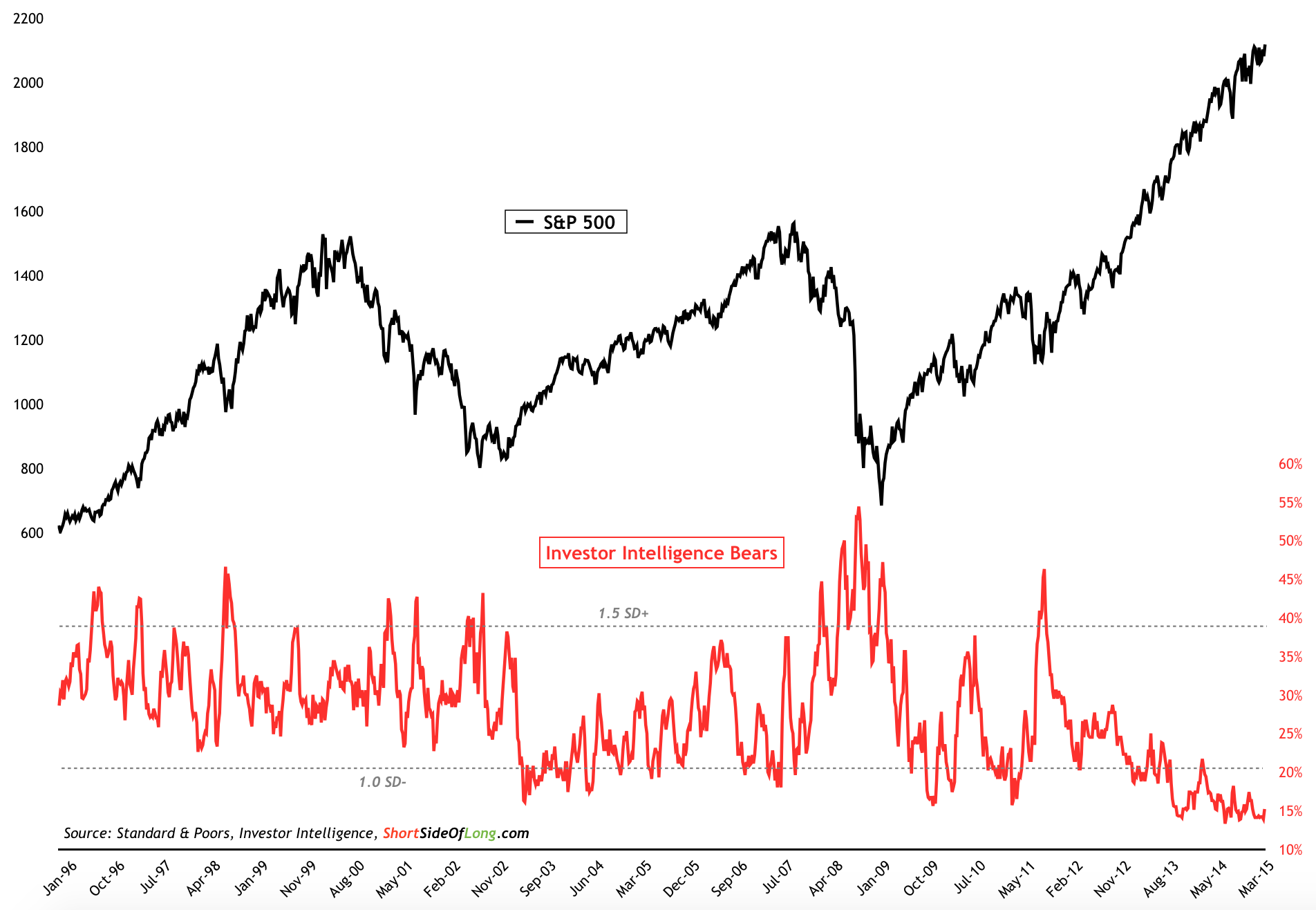
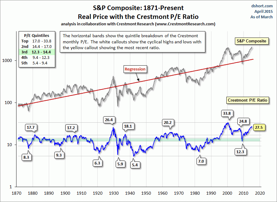
In general, it is very hard to predict whether this is just a cautionary event or potentially a major top in formation. However, one thing is true, as a contrarian investor I am extremely uneasy of just how bullish the sentiment is, how overexposed "dumb money" has become and how expensive the market currently is (please refer to Charts 4, 5, 6, 7 and 8).
Chart 4: Retail investors currently hold least amount of cash since 2000
Source: Short Side of Long
Chart 5: Households equity exposure remains 2nd highest since WW2
Source: Short Side of Long
Chart 6: Newsletter writers & finance advisors are extremely complacent
Source: Short Side of Long
Chart 7: Global fund managers continue to be highly overweight equities
Source: Short Side of Long
Chart 8: US equity market is as expensive as it was in 1929 and 1999!
Source: dshort.com
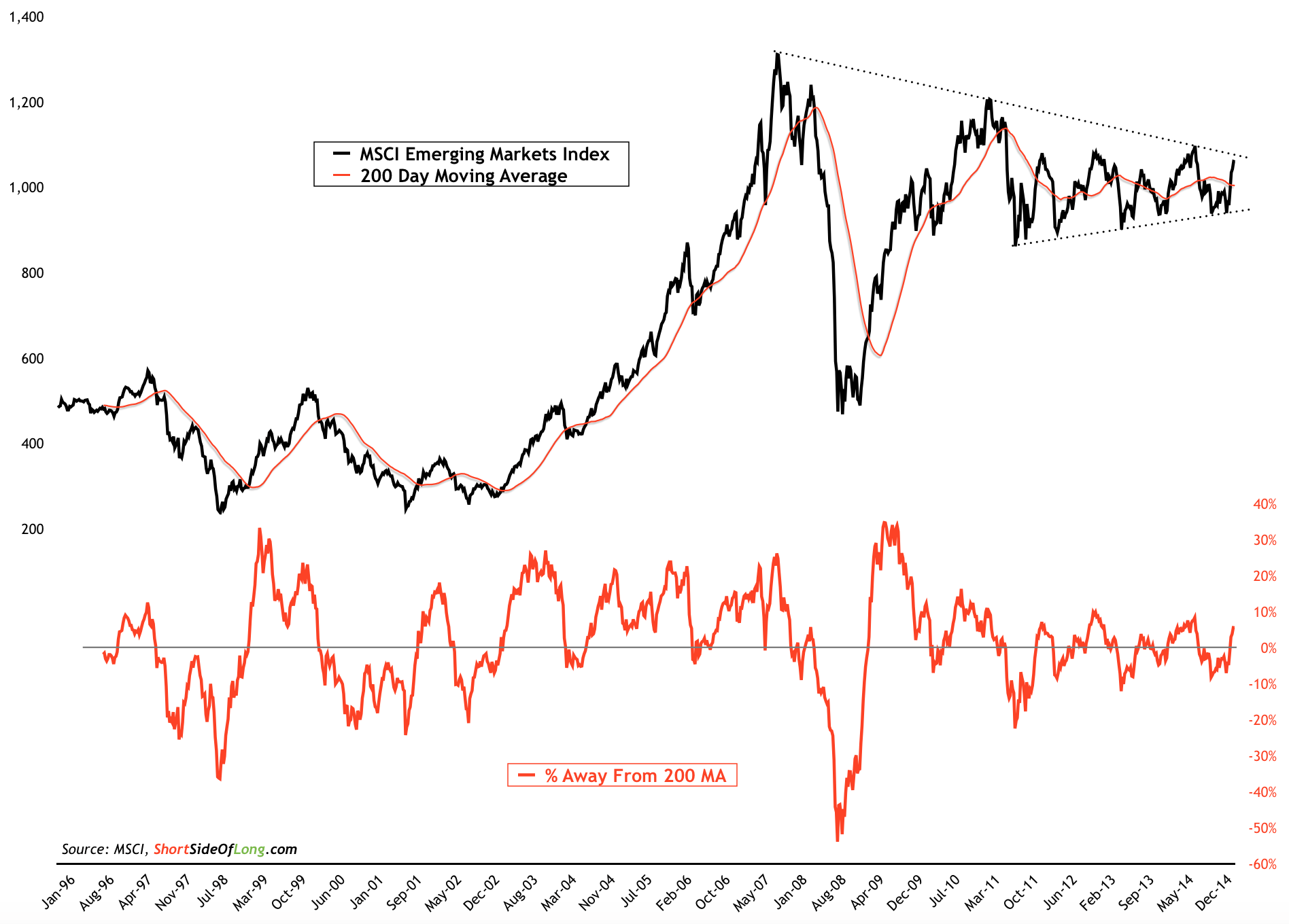
Finally, I would like to update the readers on my previous article, which discussed Emerging Market equities. The MSCI EM index has rallied about 12% since I've entered the trade and wrote about it on my blog (refer to Chart 9). We have moved from the bottom range of the triangle pattern, towards the top of the range.
With that in mind, I would like to emphasis that any major correction in US indices will surely impact the Emerging Markets Index as well. If the correction in global stocks has already started, judging by the weakness in the Dow Jones Industrial Index, then I will be watching how well EM equities hold up. As a reminder, my stop loss remains below the bottom range of the triangle, but I wouldn't want to see the MSCI EM Index trade below the 200 MA again (after just rising above it).
Chart 9: Emerging markets are in decision mode with a triangle pattern
Source: Short Side of Long
Copyright © Short Side of Long


