Ignoring The Obvious
by Eric Sprott and Etienne Bordeleau, Sprott Asset Management
Not a day goes by without hearing about the fiscal cliff, the debt ceiling or another political deadlock. We would not disagree that some of these are important issues that need resolving but, in the grand scheme of things, they are relatively superficial.
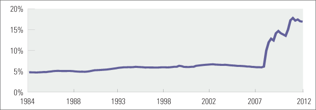
As we all know, central banks around the world have been frantically expanding their balance sheets. While exceptional times might warrant exceptional measures, Figure 1 below paints a rather troubling picture. The monetary base, the amount of money in circulation in the economy, has expanded at an incredible pace. Since the mid-80s, the U.S. monetary base had been very stable at around 5-6% of GDP. Through fractional reserve banking, this amount was sufficient to maintain annual inflation around 2-3%. With the banking system collapsing in 2008-2009, it was necessary for the Fed to increase the monetary base. However, banks are now in much better shape than they were in that period and the benefits of monetary expansion seem to be waning.
The Fed is not the solution to every economic and social woe and trying to hide real problems (eg. structurally high unemployment and rampant poverty, unsustainable income inequality and exploding government liabilities) with money printing achieves nothing constructive.
FIGURE 1: U.S. MONETARY BASE AS A % OF GDP
Source: Federal Reserve Bank of St. Louis, U.S. Department of Commerce: Bureau of Economic Analysis
Employment
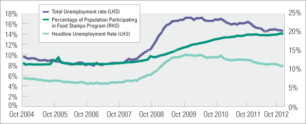
First, while we are supposed to be in the midst of an economic recovery, about one in five Americans are on food stamps (Figure 2). As the chart below shows, this measure of poverty has been fairly steady for the past year. We also find it hard to reconcile this data point with the headline unemployment numbers, which seem to be improving. We prefer a more comprehensive measure of unemployment, commonly referred to as U6, which includes discouraged workers and those working part time against their will. By this measure, we see that “Total Unemployment” has come down, but remains extremely elevated at around 14% of the labour force. Moreover, food stamps and “Total Unemployment” tend to move together. If food stamps users stabilize at current highs, we believe that it is a sign that the natural unemployment rate in the U.S. economy is now significantly higher than it was pre-crisis.
FIGURE 2: EMPLOYMENT IS NOT AS GOOD AS IT SEEMS
Source: U.S. Department of Labor: Bureau of Labor Statistics
Income Inequality
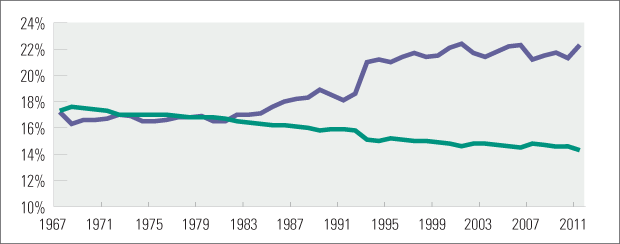
Second, income inequality has been growing steadily since the mid-1980s. Figure 3 shows the share of total U.S. income earned by the middle class and the top 5% of households. As of 2011, the top 5% of households brought home over 22% of all income generated in the country, whereas the middle 20% of households (quite literally the middle class) got less than 15%. Coupled with the unemployment picture, this shows that a majority of the U.S. population has been losing ground to the most wealthy. In a society that relies on consumption for 70% of its economic activity, this certainly does not bode well for the future, since the wealthiest traditionally do not consume much of their income. To top it off, the recent “fiscal cliff deal” just reduced disposable income further by increasing payroll taxes by 2% for all those working, putting additional strain on the working class and their discretionary spending dollars. (See Figure 3).
FIGURE 3: SHARE OF AGGREGATE INCOME RECEIVED BY HOUSEHOLDS
Source: U.S. Census Bureau, Current Population Survey, Annual Social and Economic Supplements
Government Obligations
Another obvious problem is the liabilities of the Federal Government. The current cash reporting basis that the Department of the Treasury uses, vastly understates its deficit and future liabilities. Some estimates put the current unfunded liabilities of the Federal Government at about $222 Trillion and show an increase in the deficit from 2010 to 2011 of around $11 Trillion, which represents about 70% of the U.S. total GDP.1
Simple back of the envelope calculations can be made using the Treasury’s “Financial Report of the United States Government – 2012”, which comprises a detailed breakdown of its future financial obligations for health care, social security and other government services.2 This reporting is similar to what every corporation is mandated to calculate for the purposes of U.S. GAAP reporting.
Of course, accounting can always be “massaged” to improve one’s situation. This problem is most acute when there are many assumptions, like for pension and benefits accounting (a.k.a. social security and Medicaid/Medicare). ShadowStats makes the necessary adjustments and finds that for 2012 alone, the deficit amounts to $6.9 Trillion.3 This represents about 45% of annual GDP. While laudable, the current haggling by policy makers for a meager $2 Trillion in deficit reduction over 10 years represents only the tip of the iceberg.
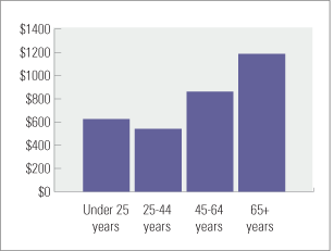
A significant part of these deficits is caused by current and future health care spending. The Deloitte Center for Health Solutions recently published a report entitled “The hidden costs of U.S. health care: Consumer discretionary health care spending”, in which they analyze the many components of health care spending and how those expenses are underreported in official numbers. Figure 4 shows their estimates for total health care spending by age group for 2010.
FIGURE 4: TOTAL HEALTH CARE COSTS BY AGE - 2010, $ BN
Source: The hidden costs of U.S. health care:
Consumer discretionary health care spending, Deloitte
FIGURE 5: U.S. POPULATION 65+ YEARS
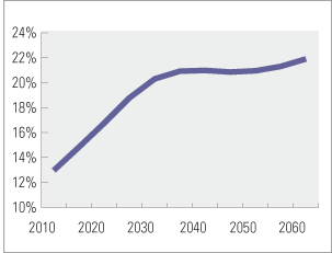
Source: US Census Bureau 2012 National Population Projections
What is striking - but not that surprising - is the very large increase in health care costs faced by seniors. The report cites that “Seniors and Baby Boomers account for 64 percent of health care costs, but comprise only 40 percent of the U.S. population.” For seniors, total health care costs represent, on average, approximately $30,000 per person per year. Other estimates by Carnegie Mellon University professor Paul Fischbeck (although a bit dated) show that these annual costs increase dramatically as people age, reaching as much as $45,000 for 80+ year olds.4 Considering that GDP per capita was about $46,800 in 2010 and the income inequality mentioned earlier, these are figures that would put most households in dire straits.
Also, structural trends will lead to an ever greater share of the nation’s income being dedicated to health care. Figure 5 above shows the evolution of the U.S. population for the 65+ age group, as forecasted by the U.S. Census Bureau. The U.S. will end up with a steadily increasing segment of its population (from 13% in 2010 to 20% in 2030) composed of persons aged 65 and over. This matters for two important reasons. First, this means a smaller workforce contributing to GDP growth and paying taxes to support government programs. Second, and this is related to the first point, this trend will put tremendous pressure on social security and health care spending in the country, thus leading to structurally higher deficits.
These facts are by themselves troubling, but coupled with the population trends described in Figure 5, they become alarming. To illustrate the impact of overall population aging on total health care costs, we use the per capita numbers implied by the Deloitte study and apply them to the U.S. Census Bureau projections for all age groups. While we believe that those numbers fundamentally underrepresent health care inflation, we inflate per capita costs for each age group using the average “medical care” component of the U.S. Department of Labor Consumer Price Index. Finally we assume a 4% nominal GDP growth, which some might argue is overly optimistic when taking into account the smaller workforce we discussed earlier. In any case, Figure 6 shows the results of our simulation.
Only with the change in the composition of the U.S. population, total health care costs are forecasted to go from 22% of GDP in 2010 to over 30% in 2040. These are huge numbers! To put them in perspective, in 2011 total U.S. GDP was $14,500 Billion, so an increase from 22% to 30% of GDP would represent a $1.2 Trillion increase in health care spending in that year. If we increase the health care inflation rate by only 100bps, we calculate that by 2040, the share of GDP attributed to health care will jump to 40%.
FIGURE 6: HEALTH CARE SPENDING AS A % OF GDP
 Source: US Census Bureau 2012 National Population Projections,U.S. Department of Commerce: Bureau of Economic Analysis, U.S. Department of Labor: Bureau of Labor Statistics & The hidden costs of U.S. health care: Consumer discretionary health care spending, Deloitte
According to the Deloitte study, about 60% of those costs are borne directly by households and the remaining 40% by the public sector (30% to Medicare and Medicaid). This means that households, of which the majority is either poor or in the declining middle class, will face an even larger squeeze in their discretionary spending.
Conclusion
To conclude, 20% of the population is on food stamps, an ever increasing gap between the wealthy and the rest and ever-increasing health care spending are all deep rooted and immensely important problems that get a ridiculous fraction of the attention that they deserve. The impact of these issues on both government finances and future economic growth are enormous.
As we discussed, the purpose of asset purchases by the Fed might no longer be improvements in the real economy, but rather a more subtle financing of U.S. government deficits. However, in the long run, expanding the money supply inevitably leads to inflationary pressures. Luckily for the Fed and the U.S. government, there is so much slack in the labour market that inflation might be years away. And, if we are right about the long run unemployment rate being structurally higher, then the Fed has all the room it needs to continue Quantitative Easing (QE) to infinity. This might allow them to continue to hide the true financial position of the government for many years to come.
Nonetheless, the rising GAAP deficit and the sheer size of the U.S. Federal Government’s liabilities to its citizens makes it clear that one day or another, services (health care, social security) will have to be cut. Financial alchemy can hide reality, but it does not provide any tangible services.
Europe’s (unresolved) experience with its debt crisis provides an insightful window into the future. Austerity measures in Ireland, Portugal, Spain and Greece have caused tremendous pain to their citizens (25% unemployment rates) and wreaked havoc in their economies (double digit retail sales declines).
Are we going to ignore the obvious?
1. See website of Professor Lawrence Kotlikoff of Boston Universityfor details: http://www.kotlikoff.net/opinions
2. Updates to his calculations for FY2012 should be made available in the near future.
3. Our calculations are similar to those carried by ShadowStats.
4. Our calculations are similar to those carried by ShadowStats. http://www.shadowstats.com/


